So, how did you all do in your office cubicle mini-golf tournament?
What’s that? You mean you guys didn’t have an in-the-office putt-putt course set up for Employee Appreciation Day a couple Friday’s ago? What?? You haven’t heard of Employee Appreciation Day?
Truthfully, neither had I. I’ve been with that company for 7 years now, and this is the first time I remember anything like this happening. Supposedly it’s a thing. We were treated to Lou Malnati’s Pizza (which is possibly the best pizza in Chicago), and we hit the fake links after lunch. Here’s a couple of pictures to prove I’m not lying.
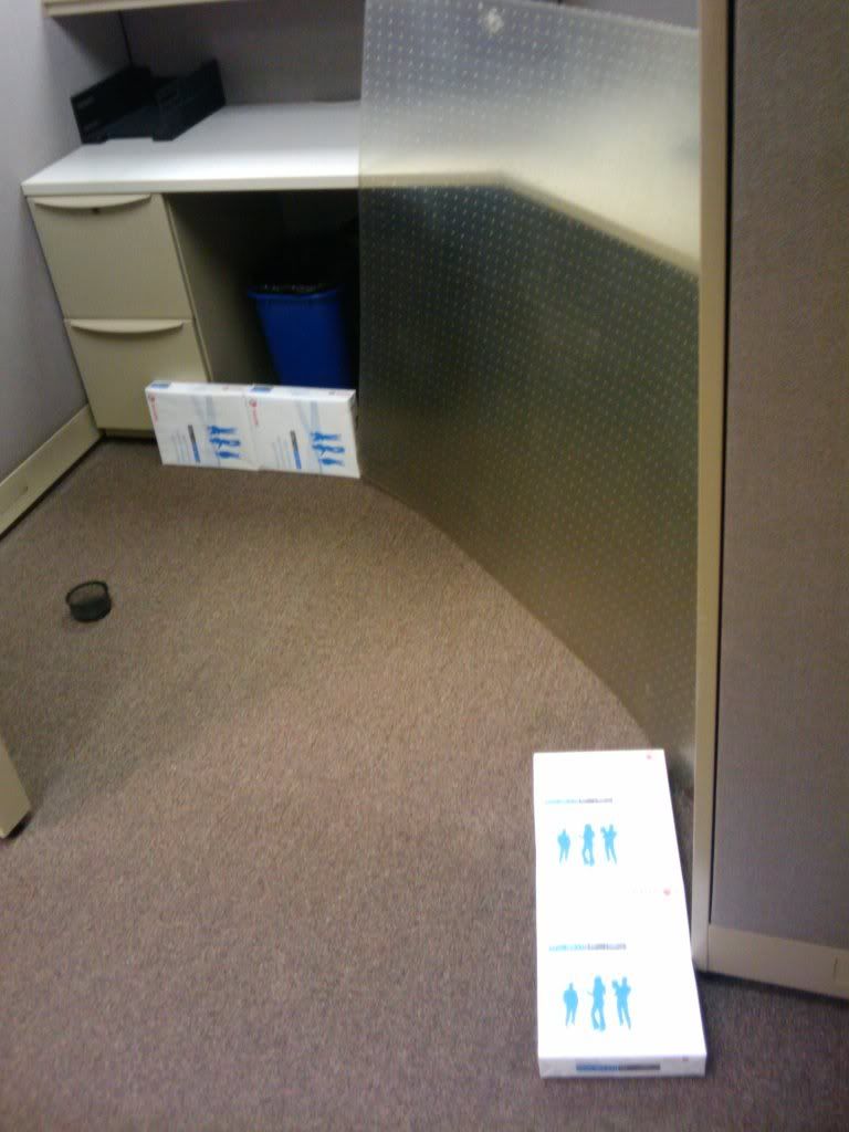
You started around the corner and had to bounce it off the paper or rug protector
You only had to hit the paperclip cup with your ball, not bounce it in.
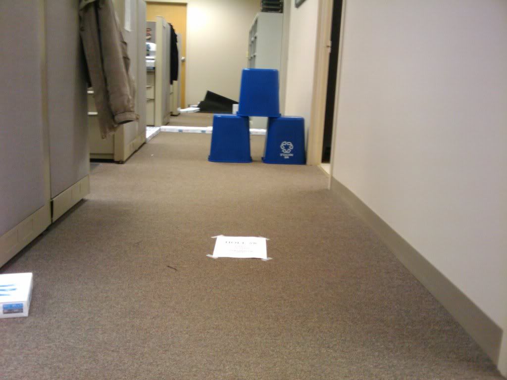
The closest we got to a windmill
You could either hit it under the bins to the hole or go around on the left. The tee is the piece of paper.
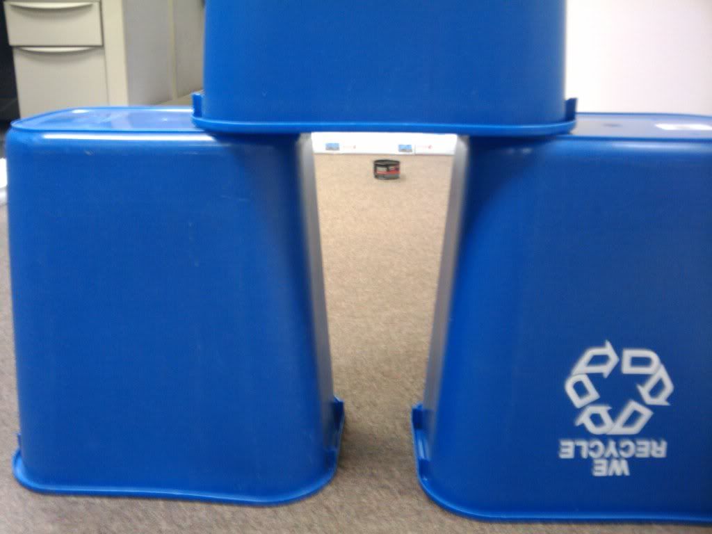
I got a hole in one on this both rounds we played. Right down the middle.
I came in 4th overall. Oh well. At least I made the cut for the top 8.
The whole situation/celebration made me think…I’m a small business owner now, thanks to this whole card selling thing. Shouldn’t I be doing the same type of thing? And what’s this? Just my luck! Andy is also an employee of the card company. So, I’m going to show my appreciation of Andy for some free cards he sent my way.
When I started my Kerry Wood collection, my blogging and business partner here donated a ton of accidentally-won-on-ebay cards to my cause. And boy do I appreciate it!
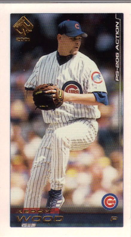
Action Packed! Wait...wrong product
I know basically nothing about the Private Stock set. The only thing I do know is that I have one of the minis. It doesn’t look too high end, but it does look like a lot like virtually every other card from Pacific. That’s cool with me. I need a bunch of them similar bastards.
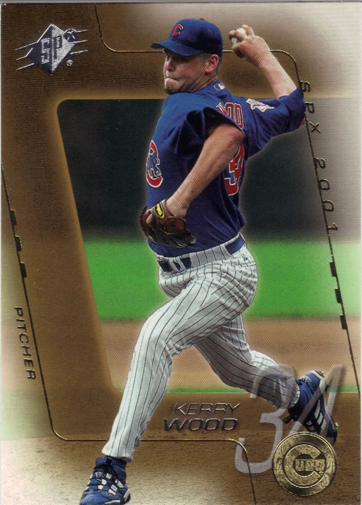
SPx has lost something off its fastball
Boy, SPx has changed a lot over the years. I remember when they were all flashy and crazy and holographic and special feeling. Gone is the pizazz, the glamor, the glitz. I don’t think there are even any die-cuts in 2001. What a world.

Must...not..rehash...Indiana Jones boulder...reference...
Is it just me or does Kerry’s hat look like it’s hovering over his head? I’m sure they never thought I would notice, what with the baseball moon and shooting stars thing going on behind them.
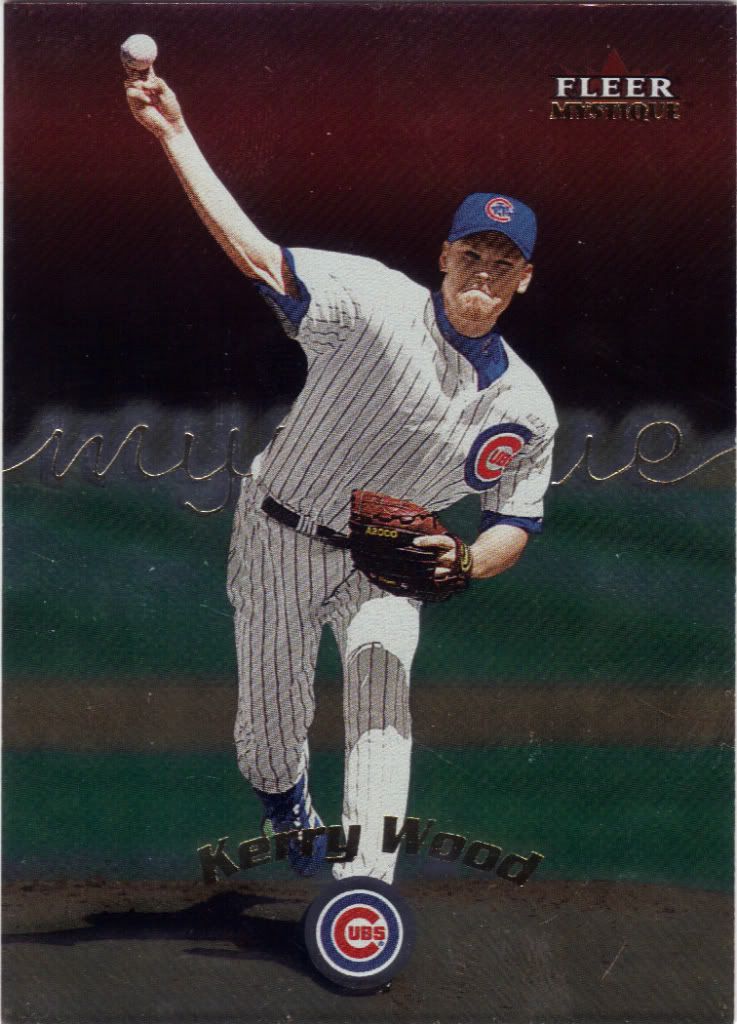
And, lo! The Chosen One will toss his sphere through a sky of blood
I honestly can’t remember if Andy gave me his stash before or after my big Fleer Group Break. My guess is it was before. I really enjoyed my Mystique break. The cards won’t blow anyone away, but the secret cards and the fact that we got 2 on-card autographs in our box made for a fun time.
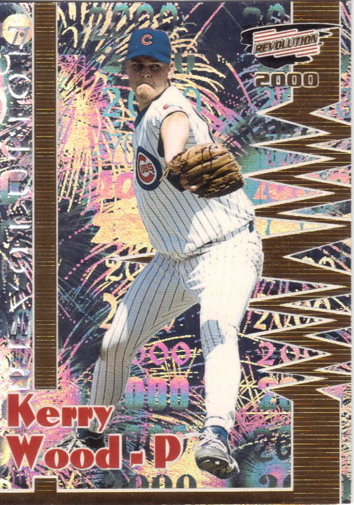
Must...not...make...Beatles reference....BackInTheUSSR...Ah, Dammit!
Wow. Happy 4th of July, everybody! This card partied like it was 1999 then threw up all the glitter. The revolution is here! Who wants in? More from this set later.
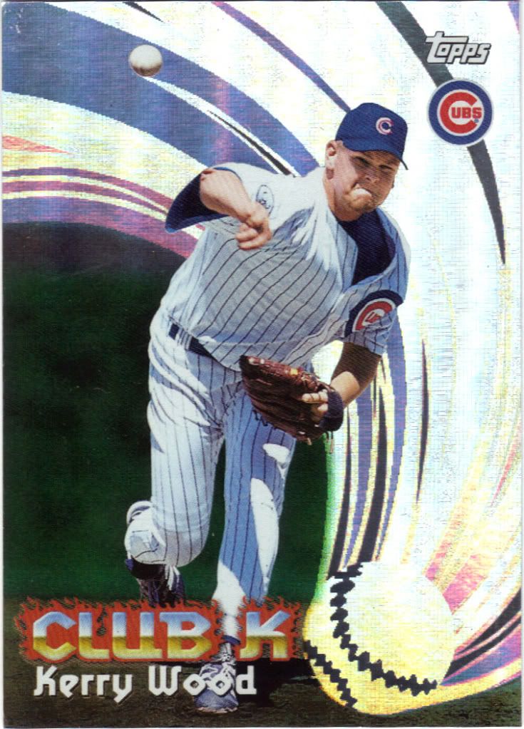
How do I become a member?
Why is this card called All-Matrix? It says Club K right there. I don’t know. Maybe the other cards in the set were labeled other things. Even so, this isn’t very matrixly. I think Topps just wanted to capitalize on Neo in 1999. They should have just put shades on everyone and put a shiny grid in the background.
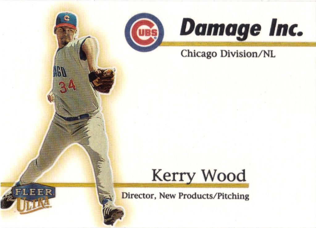
My Lexmark might get demoted for this scan
Some of you out there have seen our business cards by now. I think for the next round, we should consider going with this. Damage Inc. Chicago Division/NL – Jon Waterman: Director, Case busting/procrastinating. What do you think?
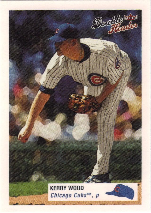
I only see ONE HEAD! And one leg.
I don’t know much about the Double Header product. Who can keep track of the 30 yearly Fleer products from this era? Everything about this mini screams parallel to me, but I don’t see a “normal” on my checklist. Is this the normal set with the dual-player cards used as the inserts?
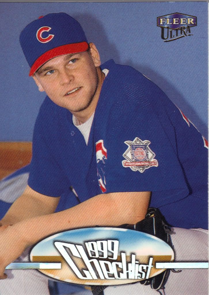
Let's take this checklist on the open road
I don’t know why, but it bothers me when checklists feature a player who isn’t actually on that portion of the checklist. The back gives us the first 74 cards of the 1999 Ultra set (although there’s room for more than that unusual number). Kerry Wood does not appear next to any of those 74 check boxes. Do you know who does? Greg Maddux, Frank Thomas, and Tony Gwynn. Oddly, Frank Thomas does have a checklist in this set, too. I’m complaining about nothing, I guess.
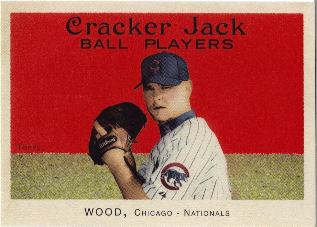
Let the backlash begin
I know a lot of people love this set, and Andy collected the balls off of it, but it’s not my cup of popcorn and peanuts. Historical accuracy aside, the blinding red color turns me away and the photoshop filter they use to “age” the picture is slightly vomitous. I appreciate the effort, and I’m glad people enjoyed it so much, because that makes it easier to get the cards I need, but I wouldn’t have bought any if I was collecting back then.
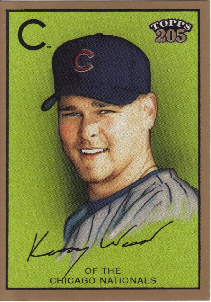
As long as he's not with the Washington Nationals
Same thing goes for these. The photo processing doesn’t look as bad, because there is some texture and it’s not entirely washed out, but it still looks like a modern effect on what should feel vintage. I don’t want to notice the computer work.
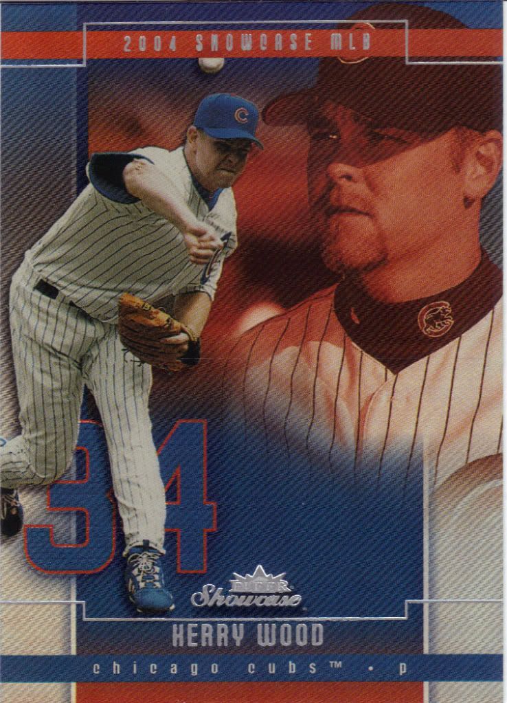
RIP, Kerry Wood. Love, Angry Kerry Wood
Now, these showcase cards, on the other hand, are fantastic. The box of 2005 was my favorite of the 7 Fleer boxes I busted for the big group break. The design powers through the red & black floating head that makes it look like a tribute card for the dearly departed. I mean, it has shiny, it has team colors flowing throughout and it has the jersey number (with a slightly different texture, mind you) that I feel should be prominently mentioned on cards more often (fronts or backs).
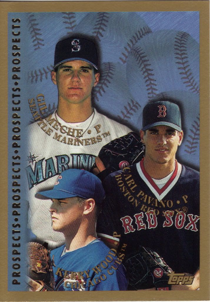
Wait. Are these prospects? I'm not clear on that.
The “Prospects, Prospects, Prospects” running down the side reminds me of a Mr. Show sketch involving a certain warehouse where they sell a certain type of taboo ring. NSFW link if you’re so inclined. You know, this isn’t a bad 3-player prospect pairing pat pall. I mean…at all. Sorry, I got caught up in the alliteration. Anyway, you have three guys who actually have had at least moderately productive MLB careers. There’s Alyssa Milano’s ex, Carl Pavano who racked up 100 wins over 13 seasons. Then there’s Gil Meche, who probably didn’t date anyone famous, with his 84 wins over 10 years before retiring in 2010. What are the odds of that?
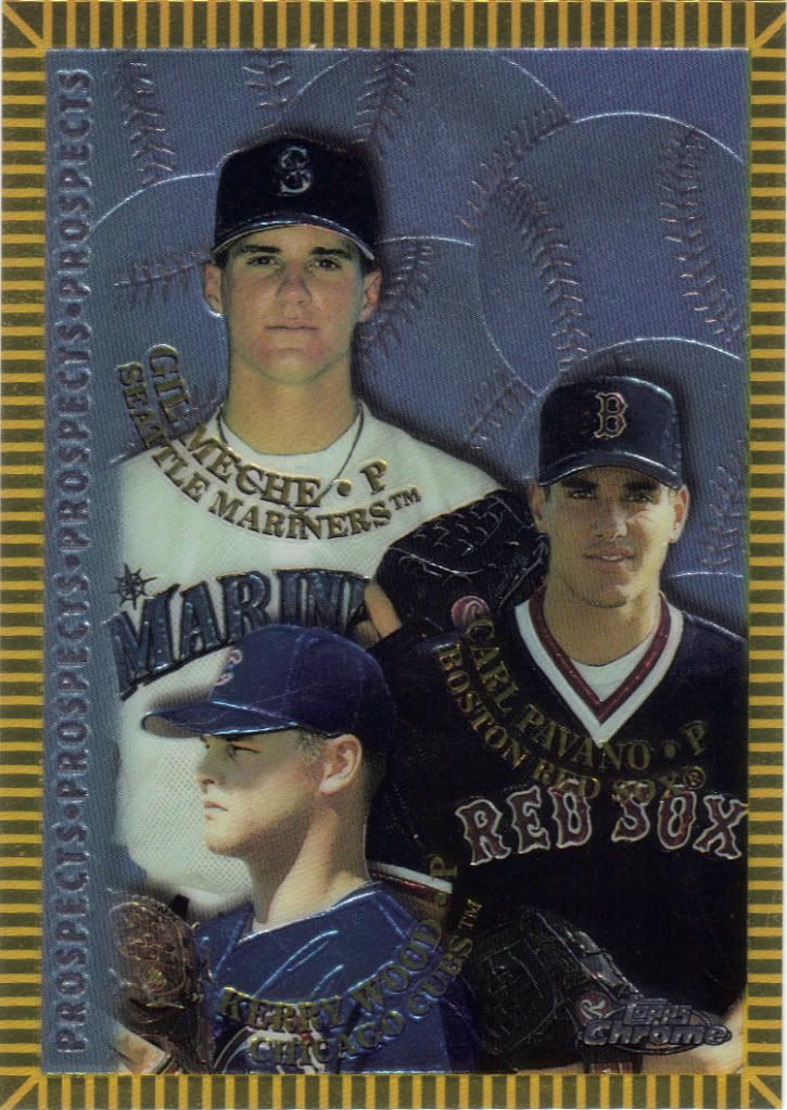
They could have wedged a fourth in up there
Hey, look who it is! I love the extra flourish on the border for the chrome version. Very cool indeed. All I need now is the refractor version from chrome and the Devil Rays Inaugural, the D-backs inaugural, and the minted in cooperstown parallels from the non-chrome and I’ll have that Meche/Pavano rainbow I’ve always dreamed of.

Its like looking into my soul
Huh? What’s this? See Andy’s post from April of last year for more info and then below for my side.
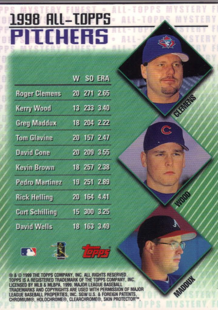
Wow, Clemens had a great year. Alllll on his oooowwnn. Look at that smirk.
I was briefly confused by this when I saw it in the pile. Black front and 3 players on the back with no card number at all? It didn’t take too long to figure out that the black part was supposed to peel. The only problem was that I wasn’t sure the card wanted to be peeled anymore. I contemplated leaving it as is and tossing it in my Greg Maddux binder. Maddux takes priority, collection wise, for the record. What stopped me was that Roger Clemens picture up there. What if this was actually a Clemens card? I couldn’t have that stinking up a binder, could I? Then I did a little more research and found out that there are also Refractor versions. Well, now I had to peel it.
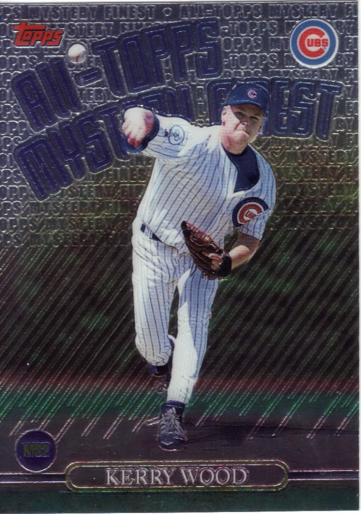
Just a slight-adjustment and the ball could have acted as the hyphen
Turns out Andy was right all along. It was a Kerry Wood card. The black peel was tough to start and I was really worried about digging into the cardboard part instead of just underneath the cover. It didn’t come off easily either. It was a tough little sumbitch. Still, it came off cleanly and left me with a nice shiny piece of cardboard history to display in the binder.
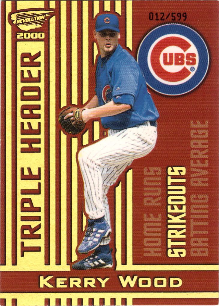
Not very holographic, but it is very gold. I know it looks yellow but trust me
Is it ironic that this “Holographic Gold” insert parallel isn’t as holographic as the Revolution card I showed up above? The internet has ruined that word and I can never tell when to use it. Anyway, we’re getting down to some of the more interesting and rarer cards in the lot. I can’t say I understand the Triple Header moniker, since there aren’t versions of this card for Home Runs and Batting Average. There aren’t even only 3 parallels.
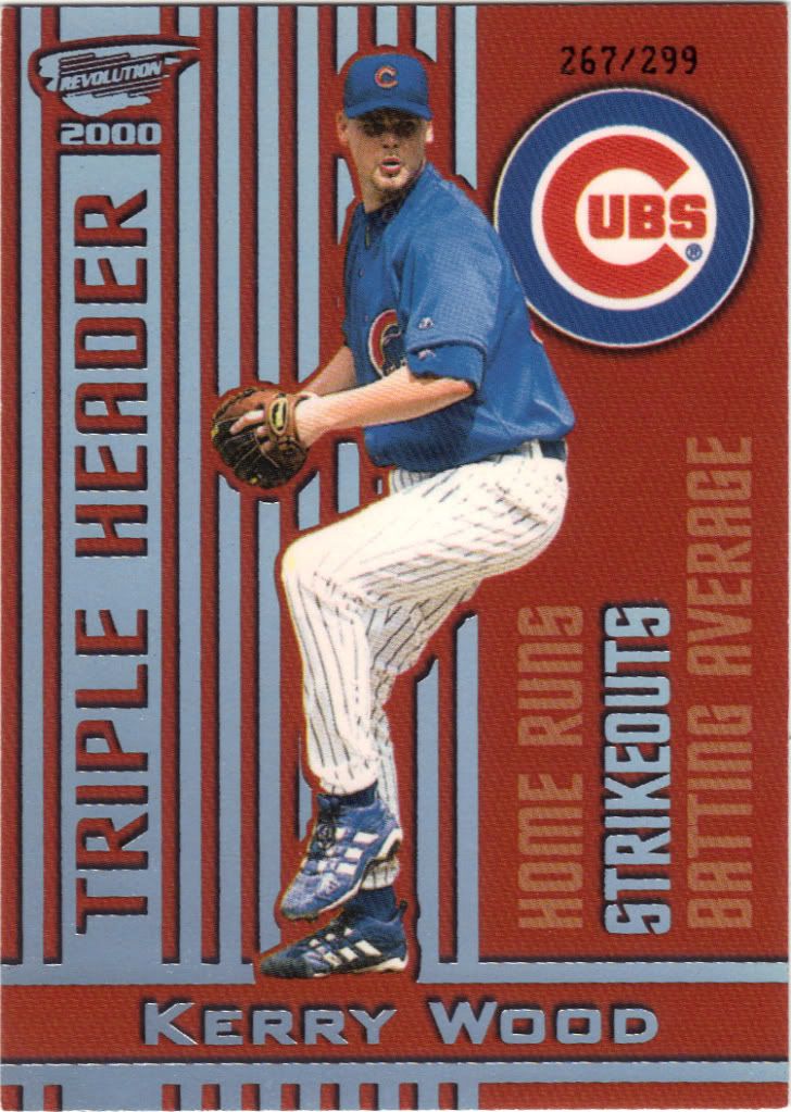
Everyone knows Silver is better than Gold
I want to be involved in the meeting when they decided to make the Holographic Silver version a tougher pull than the Holographic Gold. /599 vs. /299, which should be which? Hmmm…Why follow conventions, this is a Revolution, after all! To make things more confusing, there is a regular Silver version /999. I also will need to track down the regular insert and a Platinum Blue /799. At least I have the two toughest out of the way thanks to Andy.
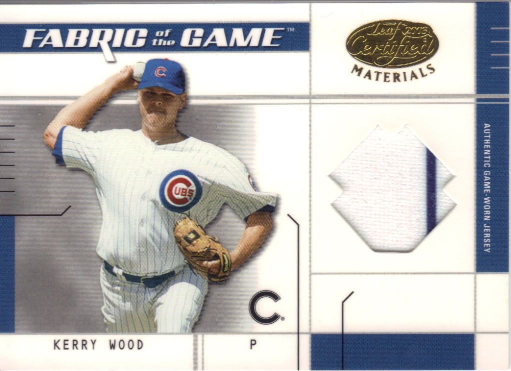
What is that shape supposed to be? And why?
Leaf is going to be the bane of my collecting experience. There are just so many parallels of jersey and auto cards out there. Take this card for example. 2003 Leaf Certified Materials. Guess how many different versions there are for me to collect /50 or higher. If you said 2, you are correct. Now, how much difference is there from version to version?

I don't know if the edges are dirty or if they're supposed look slightly burned.
Here’s another jersey card Andy handed to me. As you can see, the window for the relic is different, but otherwise it’s completely the same. My list shows the other two I need labeled JY and PS. Let’s take a look at the backs.
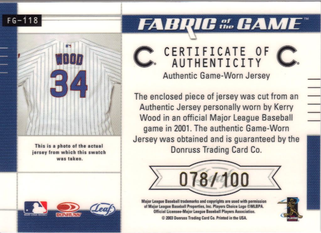
Why can't they all look like this?
First off, thank you for putting a picture of the jersey on the back of the card! Ooo, and a description of where it came from! See, it is still possible. Everyone just colluded to cut corners and stop – allegedly. Here’s the first card. The one with a window that looks like a star burst. As you can see, it’s /100. Beckett and SCD notates this version with BA, which I can only guess would mean base. Now, I don’t know if that means the most basic version or if the widow is meant to represent a base. Does anyone have a box or a clue?
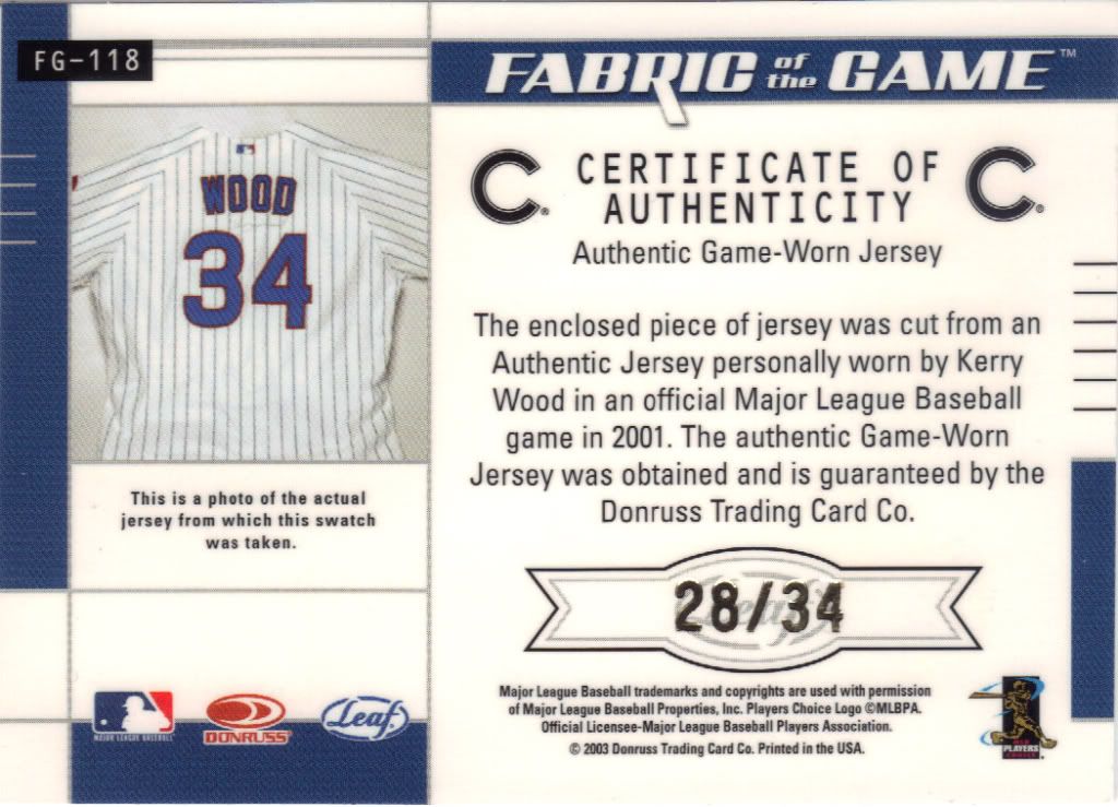
Hot damn, that's a low numbered card! Beyond my normal parameters, but I'll take it!
Here’s the other back. I have this as JN, which sounds like it should stand for jersey number. Makes sense. So then what would JY and PS be? Jersey and Position? Maybe they’re just random letter designations. Only one way to find out. I need to get the other 2.
I think I’ve made you all suffer enough. There are dozens more that I could show. Who knows, maybe I will next year.
Anyway, thank you Andy for all the generosity you’ve shown, cardboard and otherwise, and thanks for joining me in the blogging and business adventure. I truly appreciate it.

Recent Comments