Topps Bunt has only been around as a physical product for a couple years now (as opposed to the digital app) but it’s made a pretty big impression on me.
I think the most appealing part of it is that it’s a budget product that isn’t just a simple rehash like Opening Day or a Sticker (although I love the stickers and collect all of the albums). I’ve even decided to go ahead and collect the 2016 Master set. Undecided on 2017 because I haven’t bought any packs yet, but I do have a few parallels from ebay.
Boy has the product changed.
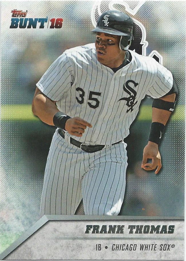
Spot the difference
Here’s what the 2016 base cards look like. Note the smokey circle border and the Fleer Ultra inspired nameplate and team logo.
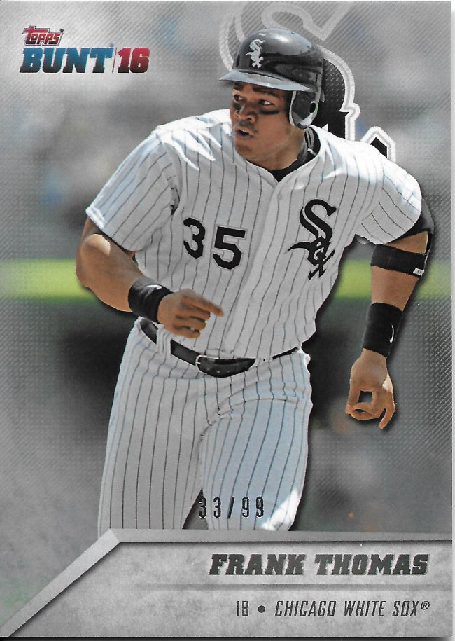
Frank’s looking for the differences
And this is what we call the platinum parallel. Notice the foil stamped number at the bottom third and what is supposed to be different looking border. Need another look?
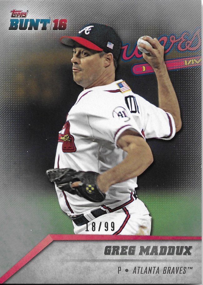
He doesn’t know what he’s looking at.
Here you are. Keep in mind there’s no foil or other markings. Very, very subtle and you have to be looking for it. I imagine there are a lot of kids (and adults) that have one or two without realizing it.
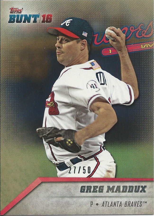
Bronze at best
Here’s the Topaz version, which is easier to see, but still actually pretty subtle when looking through a pack. Depending on what the natural background is, it could blend in just as easy.
I think they probably got some feedback about how hard they are to spot, because in one year, they went from that up there…
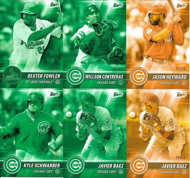
These are very cheap to buy on account of how they look
To this right here. Now, look hard at the two Javier Baez cards at the bottom. I’m not sure if you can’t tell the differences between the #/99 and the #50, but it’s there for the trained eye. You see those 4 on the left are green. Like, really, really green. And the 2 on the right are blindingly orange.
So, you know, slightly different approach. Perhaps a bit too extreme in the other direction, but at least they’re visible.

Recent Comments