We haven’t talked about Panini a whole lot on this blog lately (or Upper Deck for that matter). That’s because we’re primarily a baseball blog and their baseball related products have been…shall we say…limited.
I want to try to rectify the lack of non-Topps chatter some as we go forward, because there are some important things that these companies are doing with their respective licenses and steps they’ve taken otherwise that I personally appreciate. I’m also hoping to write about some Panini baseball cards someday – if they would just put my players on the checklist, giving me a reason to try it out.
Today, I want to focus on a new product preview that Panini posted on their official blog. It’s a new basketball product called Past & Present, and maybe I’m crazy, but I honestly think it’s fantastic and possibly the best looking stuff they’ve produced in quite some time. See if you agree.
This I guess is one of the regs (yup, I’m actually using it). The concept is to meld vintage looking styles from the past with the modern elements.
Anyone who purchased Skybox basketball cards (my second reference this week to those) will remember the orange trail coming off of the ball. How about an upgrade to flames?
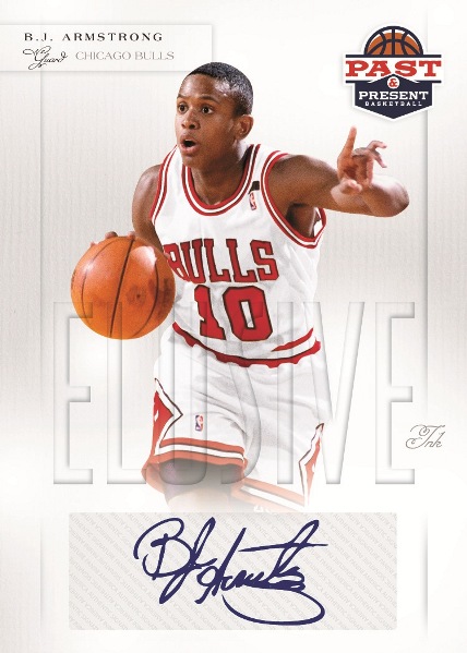
The autos are the weakest designs of the bunch, and I’m not wild about stickers, but I can’t argue with a Bulls fan favorite making the checklist. Elusive Ink features some rarely seen autographs and it sounds like a promising concept. Apparently any and all rookie autos will be redemptions, but from what I gather (and I could very well be wrong) that has more to do with some technicality from the NBA lockout and their license rather than a planning issue.
I saved my favorite for last. If you don’t like this card from the Raining 3’s insert set, then you won’t like the product.
Like I said, I may be crazy, but I think these look pretty original and at least are showing a good creative effort to try something different. I know they still have action shots with no background, but look! Look at where the picture falls on the card. It’s right down the center. That could mean they’re starting to move away from the cookie cutter “regs/relic/auto” production line format that people seem to be tiring of. Kobe takes up the entire card. No obvious place for a relic window. That’s not revolutionary in and of itself, but it’s certainly much appreciated.
Depending on what the SRP ends up being, I may have to pick a box of this stuff up, because I really like what I’m seeing so far. Enough to devote a whole post to a product preview, evidently. That should tell you something right there.


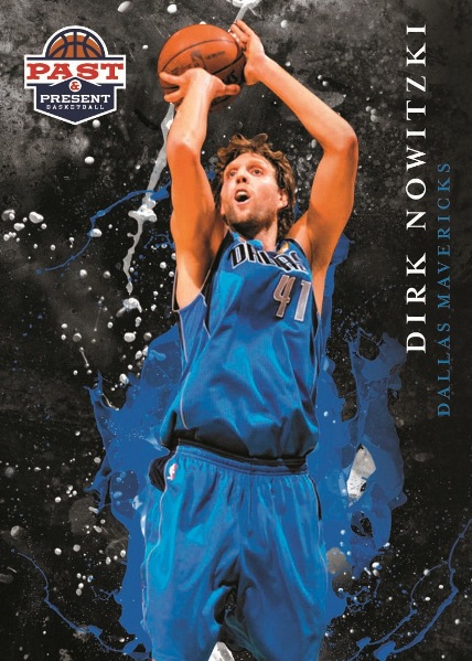
I really like the looks of these also. The Nowitzki looks like he is a bug being splattered on a windshield especially with the look of surprise on his face. I don’t know that these will make me want to collect basketball, but they are definitely not an eyesore.
See some of your readers will still comment even when they don’t get anything.
Nice cards. Too bad they’re basketball. Have I mentioned I’ve never watched an NBA game from start to finish, or even more than 10 minutes of an NBA game in the last 30 years? In fact, why am I commenting on this post?
It’s a step in the right direction, but Panini has a long way to go to convert me.
I agree – looks pretty cool. Kind of reminds me of some of the old Skybox stuff you mentioned. It’s definitely different and more colorful than the Metallic type look that they seem to have on every basketball card I’ve seen lately.
It’s funny you mention the auto having the weakest design – because that’s the one I think is closest to what I picture the design of their other basketball products being. I’m just a baseball card collector who buys Jalen Rose cards – but he does have some stuff in the new products – so my basketball opinion should be taken for what it’s worth.
[…] Basketball Video Box Break & Review By Jon Back in March, I did something I rarely do. I posted a preview for an upcoming product. While this blog comments on hobby news here and there, it’s usually in a […]