My second trade with Rhubarb Runner over at “e’ rayhahn, rayhahn” won’t be as cleverly written as the first, I’m afraid. You see, I’m getting desperately behind. There are a million things I want to be writing, but it’s getting down to crunch time for me. And I’m not just talking about the upcoming Community Break.
My wedding is only two months away, and those of you that are married (and were active participants in planning) know how much sand in the hourglass that can take away. You wouldn’t think it from the outside looking in. It’s an interesting juggling act between writing, reading, commenting, tweeting, organizing, and spending quality time with you know who. I know there will be a time coming soon where I will be virtually non-existent in the blogging world for a stretch as things get even more intense.
For now, I’m here. And I have cards! And just like my pokemans — I want to show you them.
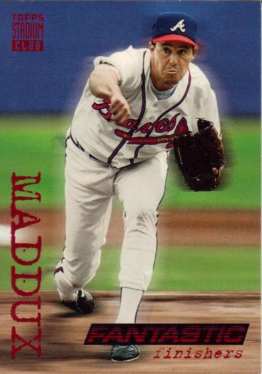
More like "Fantastic Pouty-faces"
The wonders of the mid-nineties. Intense typewriter font for the name with eyes for D’s. A blurry background for no apparent reason other than to show off. Red foil abounds in all its gaudy glory. I miss the days of the subset. Why do they all have to be inserts and parallels these days? What’s wrong with expanding the set and giving us some random themes to group ten guys together? Subsets used to be some of my favorite cards. Rhubarb also sent the non-subset 1994 Stadium Club Maddux. I’ll show that another time.
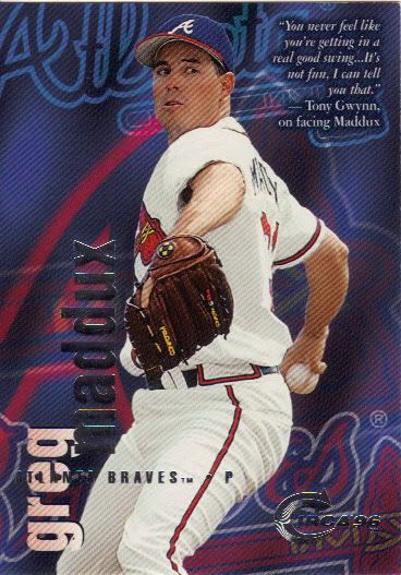
My Player Collection on My Player Collection
I know a design like this wouldn’t fly in today’s jaded world, but I like it. It’s bold, unusual, but not so ridiculously obnoxious and in your face that it becomes annoying like 1995 Fleer or anything. It’s the appropriate volume turndown version of that type of look. Does that make sense? Ah, who cares.
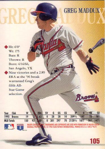
Toss that bat like you got a hit!
Here’s the back of that card. See, more proof that it’s awesome. Sure, you sacrifice stats, but there’s a pitcher batting in a “full” size photo on the back of your card. Also, interesting to note that the bat Maddux is tossing has a “47” on the knob, which means that’s actually Tom Glavine’s bat. If you’re a card company, who’s cards are you assigning that bat to?
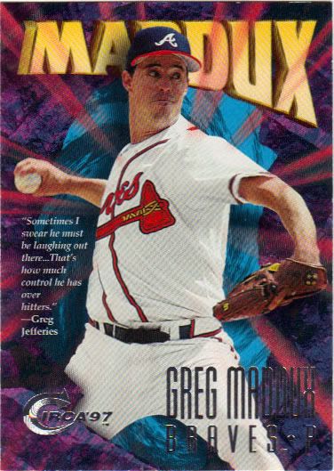
PITCHING!!!!!!!!!
Now compare 1996 Circa to 1997. This is the over the top, pitching out of an exploding vortex/worm hole/stargate atlantis/aggro crag that is just a bit too much. I may have mentioned before, but I knew this set as Z-Force from my basketball collecting days. For some reason this kind of style worked on those cards. Maybe it’s because early Skybox was very similar and we were used to it. Maybe it’s because basketball is a more action-oriented sport. Whatever the case, no amount of Greg Jefferies quotes in the world can save this design on a baseball card. The back does still look nice. I’m just not going to show it.
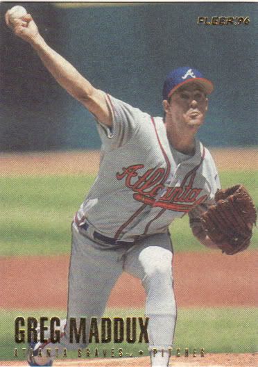
Very nice framing.
I think this is the second card I’ve featured on the blog where Greg’s eyes have been sucked back into his skull. Maybe this is actually like taking a picture of a lightning strike and he has some sort of dark magic powers that he’s summoning and it’s only visible for a split second. Could also be the lighting. When I bought my box of 1997 Fleer for the last group break I held, this is the set I actually had in mind. I love the one per pack Tiffany parallels (97 was one per box and my Molitor checklist card is still for trade – actually, you might want it Rhubarb). These boxes are much cheaper and I may get one as a bonus if I ever have time to hold a third group break.
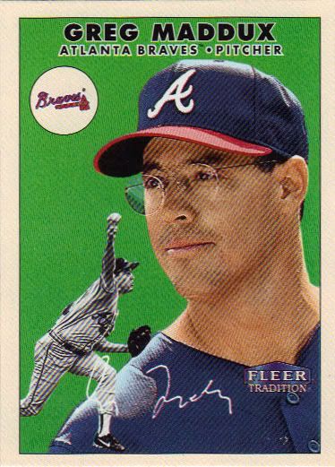
Sorry about the lines. I've changed my scanner setting since this was put in a few months ago. Told you I'm behind.
Out with the old and in with the less old. I don’t know much about the set this is based on, but it looks alright. The facsimile autograph isn’t so crisp, but it does show how weird looking it is. I think it’ll be a while before I get my hands on a legitimate one to compare. Maybe I’ll make that one my collecting goals for next year. I’m not sure what else to say about this card, really. The green doesn’t mix well with the black and white picture. I’m not a big fan of solid colored backgrounds regardless. Other than that, it has a little Angel/Devil on the shoulder vibe going on. If this were a sticker book, I’d expect this to be the left half.
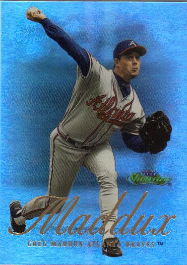
I love the way these scan, much more Cub Blue than in real life
I’ve gotten several Cubs from this set as trade extras this past year. The set looks great, even if it is plain upon closer inspection. What can I say, I’m easily amused by shiny things. The back of the card doesn’t match the flashiness of the front. It looks more like something out of a Fleer Metal set or maybe even Pacific. So, I’ll focus on the front here and be thankful there aren’t a billion parallels, because I imagine it would tough to distinguish different colors of foil on this.
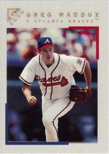
Worthy of hanging in the Hall
It may not be painted, but the border of this Topps Gallery card still looks nice. I do have a bone to pick with the gold foil on top of the sparkling white and silver border. A little too tough to read. Thankfully I can tell who this guy is. The back of the card has a blurb that says “Likes to play video games.” While it’s commonplace now, I feel like there would have been a negative stigma associated with that a decade ago. Video games were still going to rot your brain and make you stupid. Well, the Professor ain’t stupid, dummy. Maybe you should play a little more Maniac Mansion and then your snapshot will be framed.
This is actually only about half of the cards I got in this second trade. This one originated from leftover Moments and Milestone cards that I had after my Pack Lottery Contest (yes, I still had cards left, but only of teams people didn’t want). Now that I’ve opened a box of Documentary (what’s wrong with me? You’ll find out eventually as I highlight/review it), there’s a third in the works, so keep your eyes peeled. And if you have any spare Twins cards, for Black and White Maddux Pitching’s sake, please consider trading them to Rhubarb Runner. He’s got great, comprehensive want lists to make it easy for you.
Next time, I’ll be clever. Next time. Hmmm…time….

And the next package is addressed and sealed, ready for postage and to be dropped in the post. Glad you liked them! We’ll whittle that wantlist down one way or another!