Main Set
When comparing Topps Update to Topps Series 2, it’s clear as cream that improvements have been made. There were no drastically miscut cards to be found this time around (although our Jumbo boxes did encounter the not uncommon phenomenon of bent corners on cards that dwelled near the tops/bottoms of the brick packs), which shouldn’t be a sigh of relief but rather the expectation. But to me, just as important is the fact that the quality of the image printing had returned to Series 1 glory. The pictures look like actual, legitimately professional photographs and no longer look like some random digital garbage some guy dumped off at Walgreens and then desaturated, raised the gain, shat on, and then emailed Topps to use. Much better.
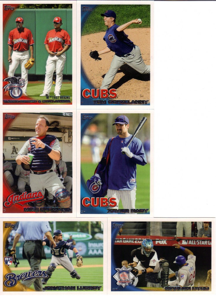
The picture selection, however, isn’t as great. Honestly, I attribute that to the All-Star and Home Run Derby cards that take up so very very much of the set. These are all cookie cutter photos from when the players took their first at bat or took the mound and they are as bland as bland can bland. I bet you want to see some bad pictures, don’t you? Well, who am I to deny my audience?
I didn’t know play at the plate shots could be so boring. I didn’t know umpire butt was an acceptable way to cover 1/3 of my card. I didn’t know Nady the hobo lost the bindle on the end of his bat. I didn’t know pointing was considered an action shot. I didn’t know Gorzelanny could look any more like Sloth than he already does. I didn’t know I was supposed to be excited about seeing two guys just stand and adjust their crotches.
Trust me, I could have selected many many more, but most of them would have been drab rather than outright terrible. Besides, you’ve suffered enough for one day.
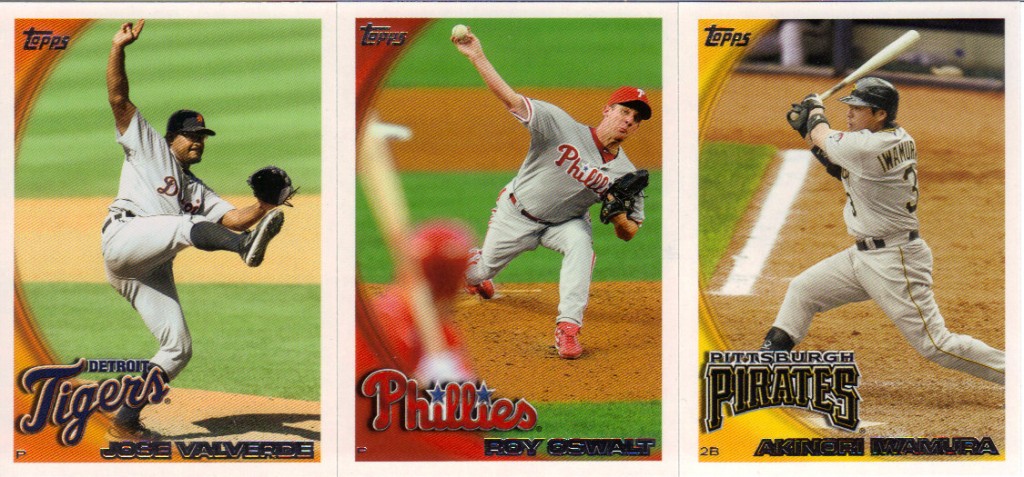
This is about as far as it goes when we’re talking about good looking vertically oriented cards. The Iwamura is iffy, but I like the perspective with the chalk. The Oswalt depth of field trick will always help. The Valverde is great because it personifies him as a pitcher just about as well as you can in still frame. So, while the vertical cards aren’t helping its case, the horizontal cards once again the best photo prizes once again.
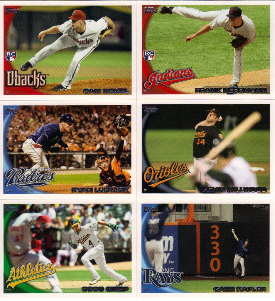
I love the framing on those top two. It’s like their scrunching their bodies specifically to stay in the boundaries. I know the Millwood is basically Oswalt on it’s side, but it still works for me. The Ludwick is fascinating, because you have the dynamic arm guestures on both sides, and you have the sea of orange and black in the background to add weight and anticipation to the moment. Having the umpire out of frame helps keep the suspense frozen. The Crisp is nice because you rarely get to see stealing cards from that perspective. The Kapler actually almost made it to the bad picture pile. I mean it might as well be a card for player “330.” But I enjoy seeing the relay in action, which is something not shown (or at least not obviously) often. And making the subject so tiny in the frame is unusual enough and eye-catching enough to make it good.
Inserts
In Update, we’re looking at more of the same, insert wise. There’s nothing here that you didn’t see before in a previous series (unless you’re counting the “More Tales of the Game”), which is a shame.
Sure, these 7 insert sets give you a lot of variety, but it’s all in the form of continuations. Where is this year’s version of a Propaganda insert? Couldn’t we have something new instead of more Vintage Legends, which still look like poo, or the More Tales cards which is really now just a collection of highlights rather than informing you of baseball lore? If we’re bringing back something, couldn’t we bring back 2020?
Simply put, these bore me. I’m bored now.
Hits
Each Jumbo box is guaranteed a manufactured bat barrel card, an all-star jersey relic and an auto. In the interest of length, I’ll just link to the post where I showed off the case hits previously. View at your leisure. Those bat barrel cards look great. I know it’s not a real bat, but the fake stuff is detailed, the design surrounding the giant window is simple and elegant, the engraved signature and team name adds a nice level of depth to it. All around, I’m a fan. They are very tough to store, however. I found the best way is to get a 15 ct snap case, because they are bigger than the biggest available toploader. There’s honestly no reason to make a manufactured card that is that ridiculously thick. If it was a real bat, I’d let it slide, but since it’s not, points will be deducted for making collectors run out special to get storage supplies and hope they got it right.
The sticker autos on the Peak (or Peek, if it’s a rookie) Performance are just as mundane as they were in Series 2.
The All-Star relics have potential to look okay, but something about them is off. Maybe it’s the blue spirograph picture behind their heads. Maybe it’s the blue contrasting with the red and orange. Maybe it’s the plain red and blue swatches in an odd window. I’m not won over.
Conclusion
Update series redeemed Topps slightly for the complete travesty that was series 2. Unfortunately, because it is essentially series 3, there’s just too much of the same going on here to get anyone excited. Aside from the Bat Barrel cards, which some of you will hate for the simple fact that they are manufactured and count as hits, the product offers up little that’s new or fresh or exciting. The novelties of the year have worn off. It’s time to turn the page and get ready for next year.
Design – ***
Set Collecting – ***
Inserts – *
Hits – ***
Overall – *** out of 5


Recent Comments