We never did a formal review for series 1, so this one is going to be double-y review-y. And a little behind the times.
Main Set/Quality Control
I had to modify the header of this section because quality control is such a key problem. If you suffered through our video box break, you saw how bad some of those cards looked. If not, here’s a sampling.
I left the cover of the scanner up as to accentuate where the cards actually begin and end. As you can see, this is nothing short of piss poor. Both of our boxes had this problem with miscut cards, and not too surprisingly, they occurred on the same cards. I can’t imagine this is an issue across the entire production run, we just got the short end. And, something tells me this “variation” isn’t going to equal the appeal of this, and so I am nothing if not ticked off.
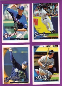
But it’s not just the PSA 1 centering that factors into the quality control problem. We must also consider the photos. I’m not talking about the photo selection (yet, hold on – I’ll get there), but rather the quality of the images from a technical standpoint. I don’t know what they did between series 1 and 2, but this set looks terrible. The colors are extremely over-saturated, the photos occasionally look grainy, and details get washed out in the process. Here’s how bad it gets sometimes.
Oh, and sometimes the foil completely overruns the names making it a big ol’ silver blob of yuck™.
They’re not all bad. Don’t believe me? I’ll prove it!
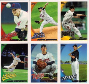
I will say that it took some doing and digging to find some decent looking pictures in this set. Chances are if you see one shot, you’ll see it several more times. Every once in a while, though, you get one that catches your eye like what you see above. The perfect positioning of the ball, the retro cap, and the depth of field on the Aaron Laffey; the canted angle on the Santana; LaRoche playing off the swoop in the design; Kooz throwing from his knees in a dramatic action shot; and the rookies. Why did I pick the rookies? Well, because I think this is a great way to feature guys with no real in-game action. The poses aren’t amazing, but they’re still well-constructed, and again it creates some separation from the standard photos you find elsewhere in abundance.
Why didn’t Topps just make a set of horizontal cards this time? They’re obviously better in every way. I don’t have to explain any of these to you. You can see it for yourselves. These cards are exciting and dynamic and more of these would certainly encourage set building. Alas.
Inserts
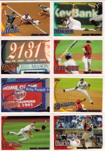
There’s no shortage of inserts here, as you know. There are retail specific ones as well, but those aren’t anything we haven’t seen in Series 1 already. Gone are the When They Were Young, Tales of the Game, History of the Game and Toppstown. In are the Team 2020, History of the World Series, Vintage Legends and Topps Attax codes. Staying are Turkey Reds, Peak Performance, Legendary Lineage, and Cards Your Mother Threw Away. Guh.
Focusing on the new stuff, I will say that I was fooled by the Vintage Legends (Honus in the middle). I originally thought they were part of the CYMTO set. Good one Topps. April 1st was a couple months back, guy. I kind of like them, but the more I think about them, the less I do. Seeing classic players on junk wax sounds like an interesting novelty, but isn’t that kind of what we’re seeing now in the base set SPs?
History of the World Series can be gone. Especially when they have two or three cards from the same year in there. Topps Attax serve no purpose and the fact that they aren’t numbered as part of a set (it could go on the front if you want to keep the back intact for gaming purposes) gets my goat. Wait, I’m a Cubs fan. Probably shouldn’t say goat. Oh well.
Topps 2020 I love (Braun – middle left). I loved Sportflics as a child and I loved Team 2000 in Pinnacle. This is the perfect combination of both! You can also add the extra thought of everything old is new again, if they’re claiming that 2020 cards are going to look like 80s novelties. That’s assuming you want to give Topps credit for going that extra mile in the thought process. I’m not, but will still gladly take lenticulars in my packs any day.
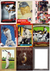
Other inserts you’ll find are blank sketch cards you can use to possibly get placed in a future Topps Set (I’m sure you’ll all love mine once I figure out my subject), Red Hot Rookie Redemptions (although I guess you could potentially call these hits, too. We got #3 and #5. Fingers crossed for Castro!), and the assorted parallels of the base set which we’re all pretty much sick of at this point (right?)
Hits
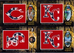
Each jumbo box is supposed to come with 2 relics (1 hat patch and one game used) and an auto. I guess Topps was trying to make it up to us with the miscut BS, because we each got 2 hat patches in our boxes. Both times they were back to back in the same pack, Jack. Unfortunately, they weren’t of very good players.
I don’t know if they’ll catch on like Series 1, but I still like the look of these. Sure, they’re gaudy and maybe some would call them tacky, but that injection of color on the neutral cards just works for me. I don’t envy anyone who tries to collect the set as there are a butt-load in this checklist.
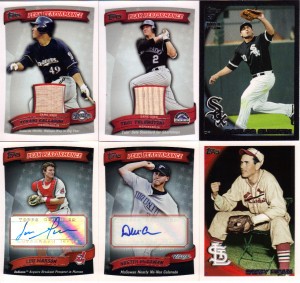
Here are the other pulls. A couple of, hopefully, rising star autos, a pitcher batting (!), a relic of a recently injured semi-star, one of them SPs everyone’s so wild about (except for those that blog), and my very first black border. Too bad it’s someone on the wrong side of town, and a guy who’s been battling injuries and a slump.
I would love to see a different design for the autos and relics. Peak performance is just way too prevalent in this set, to the point that it almost feels like they’re getting ready for a spin off product. They are far too generic to look nice, and it’s almost a nuisance to find one in a pack (hit or non-hit). Oh, and there’s quality control issues on the Gallardo bat piece, too. It’s not quite fully in the window there.
Conclusion
So, that’s a whole lot of long-winded talking when pretty much everyone knows what to expect from this set. I would hope the QC issues we saw are not going to be a widespread problem, but even without that factor, the set simply isn’t visually interesting enough to collect. It does gain some points for not having 50 SPs as part of the base set, however. Some of the inserts are good, but the only one worthwhile that’s new is the 2020. Between that and the poor checklist on the hits, I can’t see much reason to open nearly as much of it as we did. At least you get a code card in every pack of the jumbos, right? That’s 10 chances to complete your set with the 661 Strasburg!
Design – ***
Set Collecting – ***
Inserts – **
Hits – *
Overall – ** out of 5


I’m right there with you on this series. Serious Quality control issues. Maybe this is another Topps retro set. Harkening back to the 70’s and 80’s were miscut and wax stains prevailed!! I also agree I don’t know why topps just doens’t put out a horizontal oriented set. I like the wide view and it seems like you get better action shots. As for the hits. Meh. Sticker autos of players no one cares about, relics from players no one cares about. I guess this is what we get when theres only one card company to choose from.
The Conor Jackson is the best card in the set.
I got a Austin Jackson, Phil Coke, and Curtis Granderson Tigers card, but Phil Coke and Austin Jackson were traded for Curtis Granderson. About 1/5 of all the cards have the wrong team, I have 2 Rangers team cards with different pictures and I am missing a Rays Team card… I bought The 2010 Series 1 & 2 Complete Set. I will be returning it, Hideki Matsui is not a Yankee anymore, Vlad Guerrero is not an Angel anymore… but according to Topps Matsui is a Yankee, and Vlad is an Angel. That happened a lot with free agents that signed in the offseason.
[…] offering from Topps will bear many similarities to Jon’s now-classic (3 comments = classic) 2010 Topps Baseball Review from earlier this year because, as has been pointed out by other blogs and industry sources, this […]
[…] Topps Update Baseball Review By Jon Main Set When comparing Topps Update to Topps Series 2, it’s clear as cream that improvements have been made. There were no drastically miscut […]