I recently updated my want lists for the first time in 5 months. It was both a cathartic and discouraging process.
Cathartic because I truly enjoy making and compiling my checklists. I’ve always liked making lists. By no means am I an organized person, but organizing things and hobbies into lists or sorting things hits that little synapse.
Discouraging because month by month, and lately week by week, I find myself adding a ridiculous amount of new cards to the bottom and highlighting virtually none. The scariest is that my Starlin Castro need list jumped nearly 100 cards in these 5 months.
It’s not all bad news, however. There are many reasons to celebrate that want list page and many are due in large part to Lonestarr from Life and Baseball Cards (also known on twitter as TwitchWasHere).
I had to go back and find the original tweet, but after sorting through the package you’re about to see (in full!), I found myself 3 cards away from 1,000 unique Greg Maddux cards, 1 away from 400 different Frank Thomas cards (although there were none in this particular trade), 10 Kerry Wood cards away from 200 — all of which have since been surpassed — and I had finally crossed the 250 mark for Tony Gwynn and passed 100 Ryan Dempster cards in my growing collection.
I’m nowhere close to having shown them all, but how about we work on at least showing the cards that led to those fantastic milestones?
Say Whaaaa?
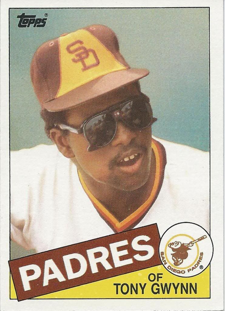
First up is a card that will be staying in the front of the binder for quite some time. This 1985 came dangerously close to being the oldest Gwynn card in my collection. Always great to add a card from before I started collecting.
Looks like a movie strip.
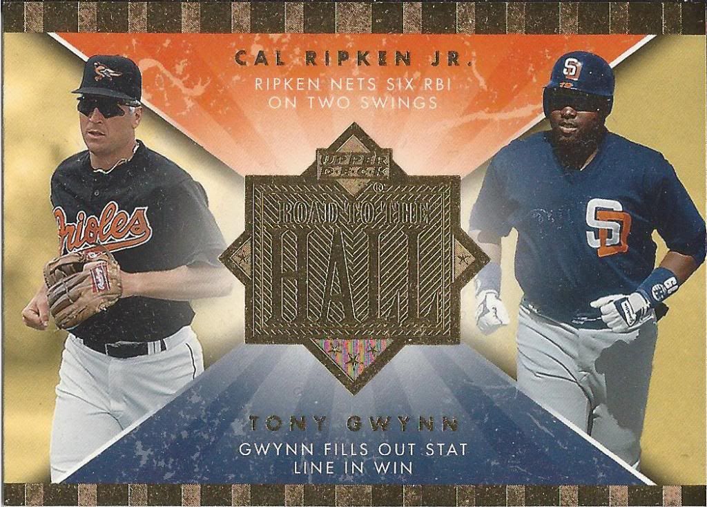
Probably the toughest part of collecting Tony is his understandable connection to Cal Ripken Jr. Take these Road to the Hall inserts for example. Not only do I still have 49 more to go to complete the set. 49!!!!!! But I also will have to pry some of them away from diehard, tenacious Cal-lectors (coining the term now).
Everyone loves a good shiny
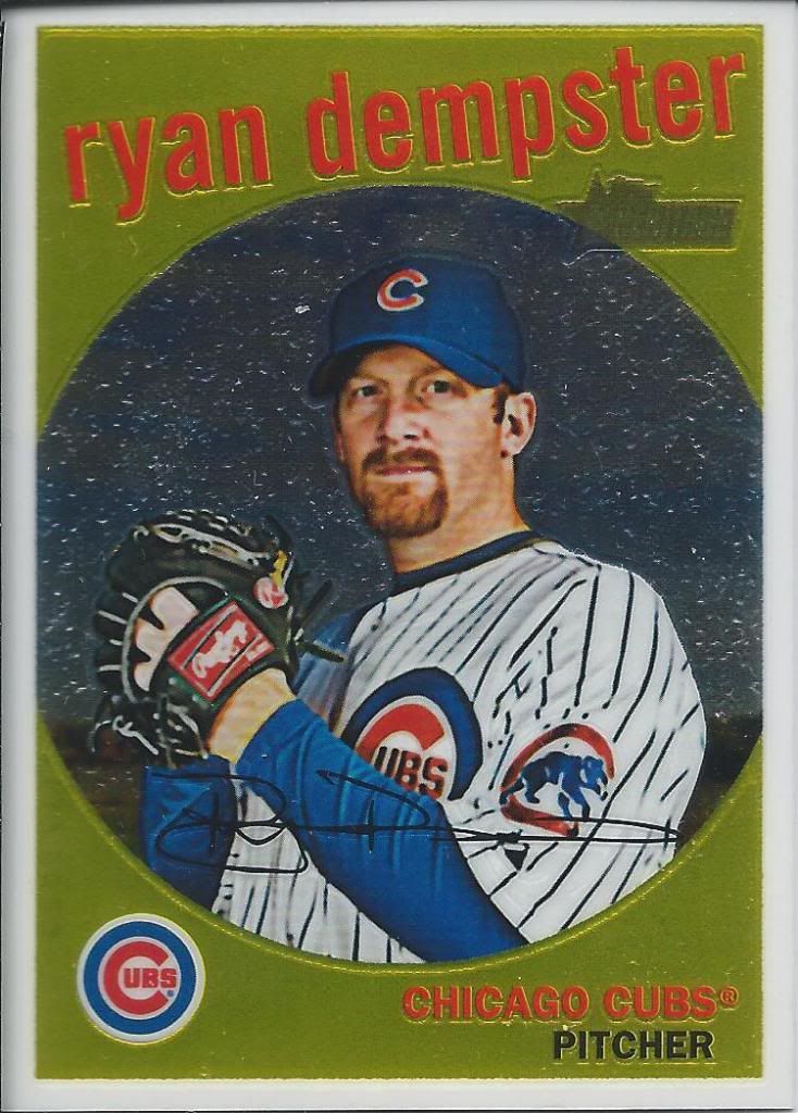
On to some of the hunnerd Dempsters. I keep expecting to see Ryan’s name on the list of Heritage Chrome subjects, but despite his solid performances, he hasn’t made the cut since 2010. I’m sure there are plenty of scrubs that could have been dropped. Still, kind of happy I don’t have to worry about it.
Radmse Yneptr
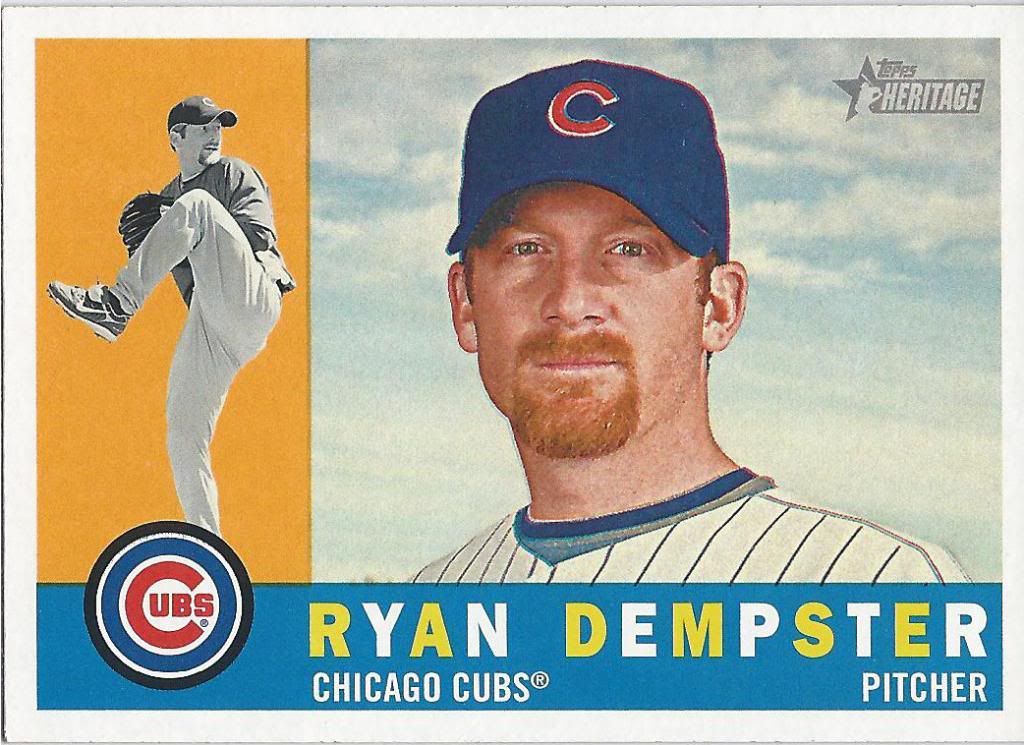
This here is a SP. It seems I have to chase at least one of these suckers every year for Heritage. I guess that’s to be expected when nearly 1/5th of the set is comprised of SP cards. So dumb.
I get why this didn't take off
I’ll never understand the Icons name. It’s a moniker best reserved for a Hall of Fame or vintage-centric set. From the backdrop, it’s possibly trying to be the cousin of Baseball Heroes, but without all those nasty variations.
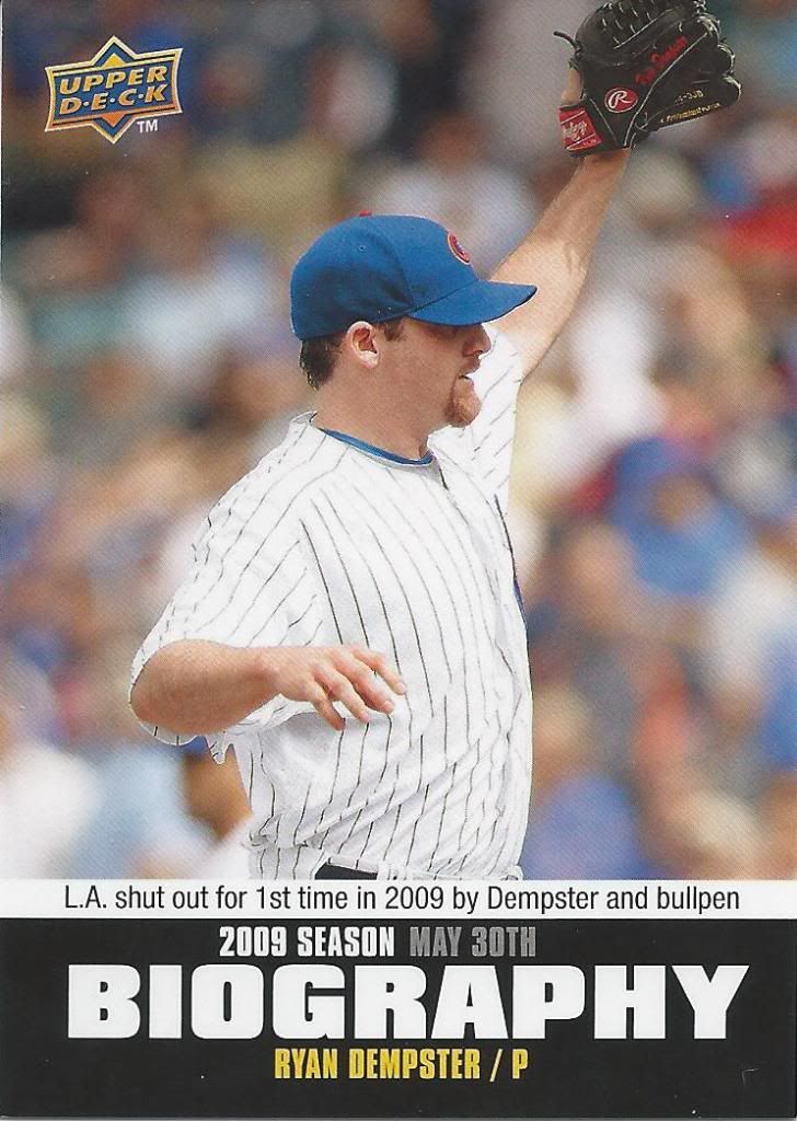
Not sure I understand the insert set, but I'll take it.
I wonder if people would be open to me including a box of 2010 Upper Deck in my next group break. I get the impression some of those hobby boxes are hiding some unexpected goodies that most of us haven’t seen.
Of course, this is coming from the same mind that would want to do a case of UD Documentary as a group break if I could find it cheap enough. I think that could be surprisingly worthwhile with the autos. A discussion for another time, I guess.
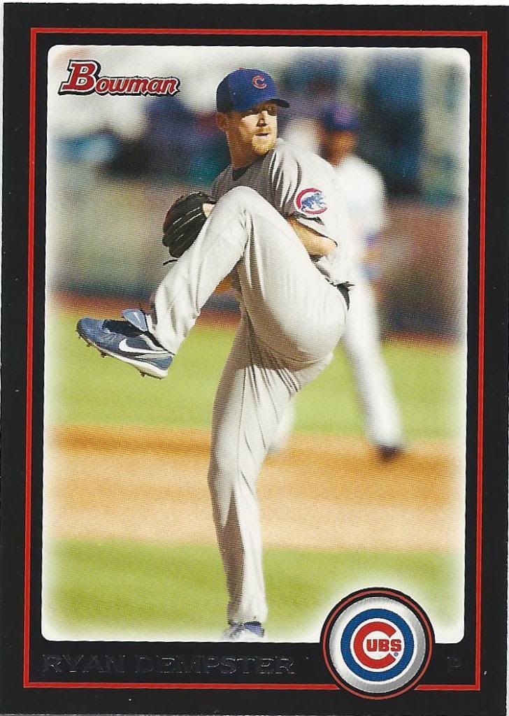
Bowman is so confusing
You know what’s strange This Bowman card features a different picture than his chrome cards from the same year. Anyone have an idea if this is something they did for other players? I know the autograph subjects understandably would have different pictures for those versions, but it seems odd to switch out the photo for something like this.
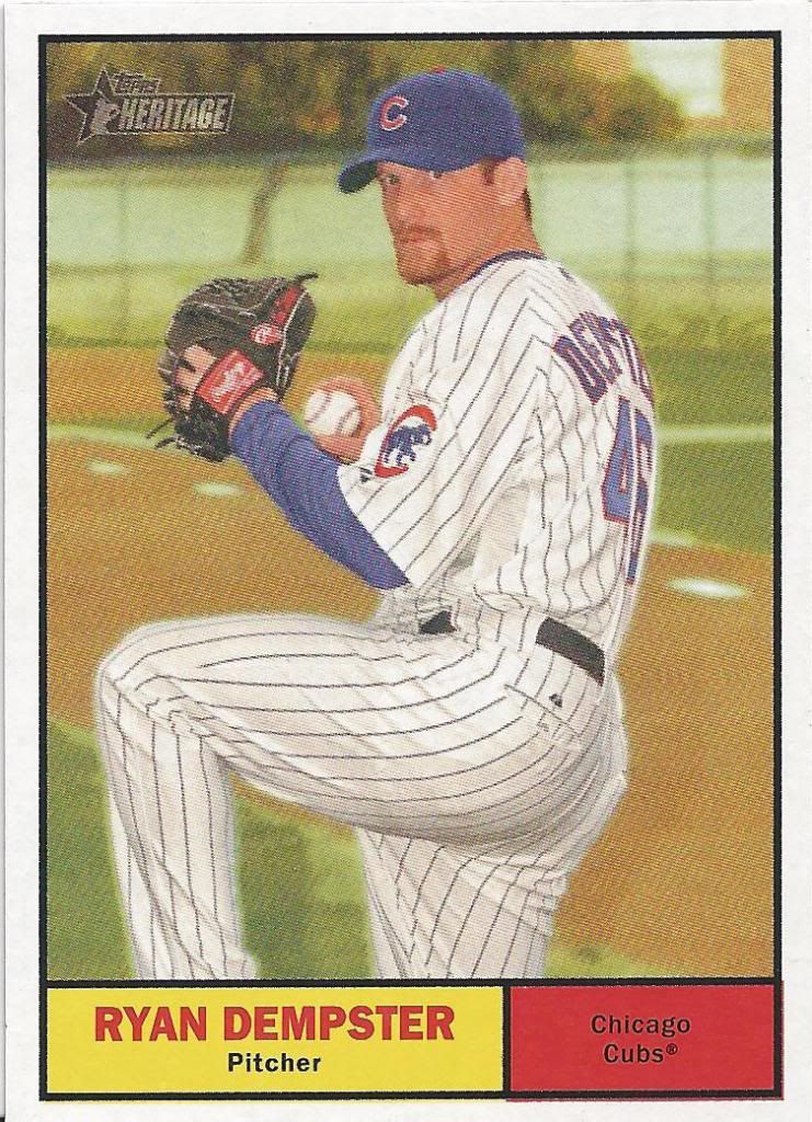
That's a heckuva a lot of bases back there
I don’t know why, but Dempster has a lot of cards featuring Spring Training settings. I should calculate a percentage one of these days. Maybe set up a contest to see if anyone has him beat.
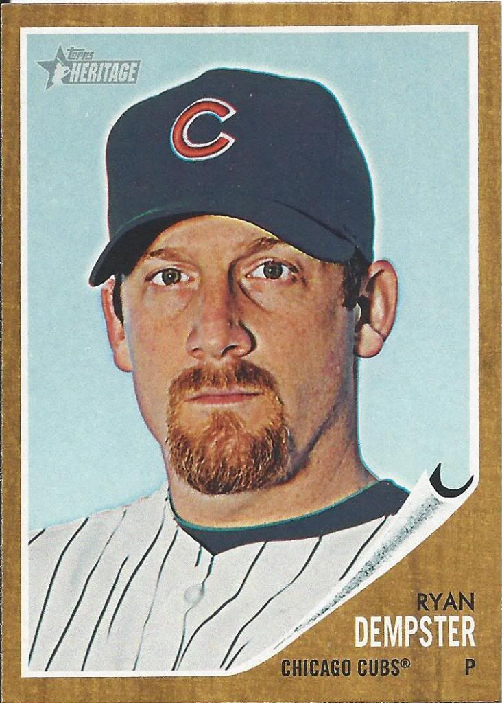
uhh...your card is peeling
Oddly, I have the Green and Red Tint versions of this card, but never had the regular until now. I’m still missing the Blue Tint, which is quite difficult to distinguish with this picture as you might imagine. Probably will find one hiding in a dime box one day, just like I hope to find the 2010 Abe variant.
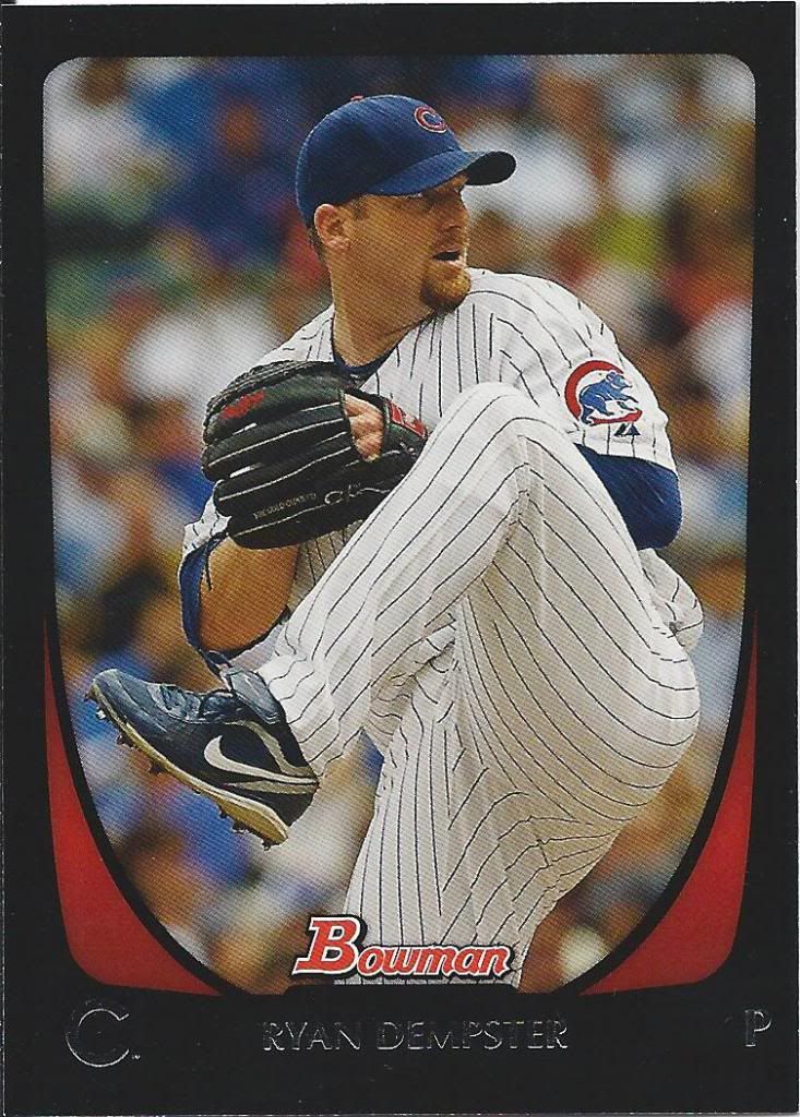
Cryan Dempsterp
See, now this picture is the same as the chrome versions. I know, because virtually the only Bowman I have for any player is some of the rarer refractors bought on the cheap.
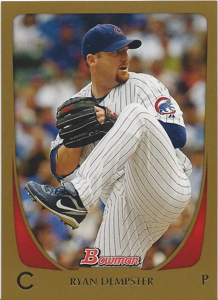
Gold Cryan
But thanks to great traders like Lonestarr here, I now also have some of the “paper” Bowmans like this sweet gold parallel. These look nice. Maybe they should try a non-black, colored border for the main set sometime.
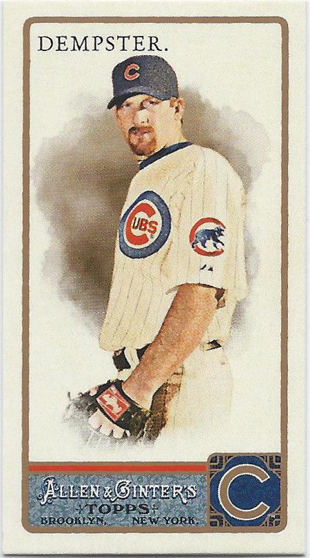
period.
I’ve been out of the game longer than I realized. I thought this was a 2012 card. It’s not that I was confusing the design, but rather that I couldn’t imagine that there could possibly be 2 (now 3) years worth of Ginter I never really purchased. So many minis.
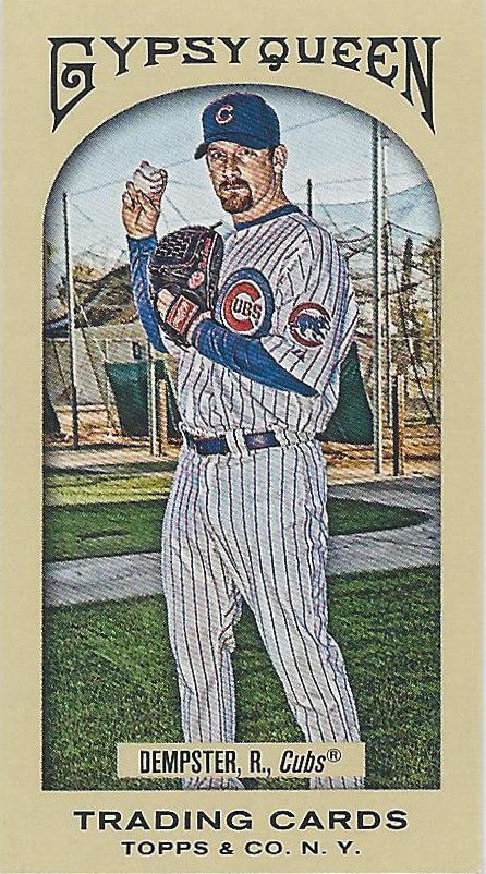
Initial, Period.
Speaking of minis…. Oh, Gypsy Queen. Ginter Redux. I’ll accept any and all minis, because they multiply faster than freakin’ rabbits. I’m bound to need 30 more next week even without any sort of new release.
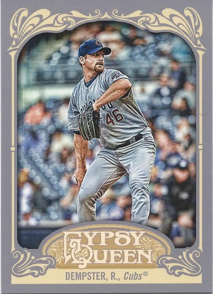
A biggin'
So, general consensus is that the beige border is better than the gray, right? If so, then I disagree! That that, opinions!
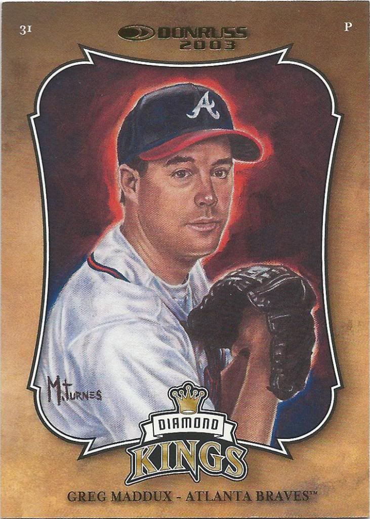
Fire head Greg
Man, Donruss milked the Diamond King name for all it was worth, didn’t they? It got to the point where you couldn’t distinguish one from the next. I think this is an insert of some kind. I do know that it is numbered out of 2500, and that’s pretty damn cool.
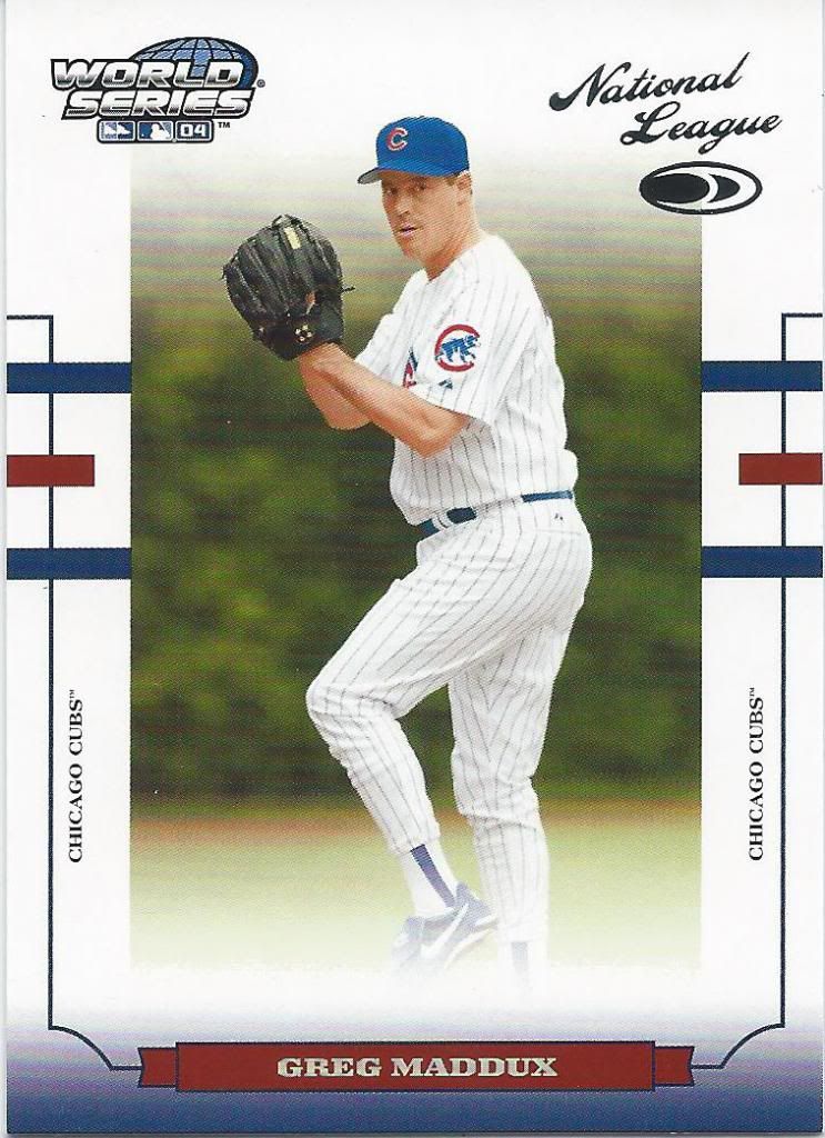
I don't want to talk about it
Alright, this is just cruel. You don’t put the words World Series on a Cubs card. Especially in 2004.
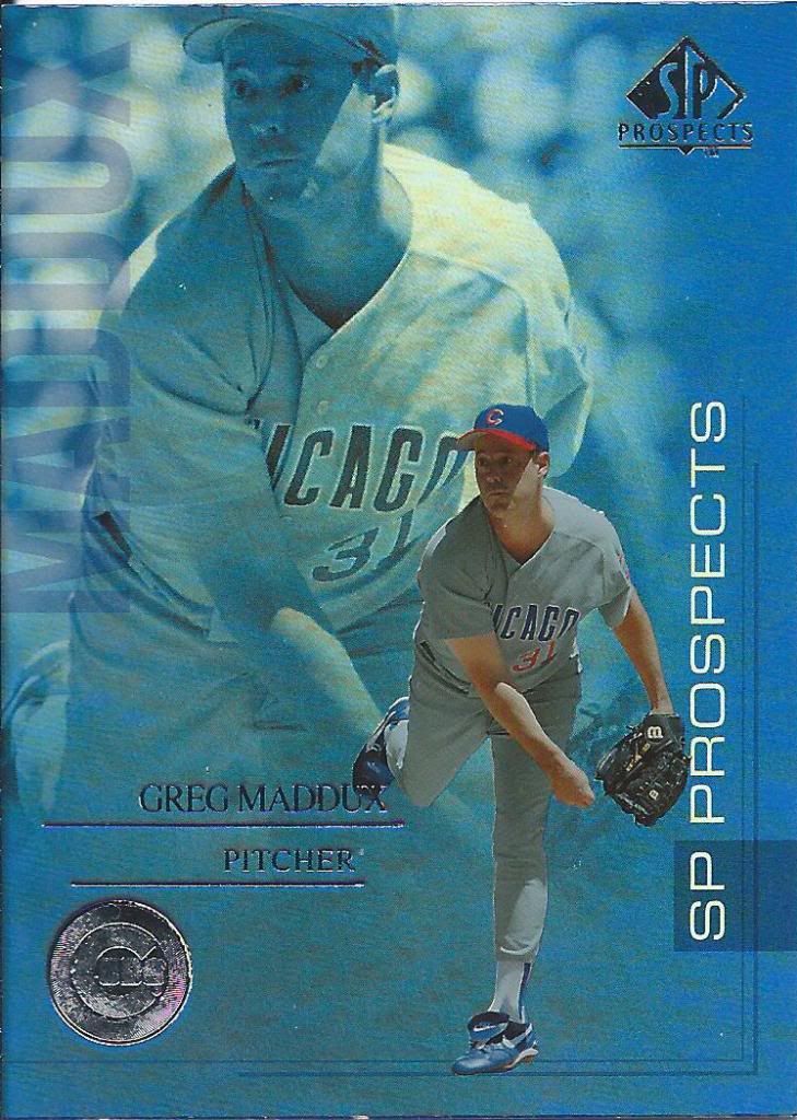
Shiny and blue: perfect for a Cubs card
I’ve probably used this joke before but… I think this kid is going to make it. Hey, after hundreds of cards, you’re bound to repeat some things.
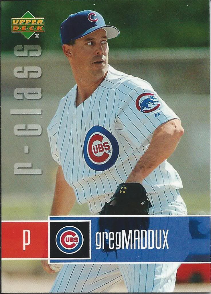
Don't know why I noticed, but that is some beastly arm hair
Okay, what the hell is r-class? Is that for Rookie class? I’ll assume it’s another way to pump a product full of rookies and prospects that already failed. How close am I? I’m close. I’m close, right?
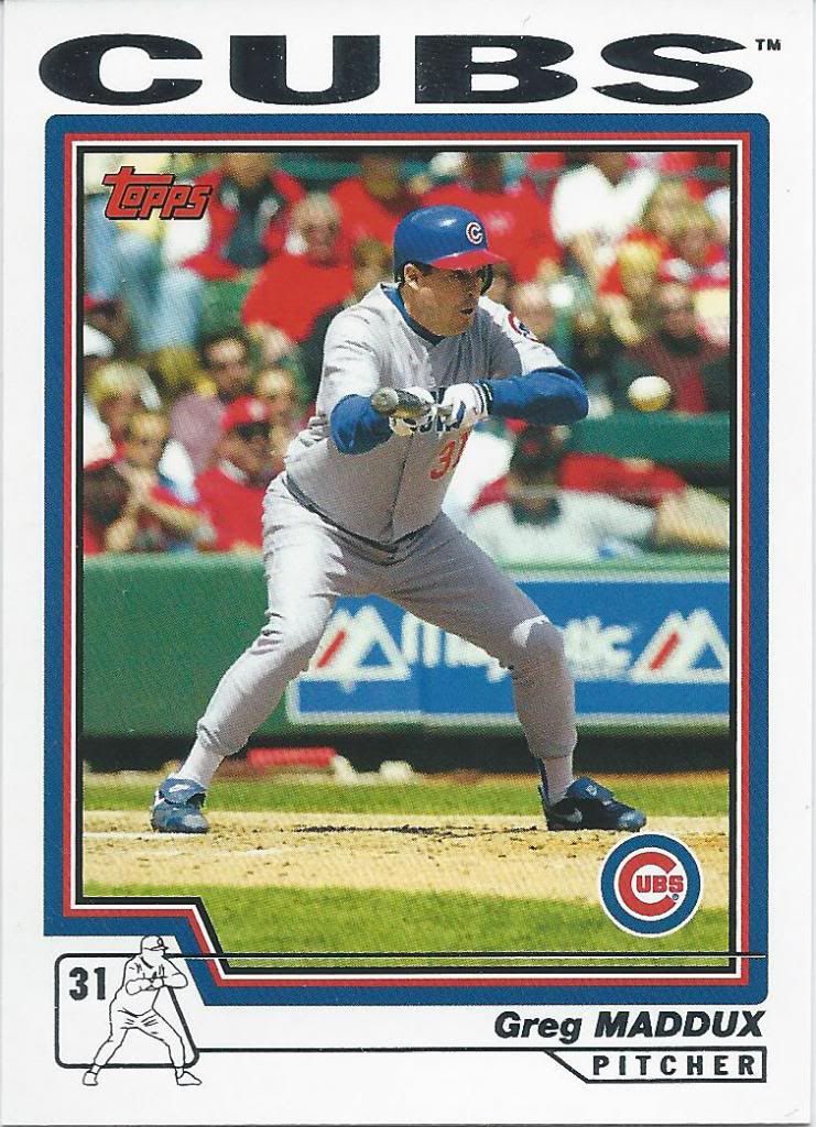
"Ooh shit! Muther Bunter!"
Action packed! Mini mascot man in action! All the excitement of bunting, with 30 times the fear. If this were a card of me facing an 80-90 mph baseball, then I would totally understand that face. Man, maybe someday if I ever have ambition I should recreate some baseball card pictures for a post.
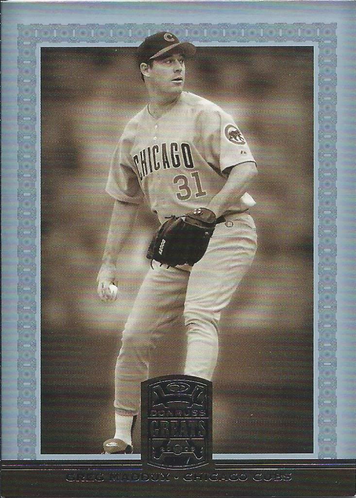
Another card for me? Great!
Let’s add another thing to the list of things I should do. I should make a list of products that feature Greg Maddux as a Cub and a Brave in the same series. There are more of them than you might think. This, being one of them.
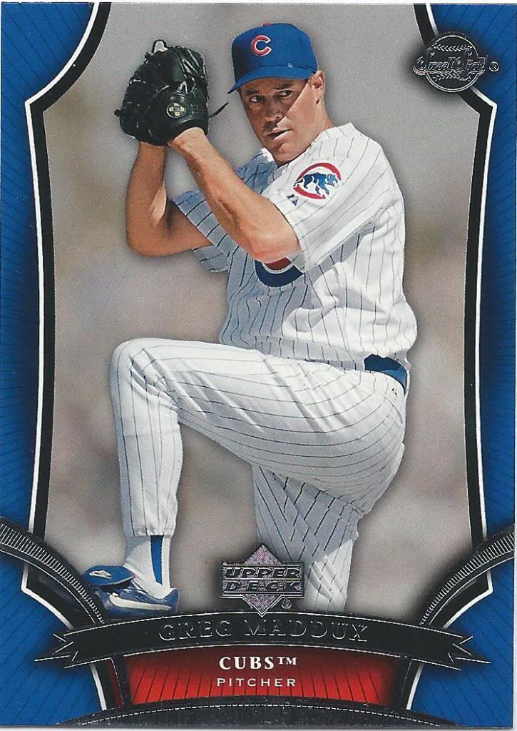
Another card for me? Sweet!
See, this just makes me want to bust another box of Sweet Spot. That was fun. People forget about the base cards, but they ain’t half bad most of the time either.
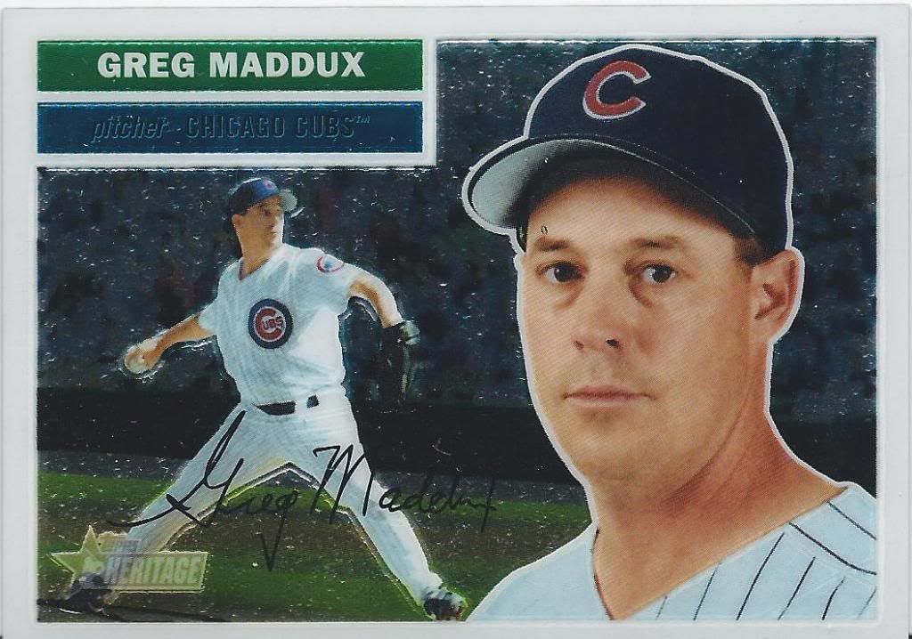
Psst, there's something on your eyebrow
Are you keeping count? Here’s numbered card number three, this time in the form of an older Heritage Chrome. Even though there are about 2,000 of these made each year, and that’s not exactly a small number in the world of cards anymore, it still feels special to find one in a package.
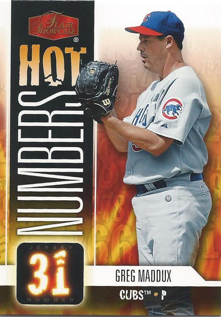
Don't forget to dot the "1." Twice.
Woah now. I don’t know, guys. I think these numbers are just a little too hot for me. I mean, look at how it glows. It’s obviously going to burn. I mean, how else could you explain the word “Hot” made out of…paper? I don’t know. Not fire.
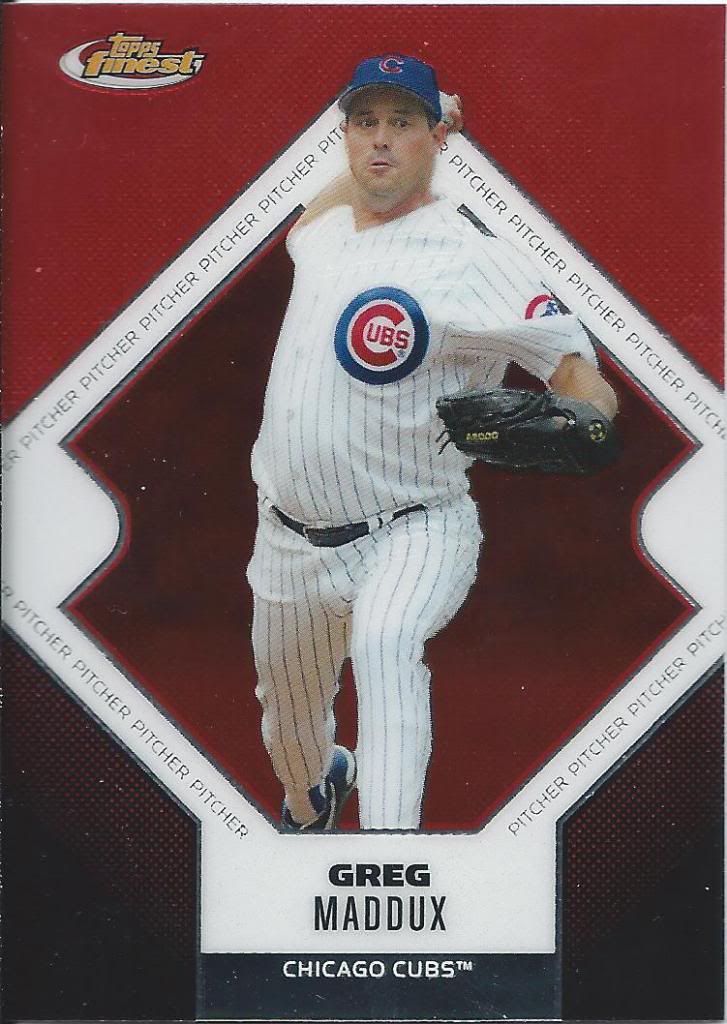
I guess that counts as a mound?
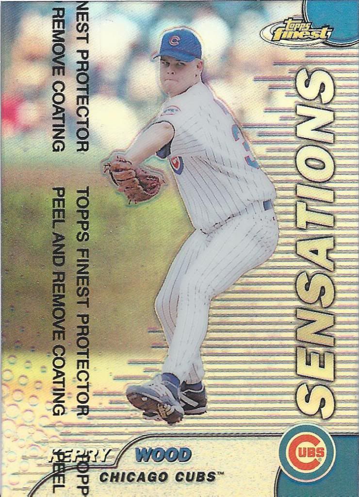
Yay! Finest. It’s the…well, it’s pretty good. Except for the countless variations to chase. That part is the opposite of fine. Unfine. Running out of words here. This post is long.
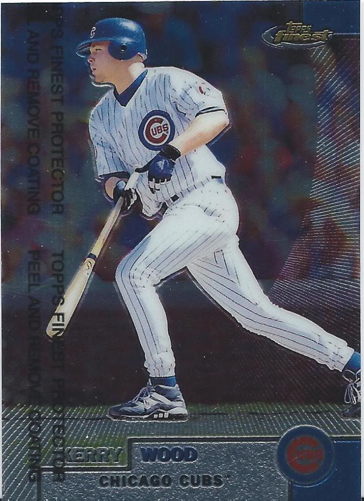
Pitcher batting!!!
Okay, we’re in the home stretch. We’ve seen a whole lot of cool stuff so far, but it’s going to get better.
Look, more Finest! Is this the only year of Finest that had photo backgrounds and not some random metallic geometric design? Maybe. Maybe not, but I like the ray effect.
Batter Pitching!!!
Second question. Is this the first and/or only year of Finest that had subsets? Actually, I already know the answer. Scroll down even more to my 1996 Finest breaks and we can see for sure. Hell if I care, because this puppy is a refractor! I know they’re everywhere these days and come in 45 different colors per set. This is from a simpler time where there were only regular and gold…except for the Team Finest which had three color variations. Ah, dammit.
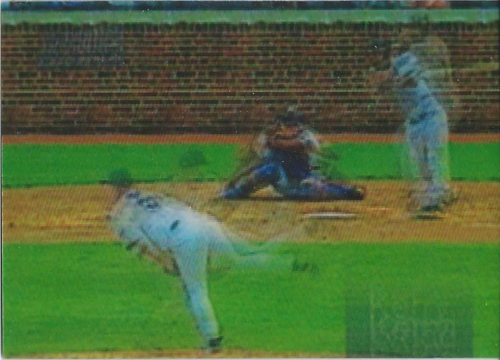
I bet you can't guess what game this is from
I swear this isn’t a terrible picture of a tv screen. It’s several terrible pictures of a tv screen placed into a lenticular system and scanned in an incomprehensible manner. Oh, but since you can’t tell, this is a sweet Stadium Club Video Replay insert.
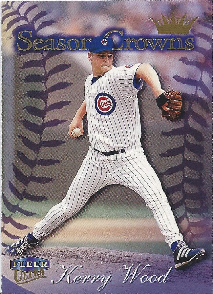
Not a Sweet Spot Card
You all know by now that I love me some Ultra inserts, but don’t you think they should have tried to find a way to put the Crown on his head? Or over one of the capital letters?
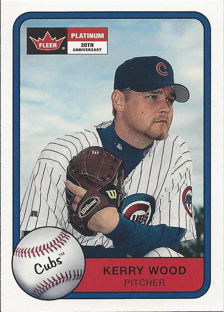
Can't get much more Platinum
Hey, I remember opening a box of this. How did Kerry elude my grasp? No more, Mr. Wood. No more.
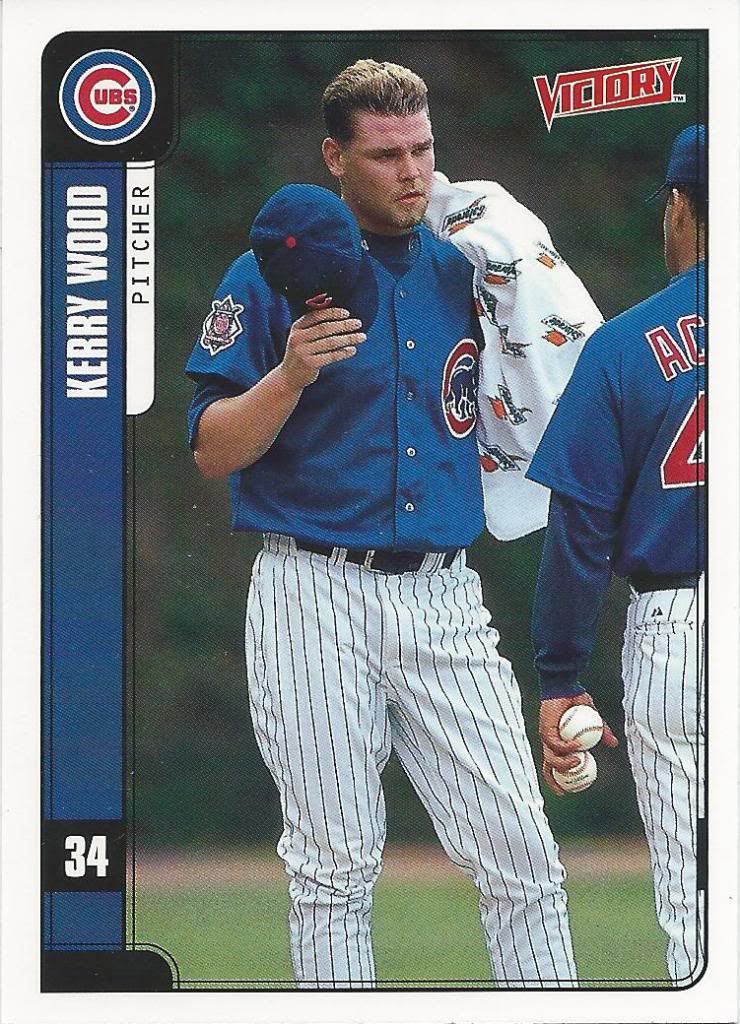
That's not Victory
Oh no.
No No NO! NONONONONO!
Everybody knows that towels and Cubs pitchers don’t mix.
….how dare you, Upper Deck.
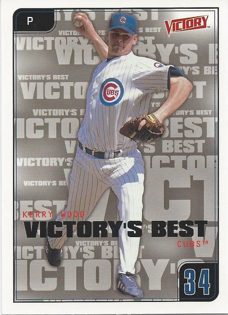
Covering up that Zack Morris frosted hair
Man, I wonder what this subset is called. If only there was a way to tell.
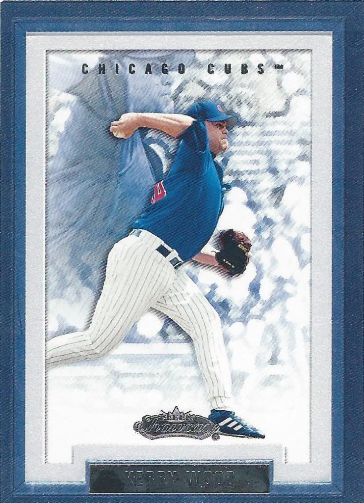
Sometimes the dual picture doesn't work
Yep. That’s it. Reach back and summon the power of your own ghostly armpit. Pretty sure that’s how Cy Young did it, too.
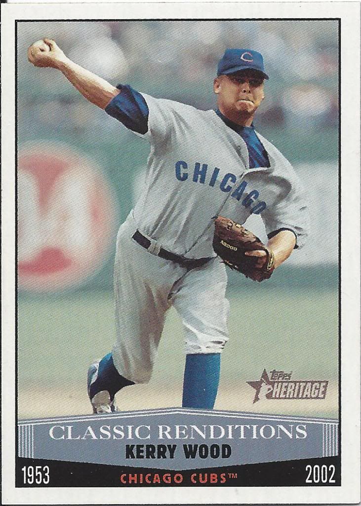
Render me impressed
Wow, I didn’t realize Heritage had an insert set that was eventually dropped. I like it. Sure, it may not be the most detailed art card, but it doesn’t have to be. It looks like Kerry Wood and not some mutated monster blob.
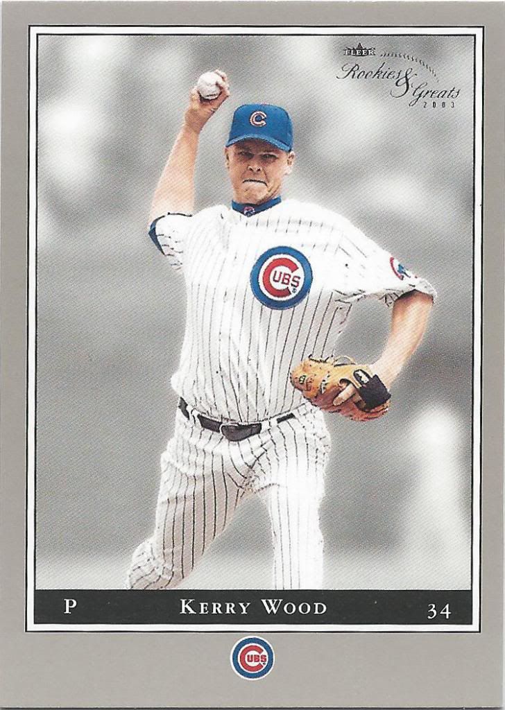
Not quite the same appeal as early Leaf
Boy, that’s a lot of bottom border for such a little logo. That’s a lot of gray. Yep. A whole lotta gray. Great, or Rookie move? You be the judg–it’s a rookie move.
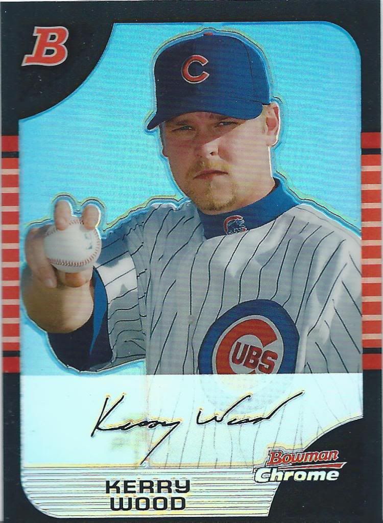
I'm squinting from the light in my eyes, too
Oh yeah. Another refractor. It’s raining shiny over here.
I told you this was a massive trade. Maybe I didn’t. Either way, we’re STILL not at the best part.

'Round the horn
And back to the world of the minis, if ever so briefly. I know it doesn’t look much smaller in the scan, and it doesn’t in person either. But, it is also die cut in the top right corner. That’s the real appeal. That tiny missing corner makes all the difference.
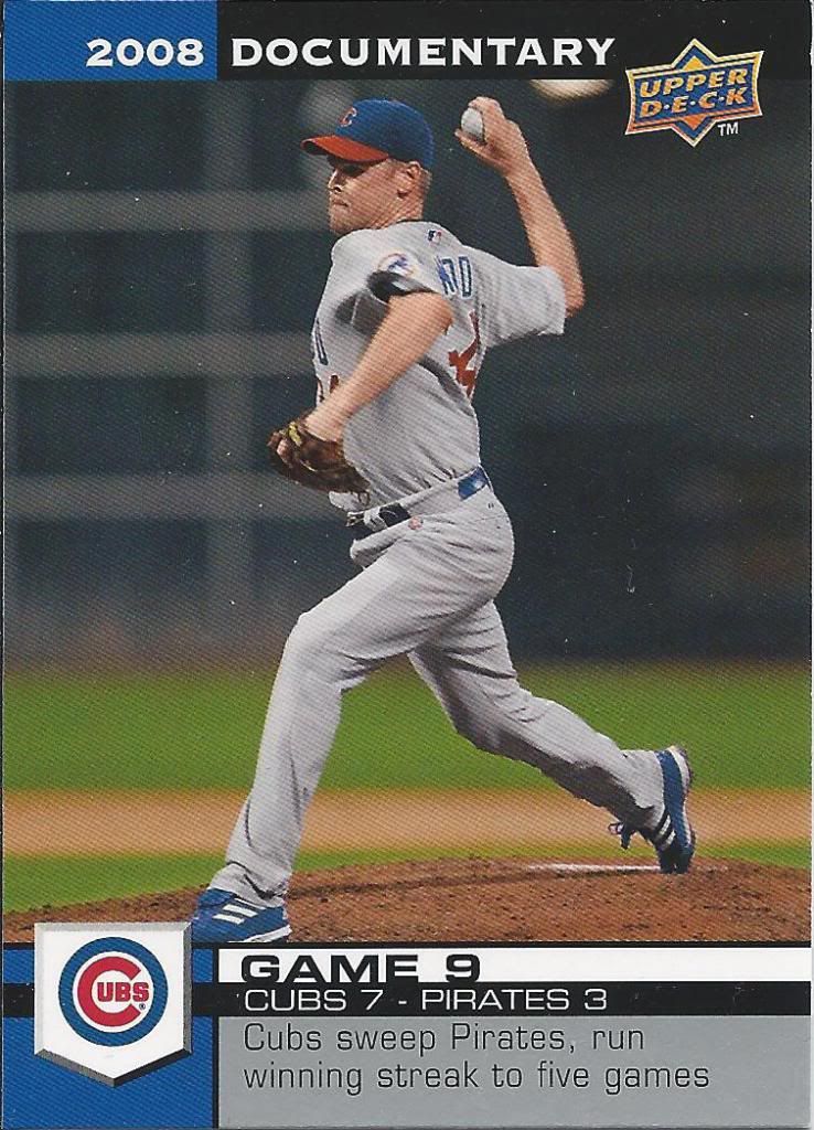
over .500...those were the days
See, this package has a little of everything. I didn’t hear any takers on the idea of a Documentary group break. Those that made it this far, what do you think about the possibility in the future?
Hey, look! The Cubs won this game. I think we should see quite a few more of these, because this is before the Cubs started to suck again.
Cubs card record: 1-2
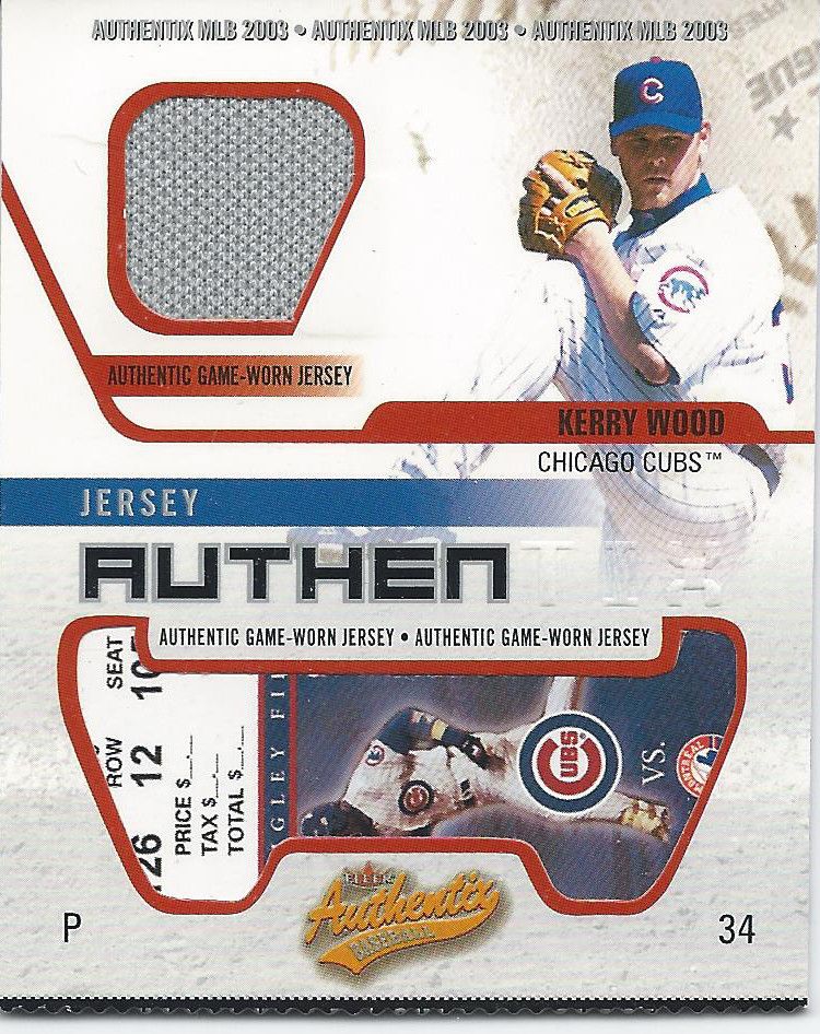
Hey kids, remember the Expos? It cost $__.__ to see them play
Last three and they are doozies. Doozys? Zoodies? Like this one! It’s an authentic non-authentic authentix jersey with a fake tick inside and a fake rip on the bottom. Authentix was a cool brand and I love the way they do their relic cards.
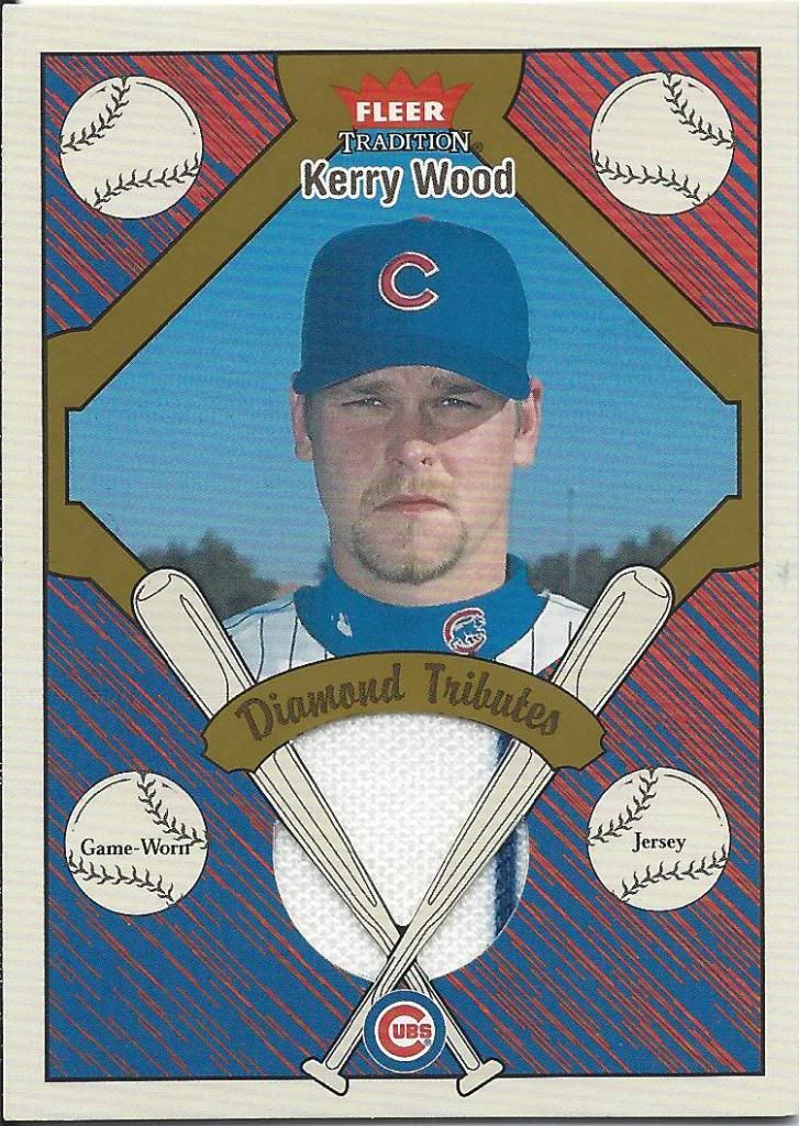
Could have made better use of those top balls
Another Fleer hit and this one I find quite interesting. They make you think it’ll be your standard circle swatch cut out, but then Bam! Weird Triangle Top. Maybe it’s supposed to be the diamond in the Diamond Tribute? Also, a very funky baseball diamond framing the picture.
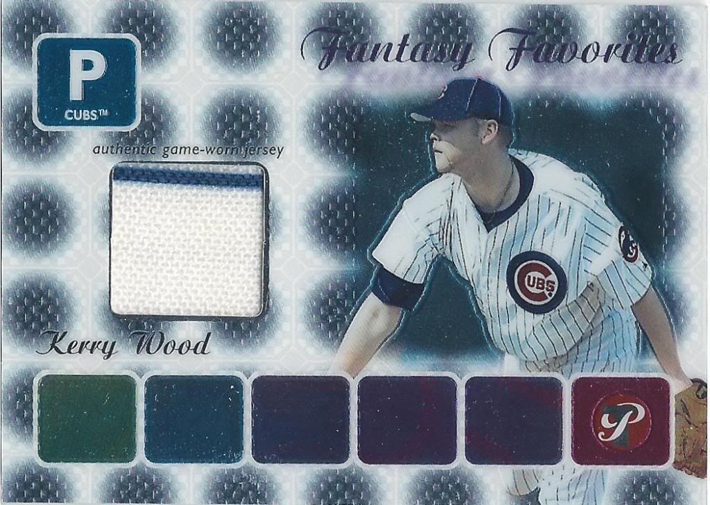
ROYGBIPristine
And last but certainly not least, we have a third jersey card! I told you this trade was massive and loaded, didn’t I? Yeah, probably a couple times. Pristine is one of those boxes on my wish list for a future group break. I really like the overall concept of the set and they look like really cool cards. Like this one. It’s a little busy, but still shiny and good. Very, very good.
Thank you very much to Lonestarr for the amazing trade. I honestly have no idea what I sent to him, but I can’t imagine I properly compensated him at all. The man may not blog a whole lot, but I believe he’s still active on twitter, so please give the guy a follow. You’ll be very glad you did.

Who, or what, photoshopped that Classic Renditions monstrosity?
[…] legendary dayf for the trade. This was all part of the small drive to get me past some of those collecting milestones I mentioned a few posts back. He put me over the edge on a couple marks and it’s much […]