
1998.
The Green Bay Packers fail to repeat as champions, losing to the Denver Broncos.
The Bulls once again beat the Utah Jazz in the NBA Finals to earn their 6th title in 8 years. The Jazz were the only team the Bulls faced twice in the finals during that run. Also, the Houston Comets repeat to win the second WNBA title in history over the Phoenix Mercury.
Curling debuts in Winter Olympics competition.
Tennis happened.
The Detroit Red Wings repeat as Stanley Cup champions (a lot of repeating this year) in another sweep, this time over the Washington Capitals.
The Yankees beat the Padres, denying Tony Gwynn his championship ring. Also, a young Kerry Wood would strike out 20 batters in a game and inspire 30,000 cards.
And in 1998, card manufacturers released 659 cards of Greg Maddux that I deemed worthy of my collecting efforts.
Thanks to the generosity of reader Jeremy, originally mentioned in our landmark 500th post (and in my 1993 Overload post, and 1994 post, and 1995 post, and 1996 post and 1997 post), I now have 40 more of those cards as I did before.
1998 Before Jeremy – 26/659 cards – 4%
1998 After Jeremy – 66/659 cards (including two upgrades) – 10%
1998 more than doubles the amount of cards to chase. 1997 had a smidgen less than 300 cards, and now look at what has become of this hobby.
Since Jeremy’s package, I’ve acquired 19 more 1998 cards, adding nearly 3% to the grand total, so there’s plenty of progress yet to be made. For now, let’s focus on what Jeremy sent.
Reminds me of the Arrested Development chicken dances
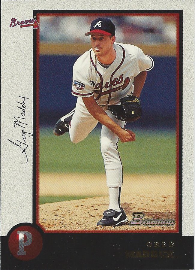
We go in alphabetical order, and so we’ll start off the year with a little Bowman. Bowman was light on the paper side, but will still present a challenge. Not as bad as Chrome, I’m sure.
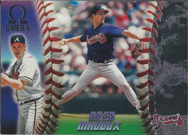
Baseball eyeball
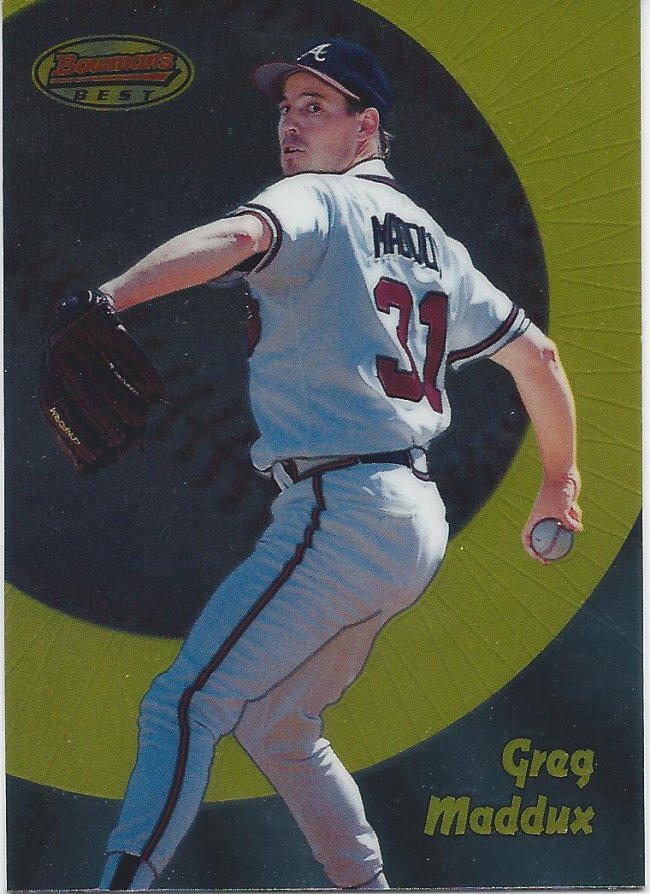
Although I think Best outdoes them both. The refractors are all really low numbered (especially for the time) and are actually worth something.
The nutty professor
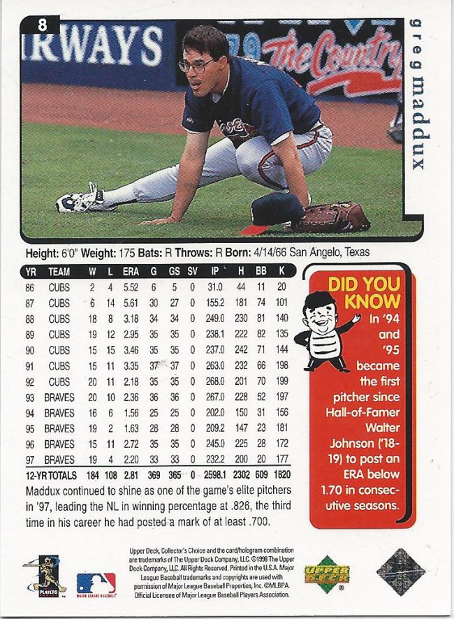
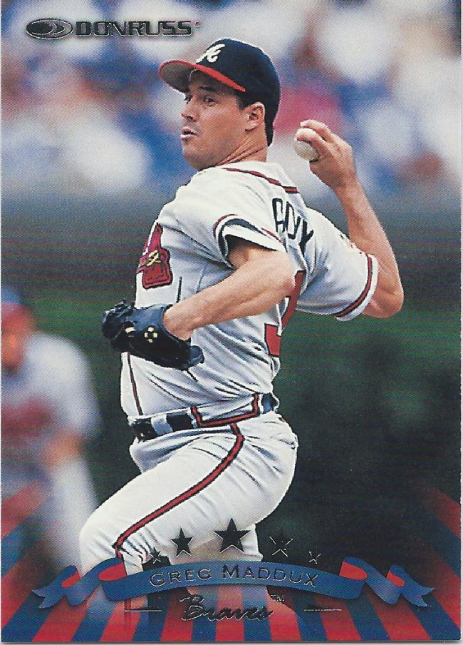
I’m showing the back of this card because it’s from the Brave’s team set. Besides, how can you not love that stretching picture?
Insert Walking Dead reference here
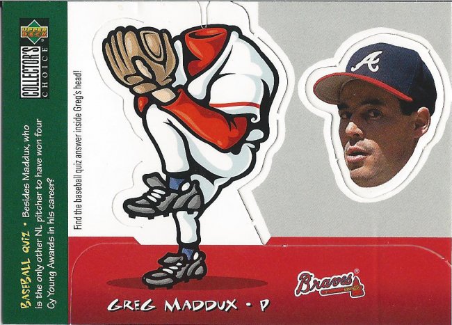
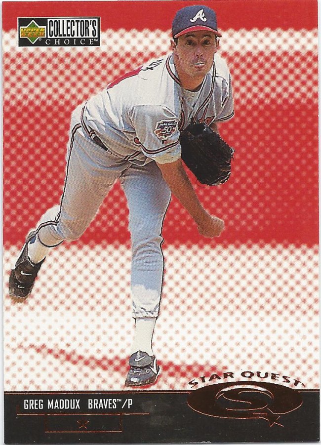
This is not from a team set. I loved Collector’s Choice because of stuff like this. Budget set with interesting and quirky inserts. I wouldn’t mind a double of this so I can put it together.
Ed McMahon hosts
However, StarQuest is a reason why I hated the product. It took parallels to an unnecessary extreme for the price point.
Why? Just…why?
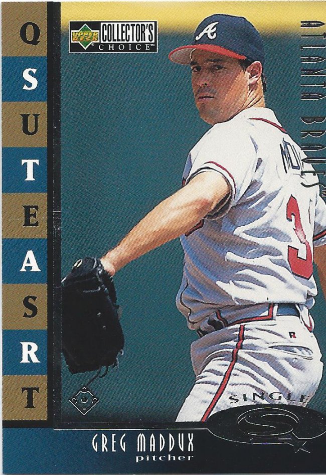
Yeah, and then there was a second type of Star Quest in this same year for some reason.
Shiny crown
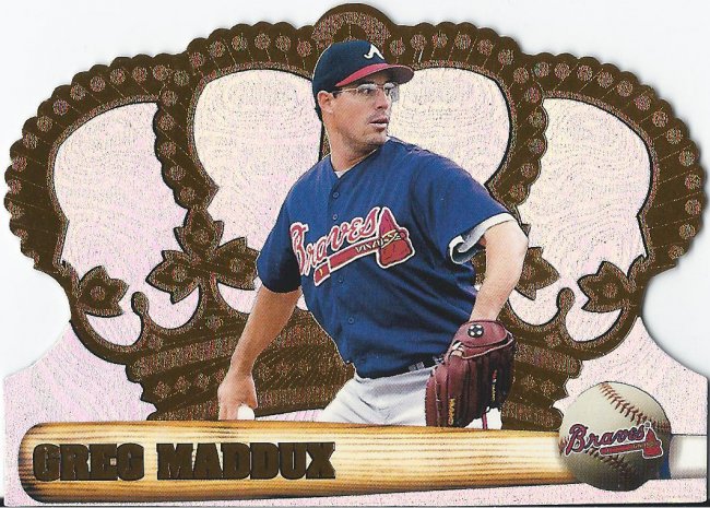
For all the crap I give Pacific, I still do enjoy the Crown Royale cards, if only for the die cuts.
Throw it in the moat
But then there’s more crap like this. Blech. Die cut this sucker and then maybe I’ll care.
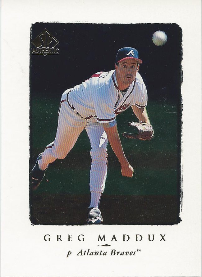
5 stars
They love showing Maddux pitching at Wrigley during his Braves days.
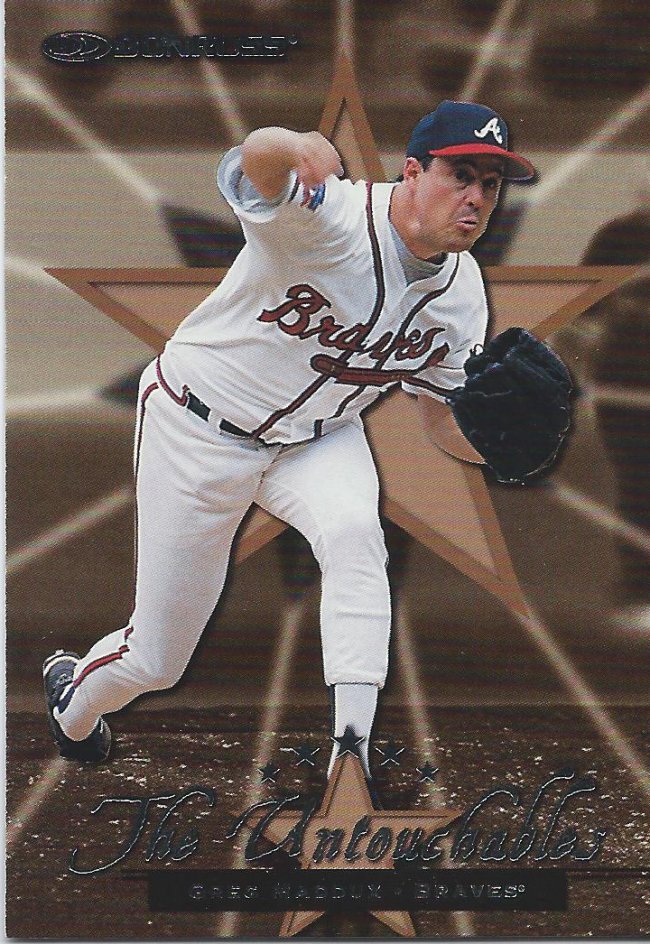
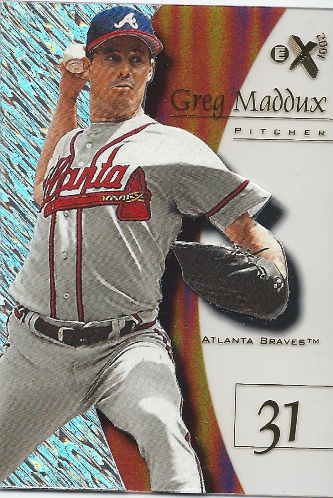
7 Stars!
They also love showing this ugly pitching face. I guess there aren’t any good pitching faces, though.
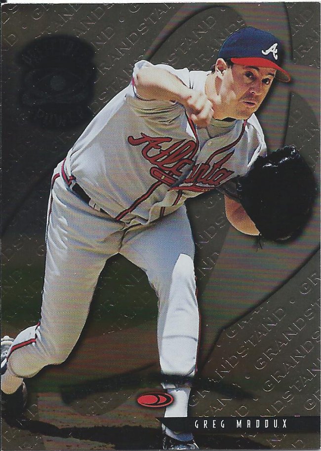
0 stars
I guess this face isn’t as bad. Ain’t that grand (stand)
Not a signature
Donruss went super crazy with all their products and low numbered stuff. As far as I can tell, this may be the only one that will have autographs. Still, those are going to be tough to come by.
Clearly different
Now we switch gears to get a glimpse of what cards will look like in the future year of 2001. What a time to be alive.
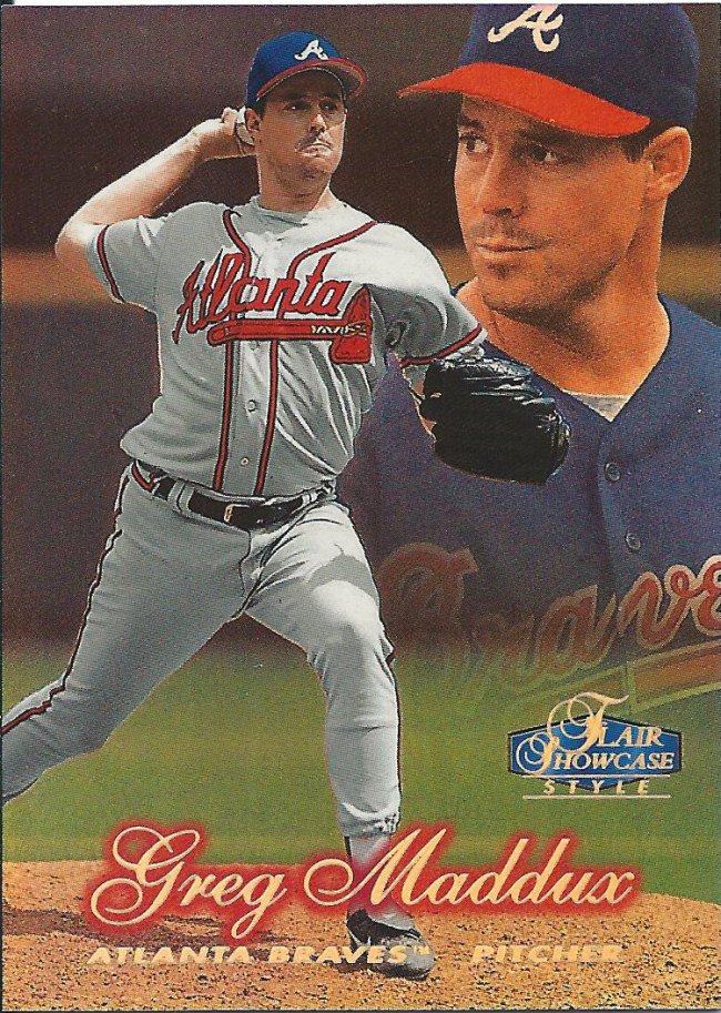
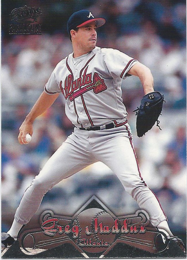
Do you really want to throw THAT pitch?
Flair Showcase, the precursor to Topps Gold Label (I think). I like this approach better.
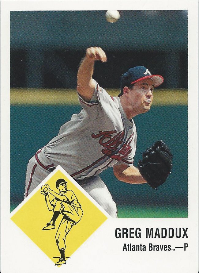
Vintage-y
Looking at all the Fleer Tradition cards I still need of Maddux alone (11 of them) makes me think I should just buy a box.
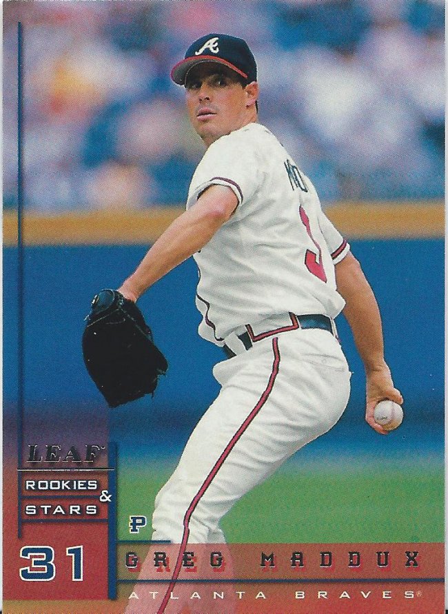
S. Not an R.
I need a lot of Rookies and Stars, too, but most of those are numbered inserts, so I can’t imagine buying a box would help very much with that effort.
Welcome back, Star Trek font
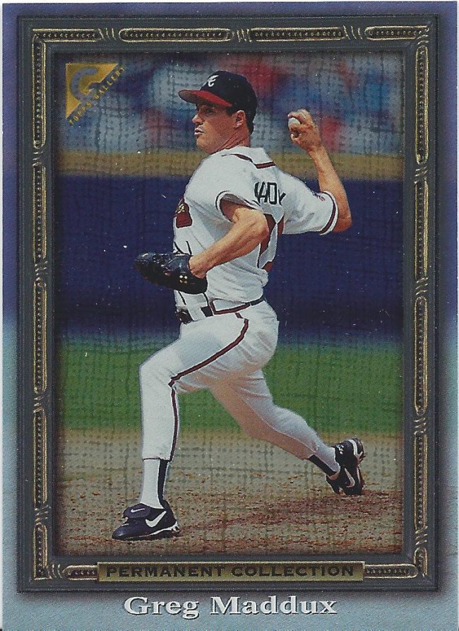
Contrary to its name, this was not the last set Pacific would release.
Not just one..
Another…”effort?”…from Pacific.
…but two
And it comes in different colors as well. There are a couple more to chase, too.
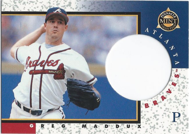
Well, dang it! The card’s broke. It’s got a big ol’ hole in it!
Don’t tell anyone, but I’ve been looking for a decent priced box of the Pinnacle Mint cards.
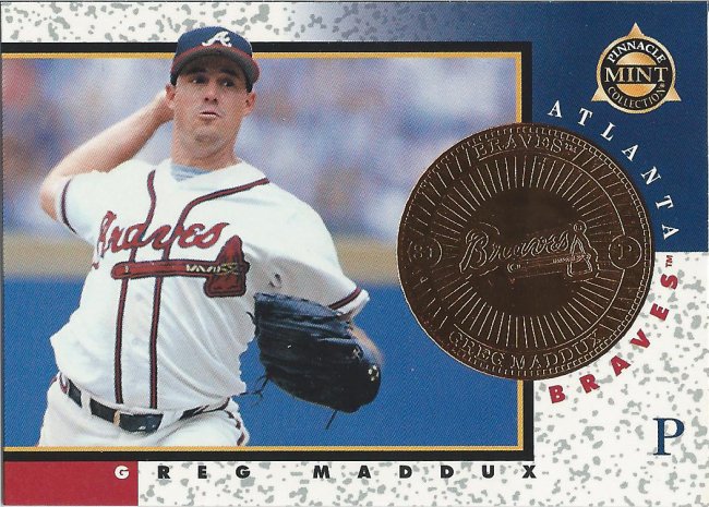
That’s better. I think.
Coins are fun little oddballs. There are normal cards like these, too. But those aren’t as fun.
That’s one way to present a name.
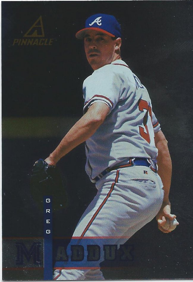
No, I don’t really know what’s going on here, either. All I know is that Pinnacle released an ass-load of cards and this is one less that I need.
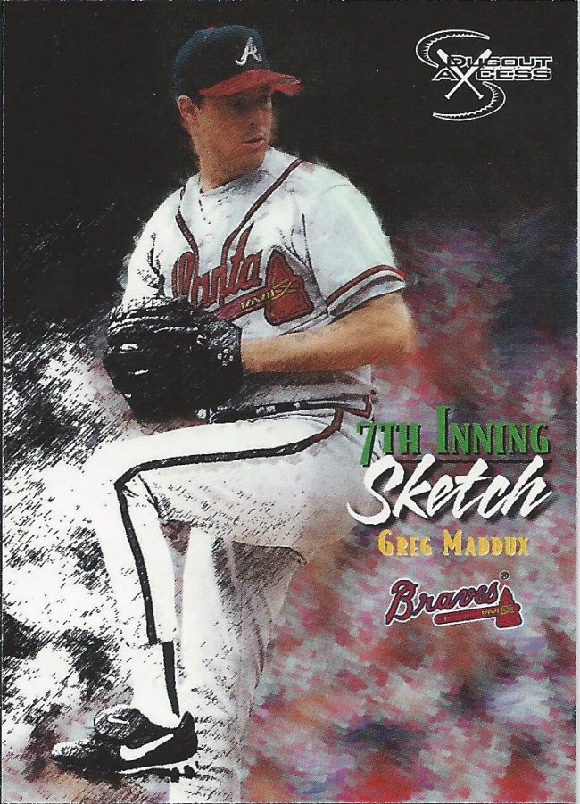
Paint by numbers
This isn’t really a sketch. More of a painting. Actually more of a computer manipulation. 7th Inning computer manipulation.
Drowning in foil
There’s a reason why sets haven’t really used this insert name. Or that font.
It’s like the scene from “Get Out” where he sinks into the chair.
Needs more border.
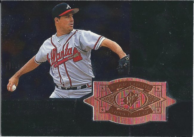
I love cards like this
SPx Finite is another box I would love to open, but there’s really no incentive to do that anymore. Other traders have been very generous and I have the most basic ones and a couple of the uncommons for my players.
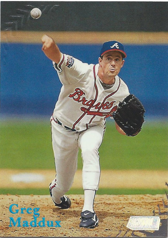
Embossed base cards
This was a light year for Stadium Club cards. The biggest problems will be the rarer parallels like the “One of a Kind” version that is numbered to 150.
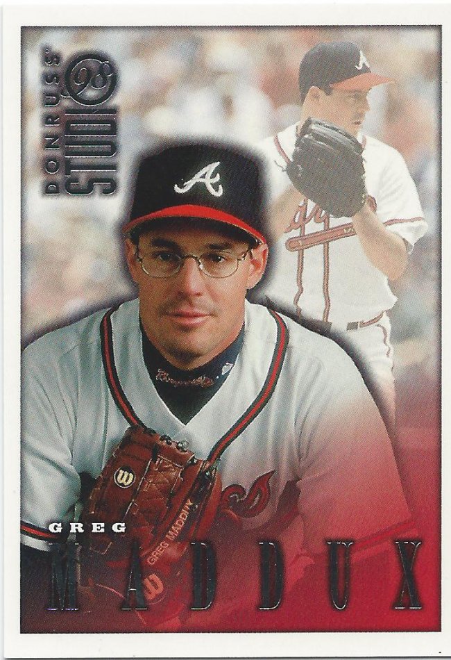
I always think of Clue when I look at this logo
This is probably one of the last good years for Studio. Then they got into some terrible designs.
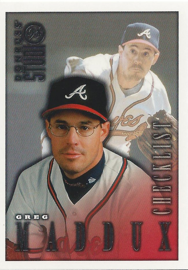
The logo looks like a magnifying glass to me.
Of course, not being able to tell the difference between the checklist and a regular card doesn’t work in its favor.
No photography
If this were a classic work of art hanging in my house, I’d probably pick a different frame. Then again, I’d probably hang something that had a bit more detail.
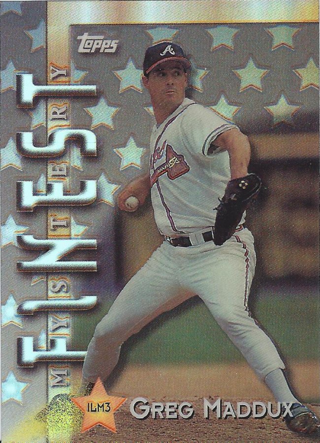
Mystery solved
This is a pretty card. I don’t know much about how these mystery Finest were distributed, or why there’s multiple types, but this is a nice start.
Silver border looks better on this.
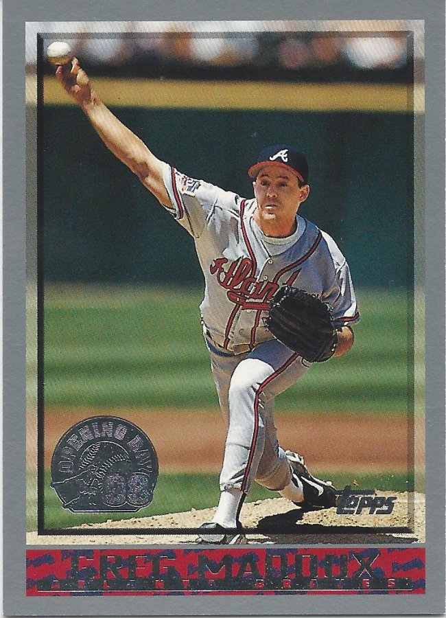
Opening Day has changed. I miss the days of foil stamps and different colors. Now the best thing they have going for the set is the parallels and half of the inserts.
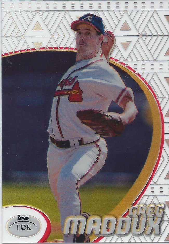
1998 #24
Pattern #24 – Southwestern Wallpaper
Welcome back to “Name the Pattern.” I’m always open to suggestions if you think you have a better name.
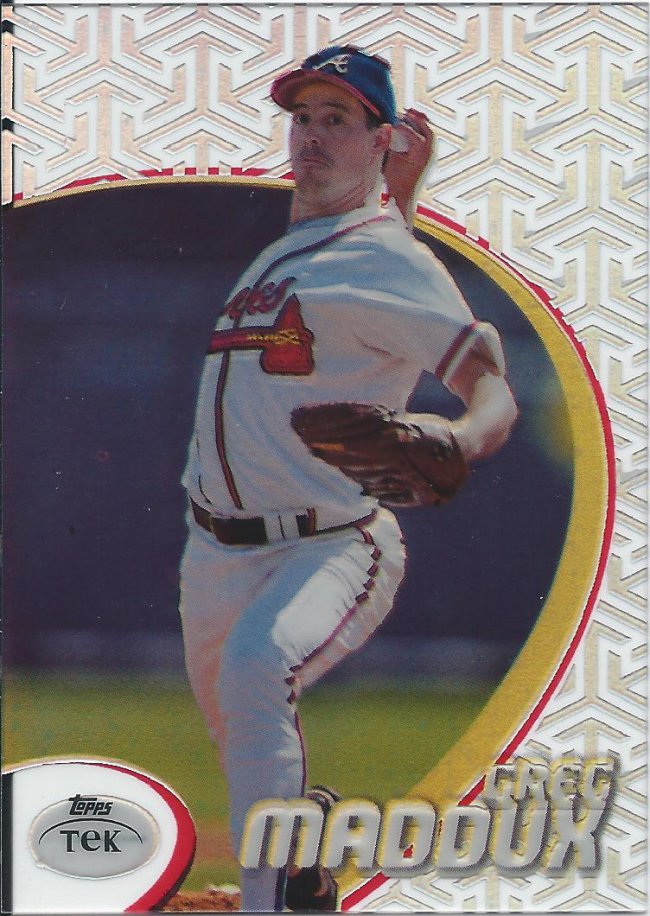
1998 #69
Pattern #69 – Nice
You know, sometimes it’s not about the look of the pattern. It’s about being a 12 year old boy inside.
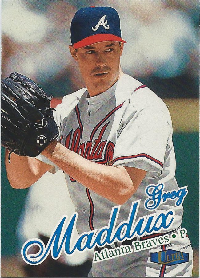
UV coating
Even though some years blur together, I still love Ultra. I thought Upper Deck was given an MLBPA license again a couple years back. I wish they would have made some more Ultra cards.

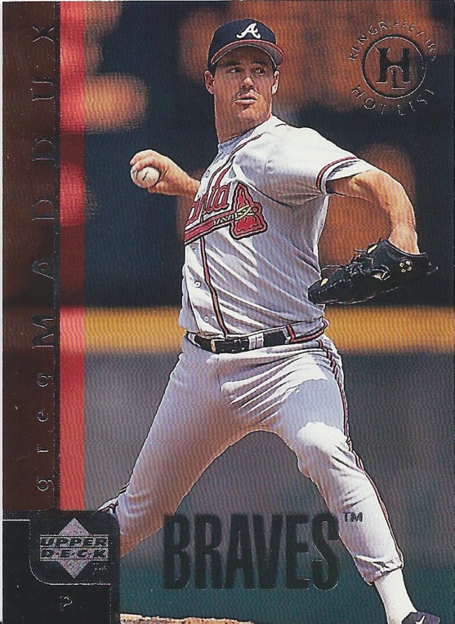
Extra! Extra!
We interrupt this post for a “special report.” This card is boring. Back to regular programming.
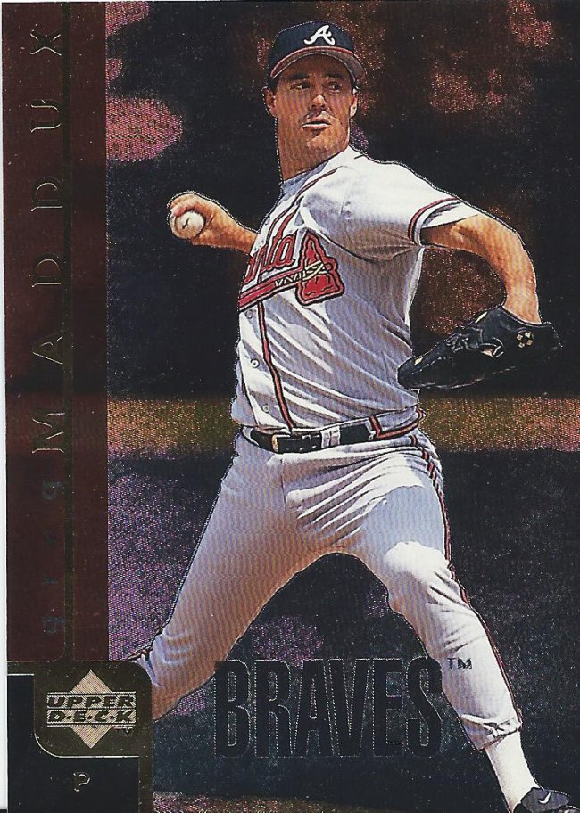
Almost done
To help us close out the year, we have a couple Upper Deck cards including this subset that looks like it could be a lame parallel.
Etched like crazy
And a parallel of a subset without the stamp for some reason.
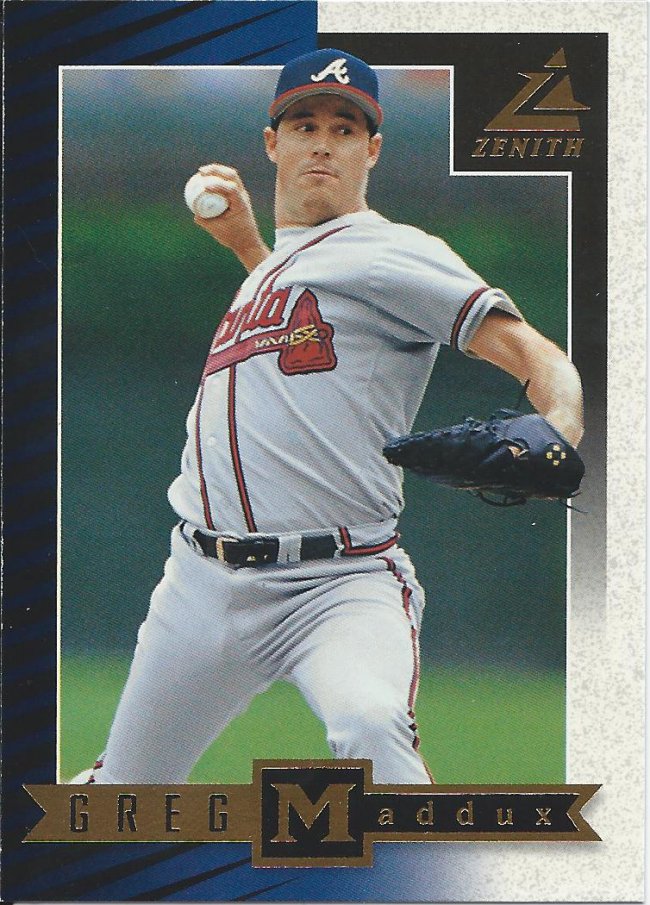
These are neat
Finally, here’s a regular sized Zenith card. This is another box I’d love to open just for the novelty of the 8X10 marsupial aspect. For now, I’ll just enjoy the one I have.
As always, thank you very much to Jeremy for the great package of cards. We’ll see you again in 1999!
Recent Comments