1994.
The Dallas Cowboys handed the Buffalo Bills their 4th straight Super Bowl loss, earning their second consecutive win in the process.
The New York Rangers finally win a Stanley Cup after a 53-year long drought, then the NHL locked out its players.
George Foreman becomes the oldest ever heavyweight champion boxer.
Olypmic figure skaterNancy Kerrigan gets clubbed in the leg under orders from her rival Tanya Harding.
Major League Baseball went on strike and denied fans a World Series champion, and possibly prevented several records from being broken.
And in 1994, card manufacturers released 111 cards of Greg Maddux that I deemed worthy of my collecting efforts.
Thanks to the generosity of reader Jeremy originally mentioned in our landmark 500th post (and in my 1993 Overload post) I now have over 40% of those over 100 cards.
1994 Before Jeremy – 19/111 cards – 17%
1994 After Jeremy – 49/111 cards (including 6 upgrades) – 44%
Just like with 1993, the majority of what’s left is your garden variety oddball releases and parallels. Some of those might take some serious time and effort to track down.
I’ll worry about that later, right now I have a ton of year specific cards to show off. Let’s take some inventory, shall we?
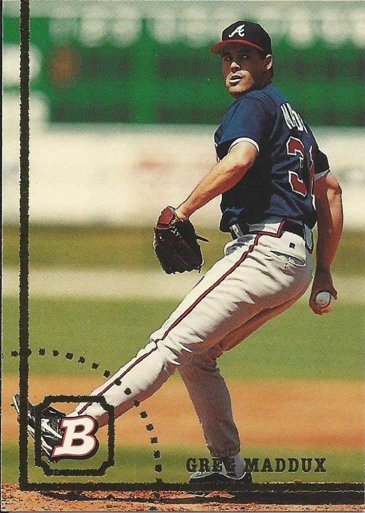
That's one big foil outfield
Remember old school Bowman? The kind that’s defining feature wasn’t confusing set design and endless pointless parallels, but instead was performance breakdowns. How else would I know that Greg was 3-0 with 3 complete games and 24 strikeouts in 4 starts against the Mets?
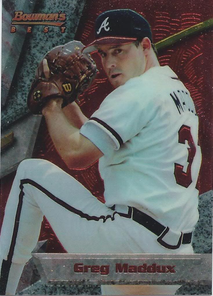
It begins
Unfortunately, 1994 was the first year Bowman started to get a little crazy. Bowman’s Best looks cool, kinda like a Chrome Fleer Ultra. Still, it’s hard to ignore that this shiny finish is actually a slippery slope.
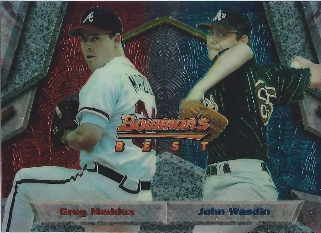
Only need the refractors now
I don’t know how they decided the pairings for these dual cards, but they did. John Wasdin had better age-compared stats in the minors than Maddux, but Greg was a starter and John was a closer. Wasdin had a respectable career, if not a great one.
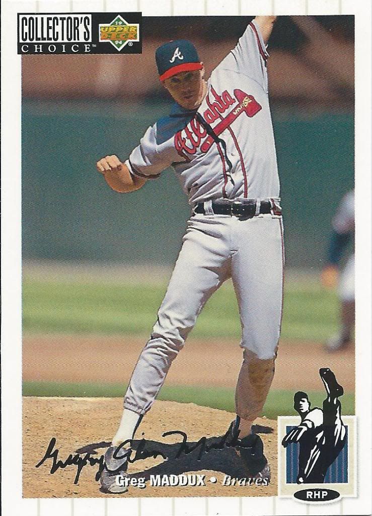
I wish the drawing matched his stretch
I love this design. I know a lot of you don’t like Collector’s Choice, but this was my jam back in the day. Gotta love the silver signature parallel, too. How long before I land the 1 per box Gold Signature?
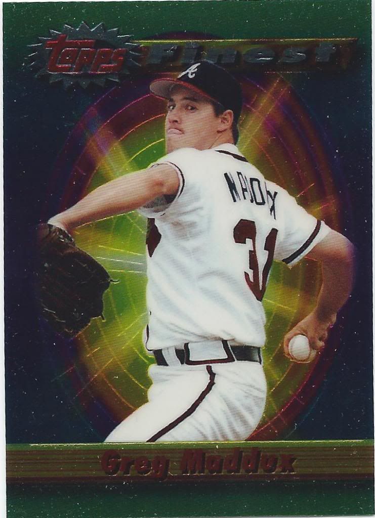
lip smacking fine
I think this post will be the chromium-est of the years so far.
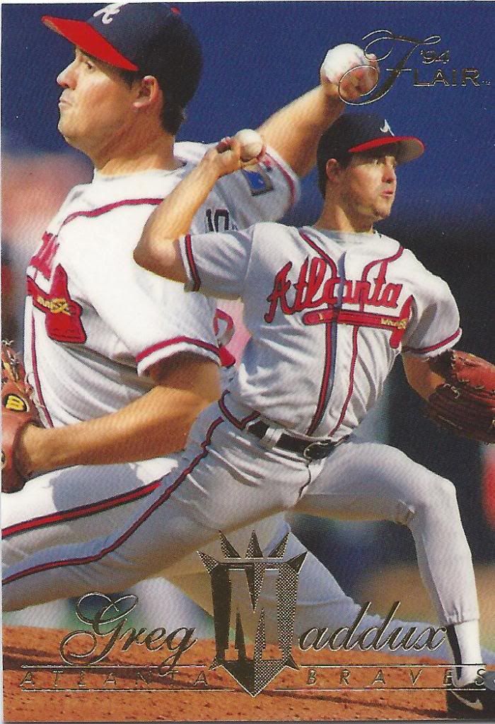
Grab your M shield and head into battle
He’s covering both sides of the plate. Literally.
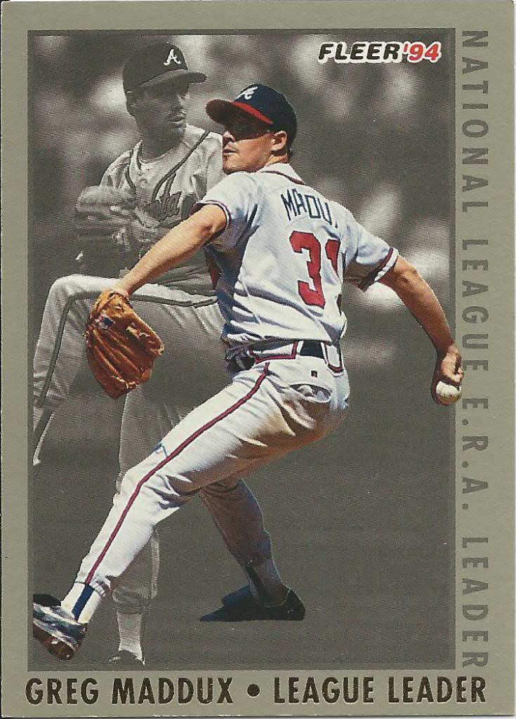
More gray than a Gyspy Queen card
A 2.36 ERA is good enough for the league lead and his second Cy Young. Not good enough for some color, apparently.
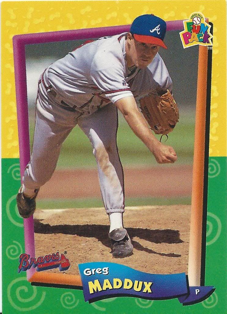
Pretty much exactly like 1975 Topps
Are we having fun yet? Based on the expression, I’ll say the answer is a resounding no. Maybe The Professor doesn’t like color.
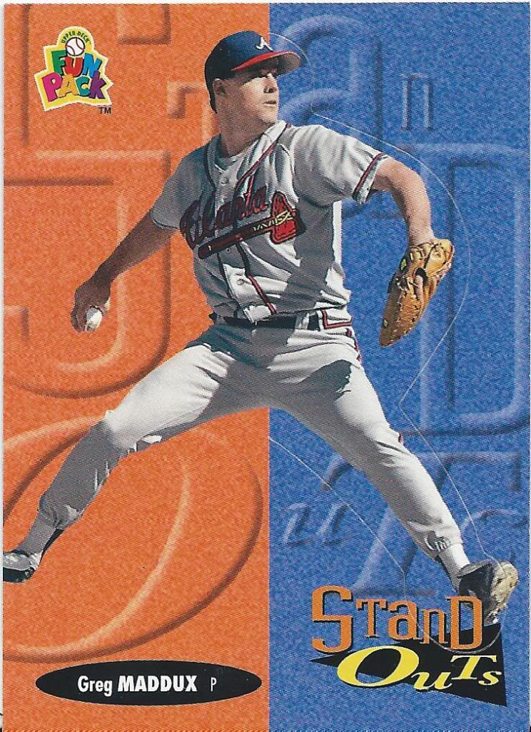
Pretty much like a Crusade insert
Fun packs are fun because of things like this. It’s a normal card in the set, but it’s also perforated so that you can pop out the right side, fold the background over, and stand it up so he pitches in 3D! I will not be doing such things.
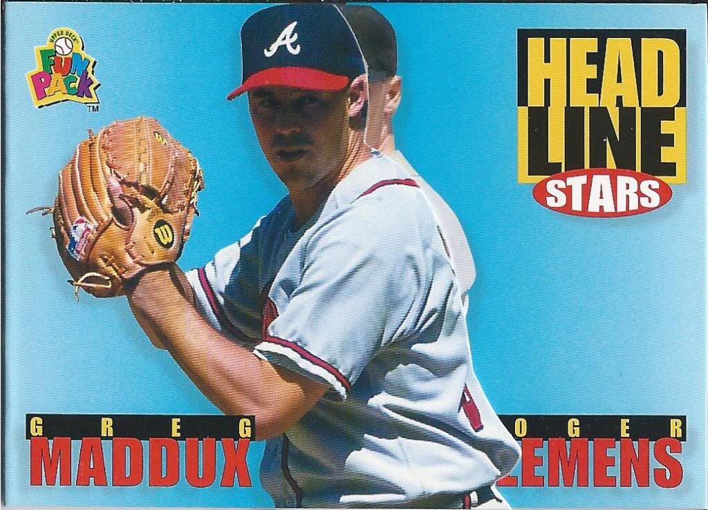
You all know Oger Emens
One more. Again, this is part of the full set. Not an insert. I love that! But wait, there’s more than meets the eye.
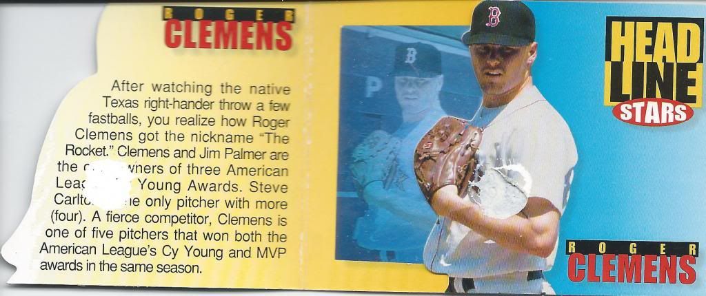
Don't try this at home
I got a few of these in Jeremy’s package, so I was able to open one up. Kinda caused some paper loss when you pull it apart. Not only is it a foldout, like a collect-a-book, but…

Read amongst yourselves
There’s a hologram inside! How cool is that? Unfortunately they’re the same pictures as the unfoldies. You know, if Clemens didn’t have the steroid allegations and whatnot, I bet we’d see these two paired together more often, what with the multiple Cy Youngs and all.
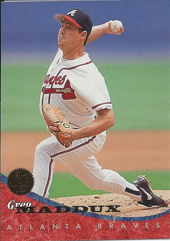
So many curves
Leaf made a u-turn and distanced themselves from the silver and black and went full Ultra.
Party on the front, foil in the back, too.
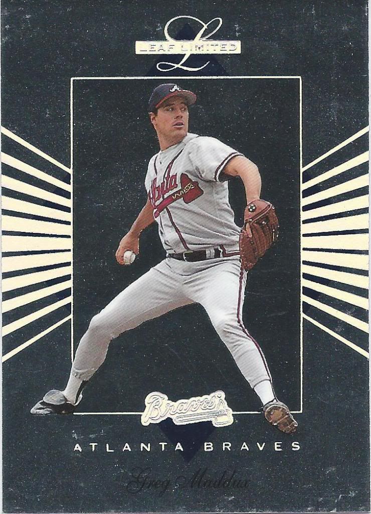
Okay, here’s some silver and black. They just saved it for the super premium Limited brand. Oh, and trust me, it’s silvery. Very much so. And a little rainbowy
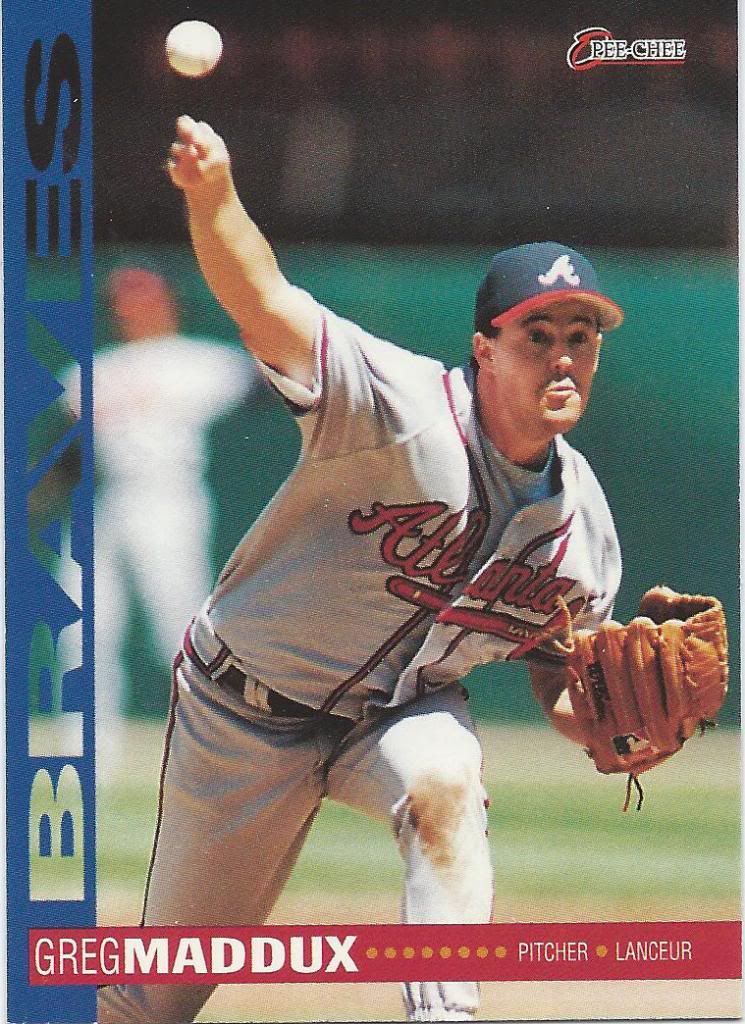
It's pronounced Mad-doo in French
I don’t think I ever knew O-Pee-Chee still existed in 1994. I guess most people were like me, because this was the last year.
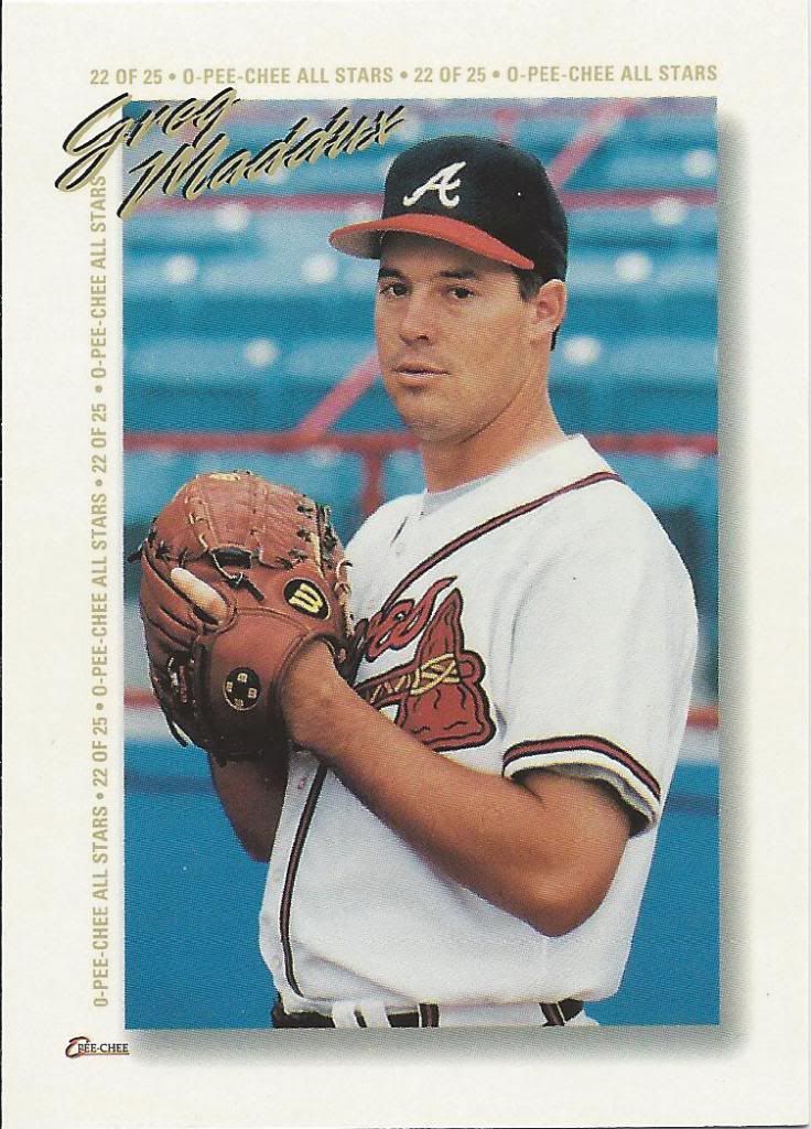
They really want you know the card number
No, this isn’t a really bad insert set. It’s a redemption for a maybe terrible jumbo insert set. There are regular jumbos and foil jumbos. I don’t know the difference or if there are different redemption cards like this for the two types. You have to send some money to Canada with a few redemption cards and you get one of only 5,000 sets. Crazy.
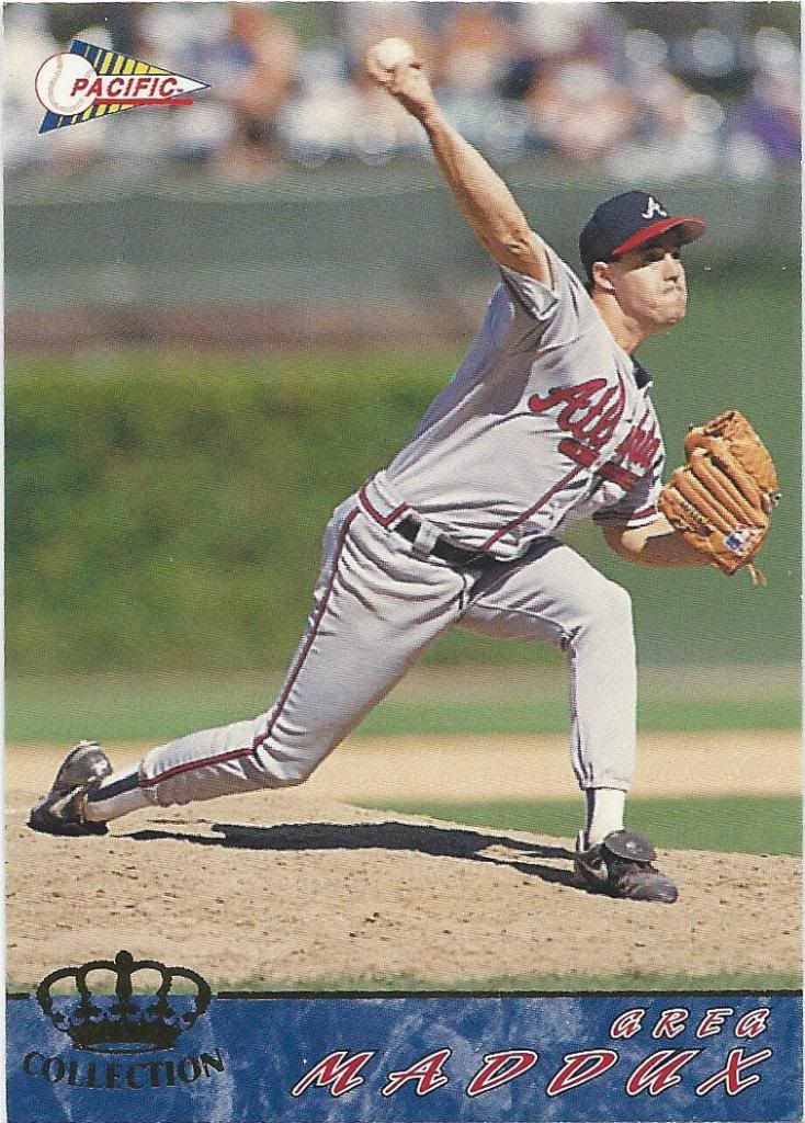
There's Spanish on the back, if you care.
People loved marble in the early ’90s. Well, card designers did.
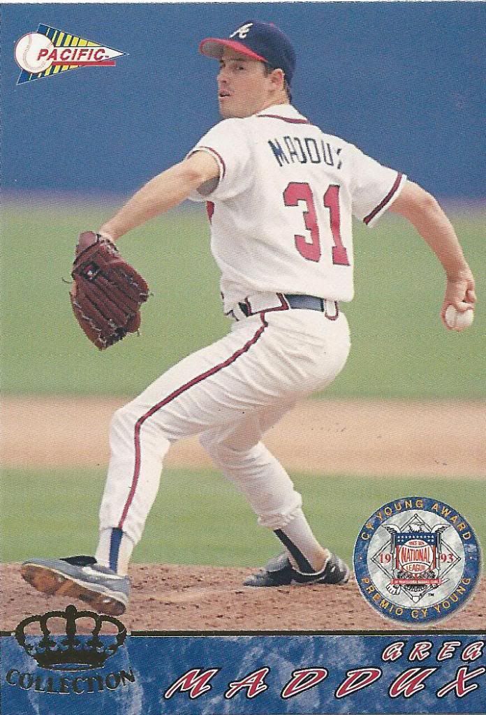
And another one, for some reason
It was a simpler time…when they only had three styles to choose from.
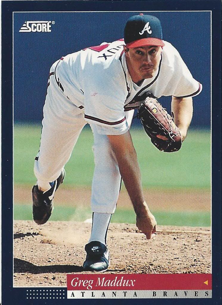
Score!
Little known fact: If you win a major award in consecutive seasons, every card back will talk about that.
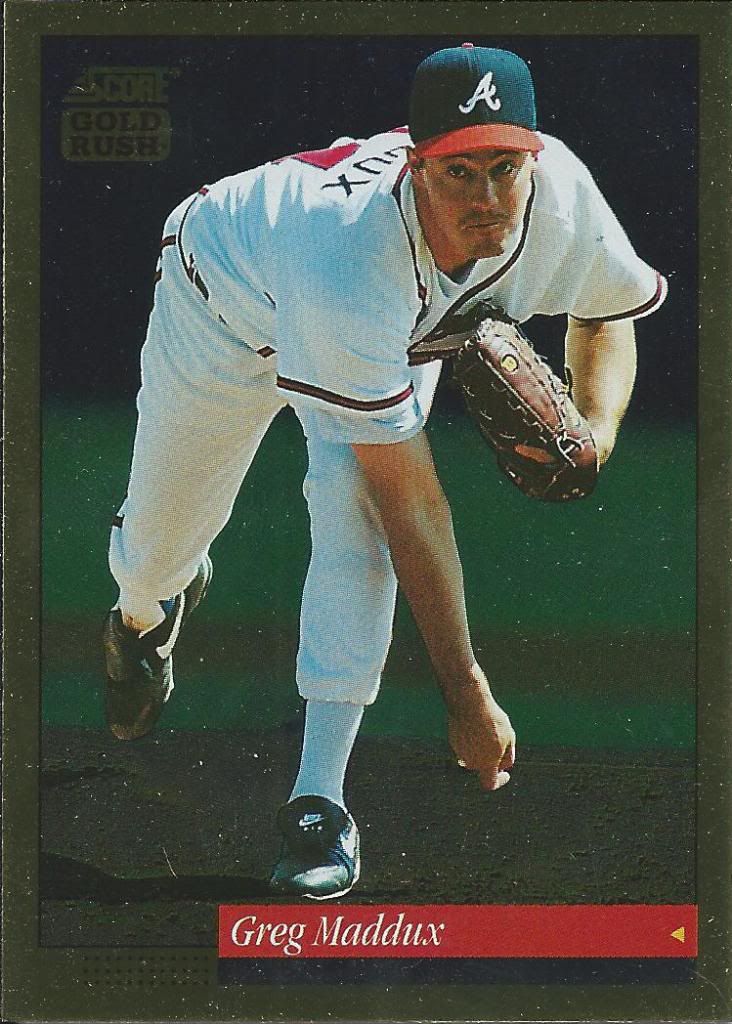
ScGold!
I’ve found this year of Score to be very condition sensitive. They like to stick together like nobody’s business. Luckily, these both avoided that terrible fate.
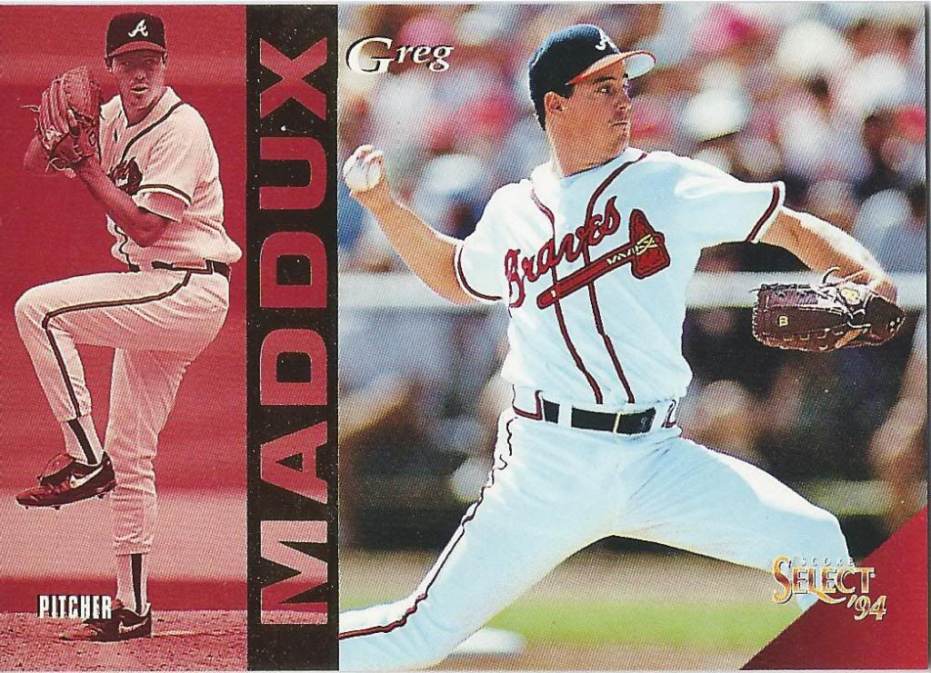
I like the red much more than the green
Remember my 1993 Overload post? Remember how there were something like 75 Select cards thanks to a super large insert set? Well, in 1994 there are only 2 Select cards. Half way there!
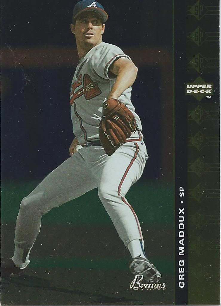
I don't think it stands for "starting pitcher"
1994 was also a time when SP didn’t mean “short print.” It meant…er…umm…well, I don’t know what SP meant, but it was a set. A high quality set that cost much more than your average pack of cards. I remember a distinct buzz of excitement around SP back then.
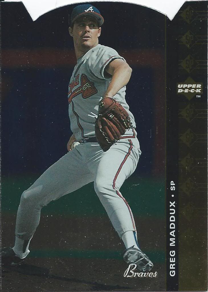
"Super pretty?" probably not that either.
A lot of that buzz was thanks to the die cut cards. I think they fell one per pack, but when the regular cards were prized pieces of a collection (as older Finest were), these die cuts were like finding a diamond in your sandbox. Am I still making sense? I’m distracted by this die cut Jeremy sent me.
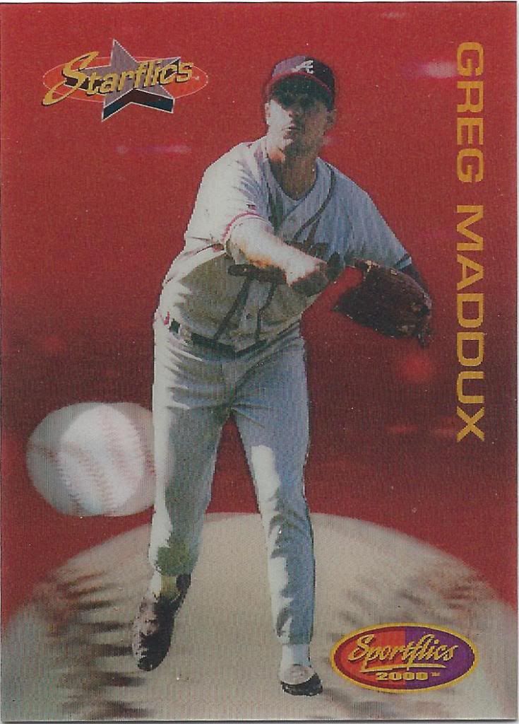
Greg doesn't move. Defeats the purpose.
Have you ever seen one of those 4-D movies? You sit in the seat with 3-D glasses on, and your seat moves and shakes with the action on the screen like a stationary rollercoaster. Sometimes they spray water on you or blow air in your face. I went to one recently where they jabbed you in the back . That part wasn’t fun. Pretty painful.
This card is a 4-D movie. It’s supposed to be fun, but it’s actually painful.
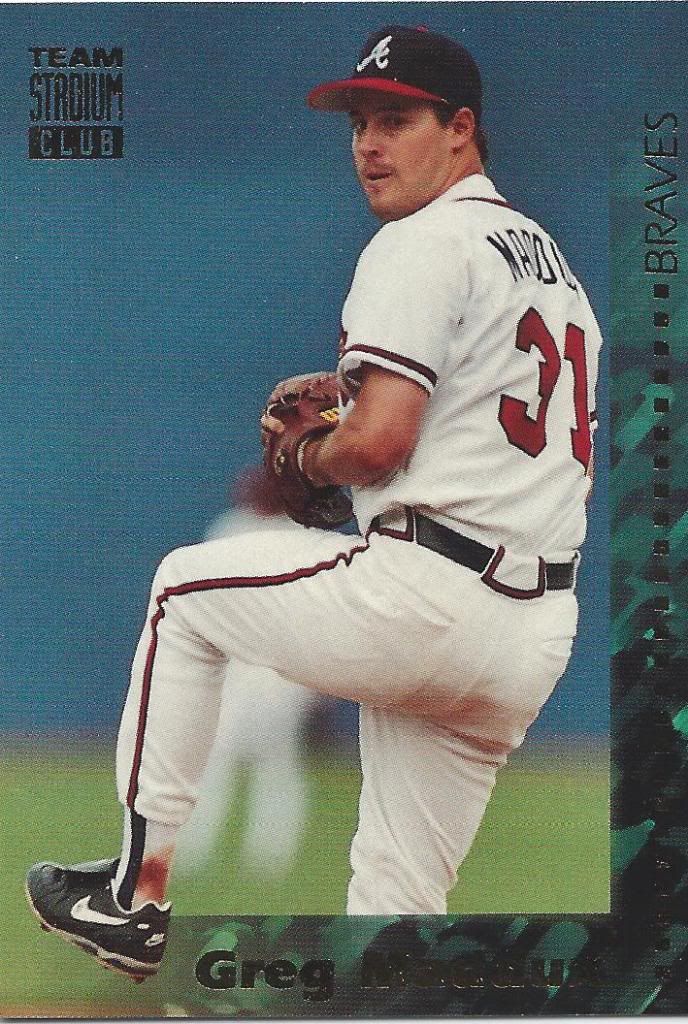
What are you? Why are you?
Team Stadium Club is a thing and I don’t know why. I think I even helped Andy open a box of it, and I’m still confused. Well, as long as I get the 1st Day Issue, I’ll be done with it and never have to think again. About anything.
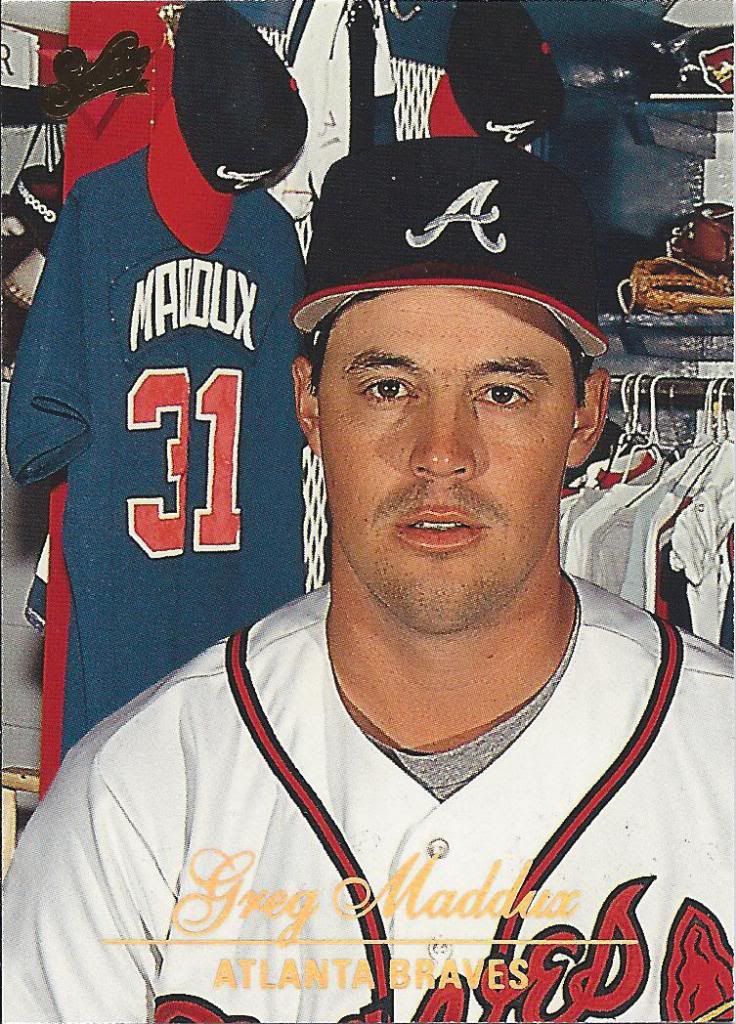
Has to be the worst lighting I've seen on a professional studio shot
I love Studio, but this is hideous. Such harsh lights coming from all directions. The cards are cool because they talk about hobbies and other high school yearbook things. Greg likes golf and Nintendo. Favorite shows include Roseanne, Seinfeld and The Simpsons. He’s just like us.
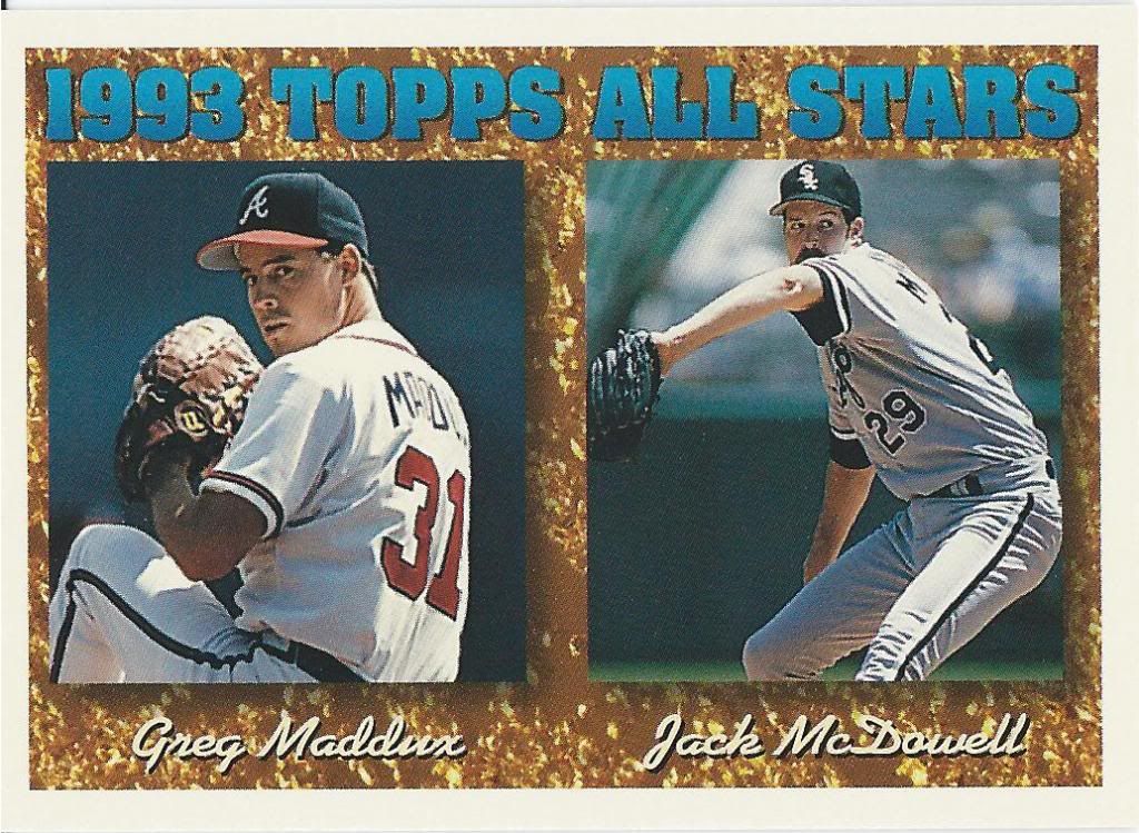
Both were 20-win pitchers in 1993
What the hell is that background supposed to be? Camouflage? Spilled RC cola? Gold?
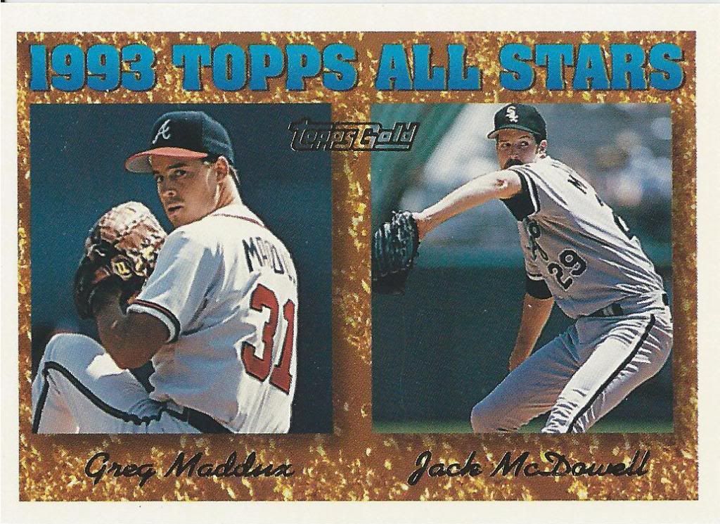
18 CG and 5 shutouts between them. Different time
Now this is gold. Not super effective, but it’s gold nonetheless and I’m happy to have it.
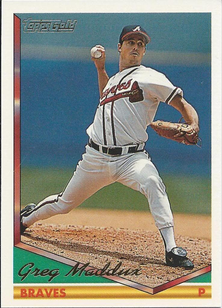
Should have made that yellow stripe a bat
Same with this one. I like the look of the gold more when the ToppsGold logo isn’t wedged smack dab in the middle.
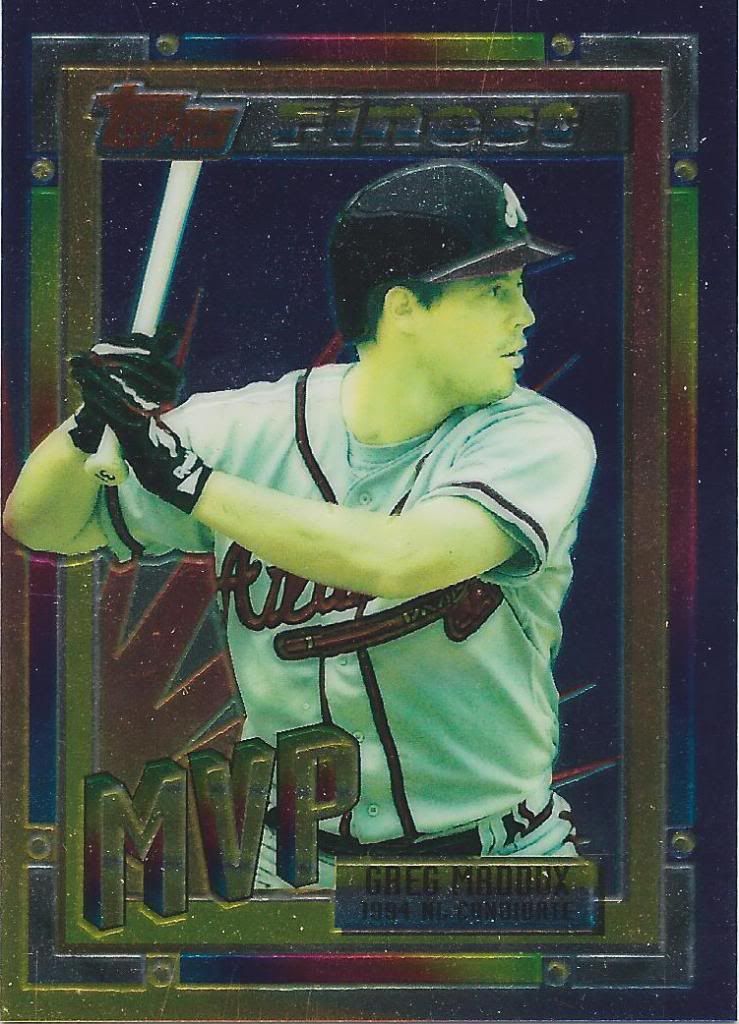
Wow is that washed out
“Now what’s this? A Finest card? But, Jon, you almost always organize your posts chronologically and alphabetically, and we’ve already passed Finest. What gives?”
Yes, that’s true. And thanks for noticing. Evidently, this is an insert of some kind from Topps Traded. I’m not sure how rare it is or how it was distributed. I just know there’s no refractor version to chase, so I’m done.
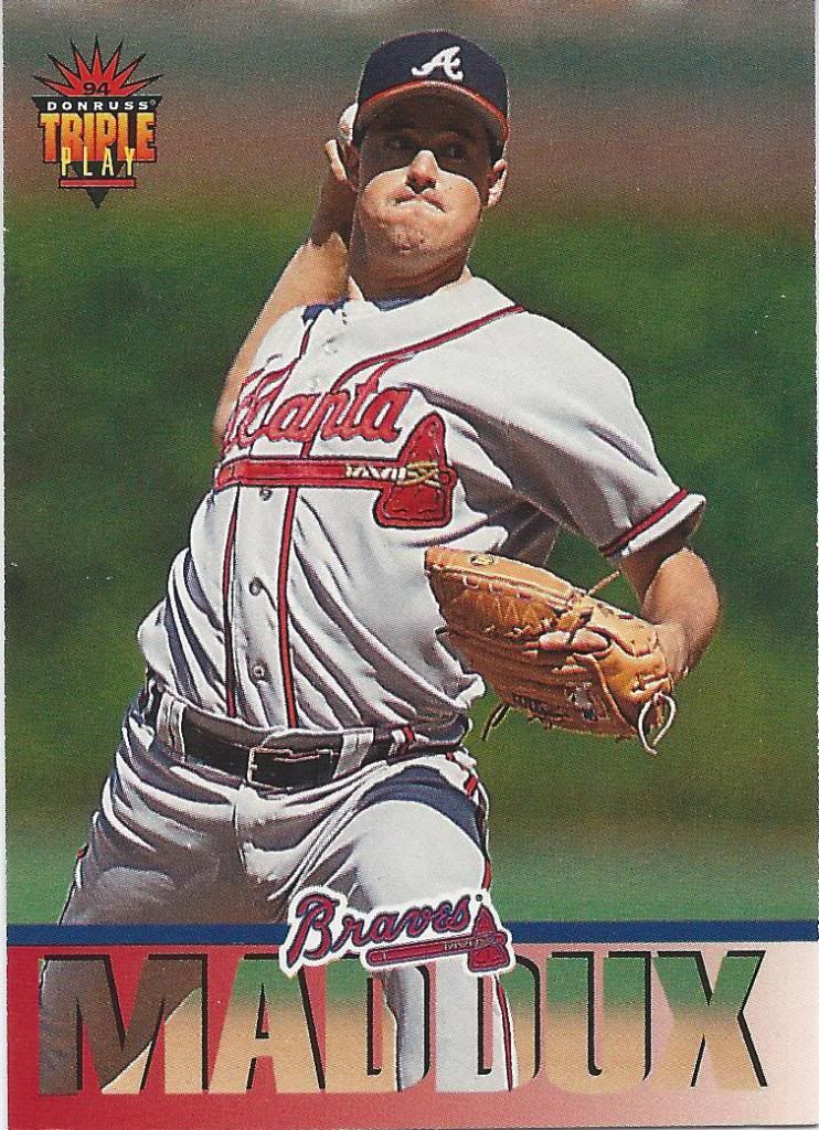
The name's Maddux. Braves Maddux.
The first two years of Triple Play had a very whimsical, childlike feel to them. 1994 kind of throws that out the window. The design isn’t bad, but it’s no longer a kiddie set. It rebelled and told its mom that he’s too old to play with action figures. He was also kind of a dick, so no one liked him anymore.
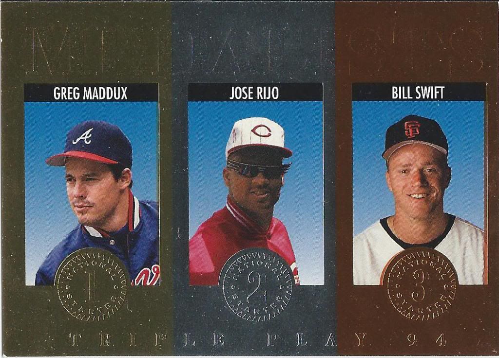
Rockin' the shades
At least the inserts were still fun. I like this concept a lot. I think a theme like this would work well today for league leader cards. In this world of parallels, you could have the leader with a rarer gold parallel, the 2nd place guy with an uncommon silver and the 3rd with a more common bronze version of an insert card. Did I just further ruin collecting with that suggestion?
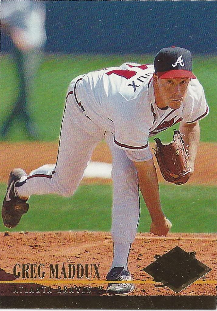
If you like foil, do I have the card for you
The defining feature of ’94 Ultra is the gold foil stripe that runs along the front and back of the card. Super fancy stuff. If I had to pick a second defining feature, it would be the one-pitch photography session used to create all their cards. Observe.
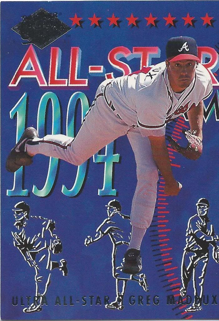
Reminds me of an opening sequence to a This Week In Baseball type show
I’m pretty sure this All-Star insert is from the same game as the first card we saw. It honestly could have been from slightly earlier within the same pitch if they had a fast enough shutter.
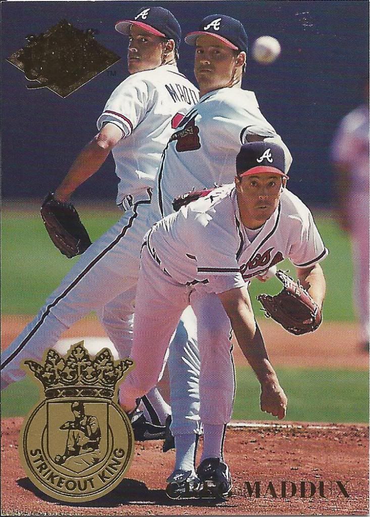
Ultra is still King to me
See what I mean? This Strikeout King sequence is either three separate pitches, or from the same pitch. And notice something familiar about that follow through? Yup, the neanderthal pose was also used for the foil-rimmed regular card.
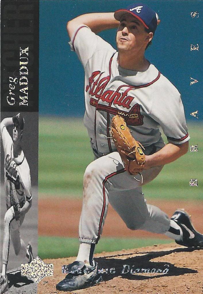
This diamond ain't rough
And with this Electric Diamond parallel, we have come to the end of our 1994 journey. What a way to end it, too!
I don’t know if Jeremy still reads this blog, but if so, I can’t thank him enough for his overwhelming generosity. Remember folks, all of these were sent for free with a complete refusal of anything in return. And I still have a whole lot more left to show off. If you thought this was a lot, wait until 1995.

[…] reader Jeremy, originally mentioned in our landmark 500th post (and in my 1993 Overload post, and 1994 post), I now have over 40% of those 160 […]
[…] reader Jeremy, originally mentioned in our landmark 500th post (and in my 1993 Overload post, and 1994 post, and 1995 post), I now have over 25% of those […]
[…] reader Jeremy, originally mentioned in our landmark 500th post (and in my 1993 Overload post, and 1994 post, and 1995 post, and 1996 post), I now have three times as many of those cards as I did […]
[…] reader Jeremy, originally mentioned in our landmark 500th post (and in my 1993 Overload post, and 1994 post, and 1995 post, and 1996 post and 1997 post), I now have 40 more of those cards as I did […]
[…] Jeremy, originally mentioned in our landmark 500th post (and in my 1993 Overload post, and 1994 post, and 1995 post, and 1996 post and 1997 post and 1998 post), I now have 40 more of those cards […]
[…] Jeremy, originally mentioned in our landmark 500th post (and in my 1993 Overload post, and 1994 post, and 1995 post, and 1996 post and 1997 post and 1998 post and 1999 post), I now have 30 […]
[…] Jeremy, originally mentioned in our landmark 500th post (and in my 1993 Overload post, and 1994 post, and 1995 post, and 1996 post and 1997 post and 1998 post and 1999 post and 2000 post), I […]
[…] Jeremy, originally mentioned in our landmark 500th post (and in my 1993 Overload post, and 1994 post, and 1995 post, and 1996 post and 1997 post and 1998 post and 1999 post and 2000 […]