1993.
The Buffalo Bills lost their third straight Super Bowl.
Monica Seles was stabbed by a crazy fan on the tennis court.
The Chicago Bulls win their third straight NBA Championship.
The Montreal Canadiens win the Stanley Cup.
The Colorado Rockies and Florida Marlins play their inaugural seasons and Joe “Touch ‘Em All” Carter hits a walk-off home run to give the Blue Jays the World Series trophy.
And in 1993, card manufacturers released 90 of Greg Maddux that I deemed worthy of my collecting efforts.
Thanks to the generosity of reader Jeremy originally mentioned in our landmark 500th post, I now have half of those 90 cards.
1993 Before Jeremy – 18/90 cards – 20%
1993 After Jeremy – 45/90 cards (including 4 upgrades) – 50%
The majority of what’s left is your garden variety oddball releases and parallels. The toughest, I assume, will be the Finest Refractor, but let’s not think about that right now.
Let’s focus on what I do have.
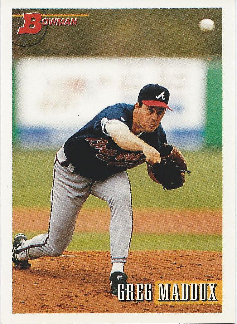
A decidedly boring design for Bowman
The one and only Bowman card. This is the last year I can actually say that. Sure, it could use a little upgrade, but I’ll worry about that after more of the white spaces in the spreadsheet are gone.
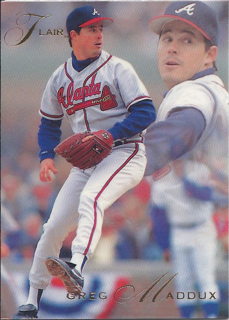
That's why he's so good. He harnesses the powers of Ghost Greg
I love Flair. I couldn’t afford too many premium cards as a kid, but I made a point to find a few mini-box/packs. Why can’t today’s high-end stuff look as nice as these?
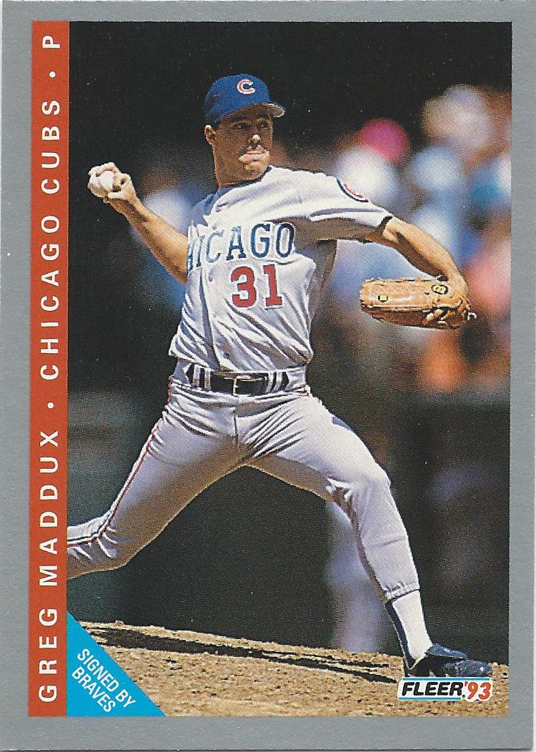
I'm confused.
First, I want to say that ’93 Fleer on the front is terrible. The backs are actually quite cool. Maybe they should have switched them around. Maybe I should have scanned them. Okay, next I want to ask why the card lists him as a Cub when they say he was signed by the Braves?
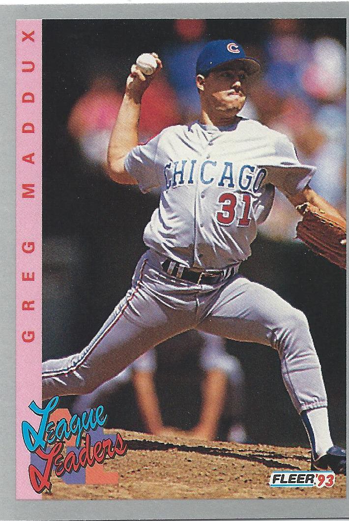
Tied with fellow future HOF'er Tom Glavine with 20 wins
You’re going to notice a lot of cards with the right side cut off. Every 9th one or so. I realized after the fact that scanning the “whole area” doesn’t mean whole right side of the scanning bay. Why couldn’t it cut off that terrible League Leader logo?
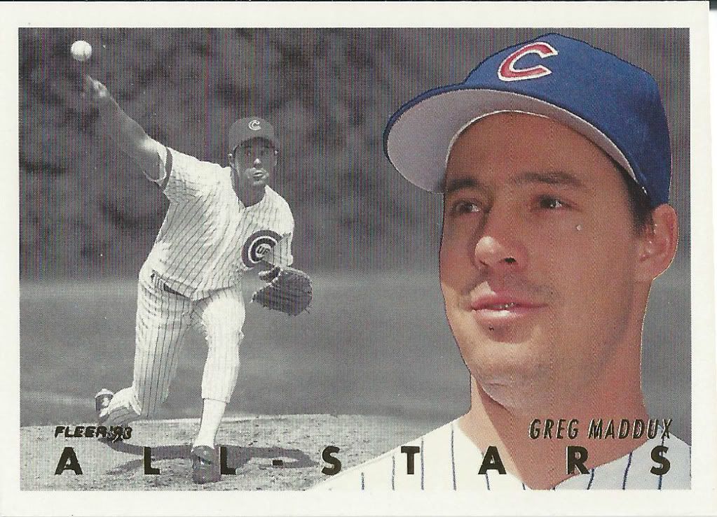
Remember that time I pitched a ball?
This was Greg’s 2nd All-Star selection, but wouldn’t be his last. I love the way Fleer handles their AS cards. ’93 is a tad cheesy, but the simplicity of them draw me in.
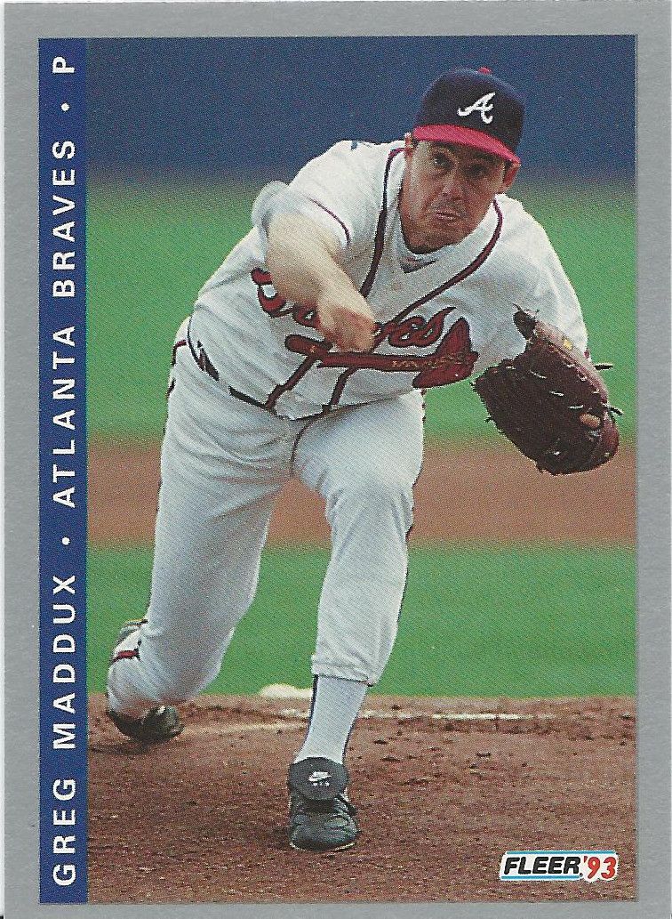
Pitcher face is not a good face
This must be the answer to my previous question. They wanted a Maddux Braves card in their Final Edition set. Why couldn’t they add a little triangle saying “Signed Away From the Cubs?” Symmetry, people.
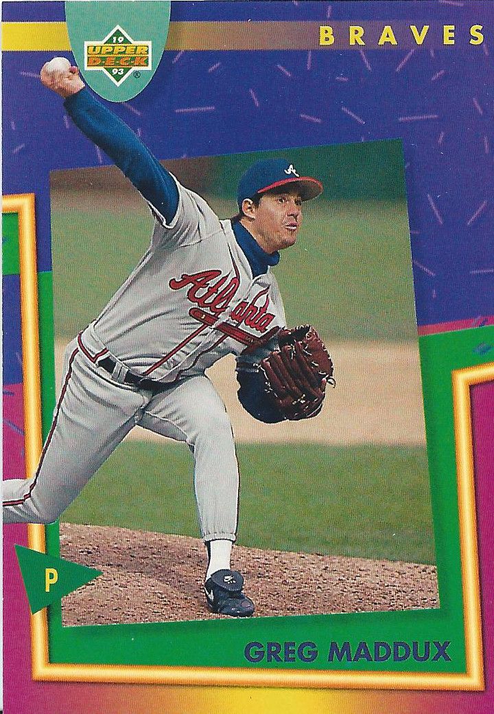
It's alright, cuz I'm saved by the pitch
I have great affinity for the kiddie cards. Fun packs are fun! Collecting is fun. Fun packs are worth collecting. Thanks to Frank Thomas and Tony Gwynn I have more of them to collect.
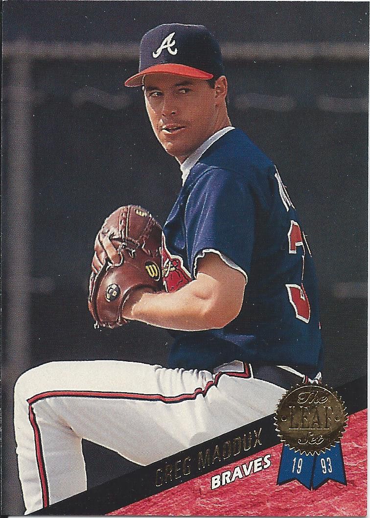
Leaf blue ribbon
Another set that should switch the fronts and the backs. I love the skyline shots they used (that you can’t see here). 2004 Studio, not so much.
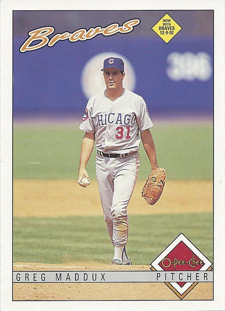
Ooo, menacing stare
See, OPC knows how to do things the right way. The team name has changed to the Braves to match the notice that he was signed by the Not Cubs.
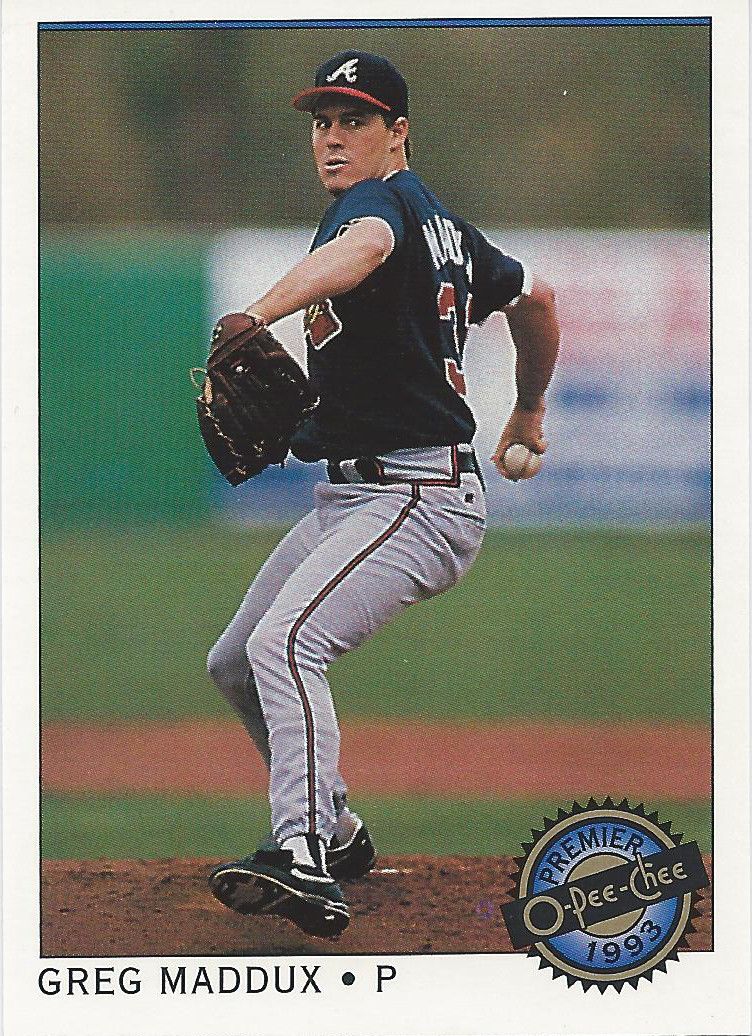
Okay, that's kind of menacing
Until I got this card, I don’t think I knew there was a 1993 Premier set. The seal is an upgrade over the rainbow text, but there’s nothing else going on. NOTHING.
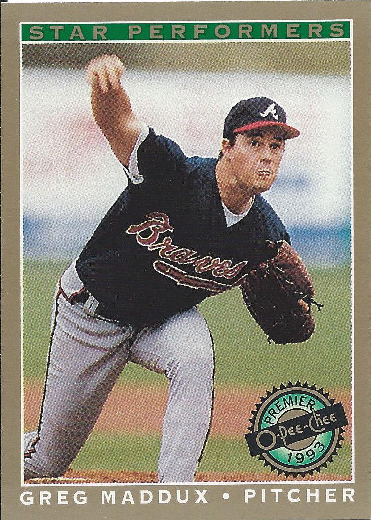
Back to not menacing
Okay, this insert card is a little better, but only because it has a gold border. There’s even a foil version of the insert. I bet those redeem the product completely.
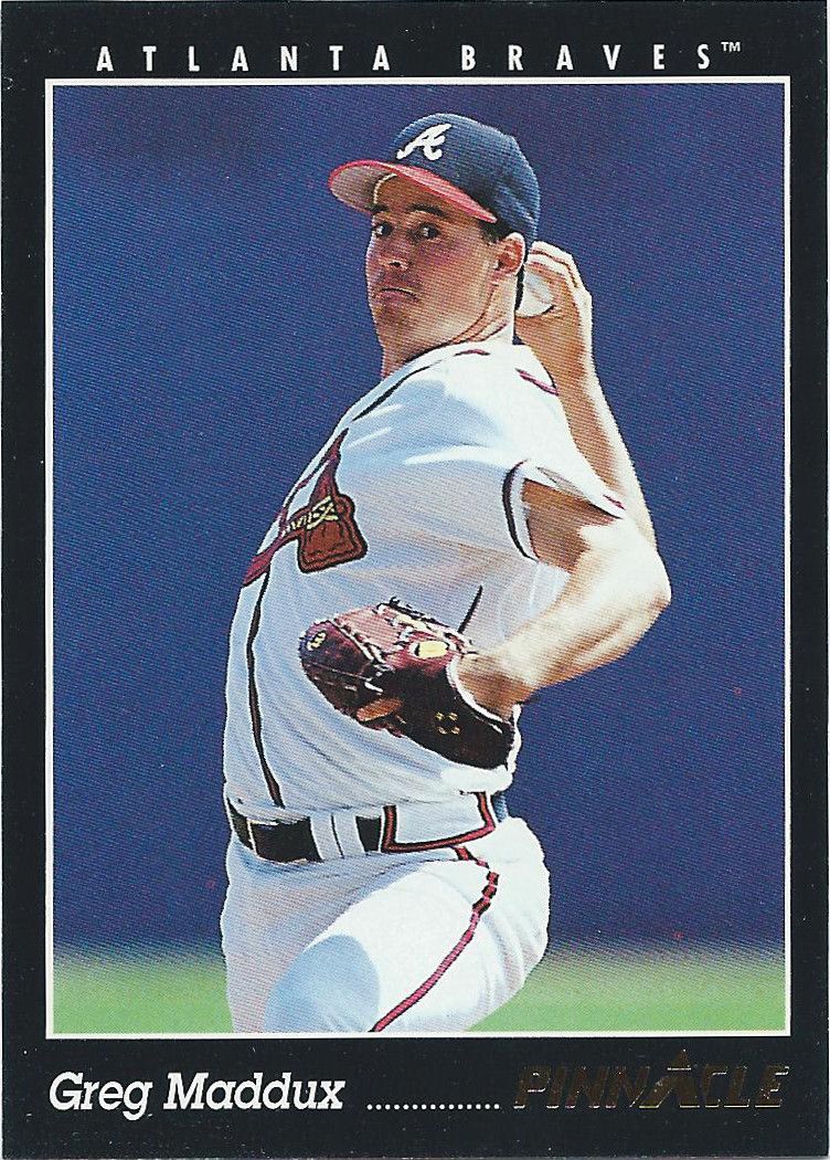
I'll get you.............................Pinnacle
I bought a ton of ’92 Pinnacle, but by 1993 I had moved on primarily to basketball. I probably would have done the same with ’93. I was a sucker for the black bordered stuff. Now, I’m too worried about chipping.
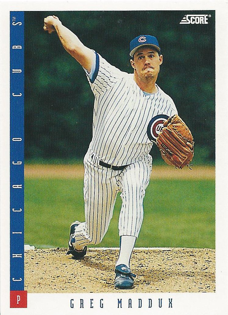
nngh..take that..please
Score got worse and worse, didn’t it? Where are the vibrant colors?
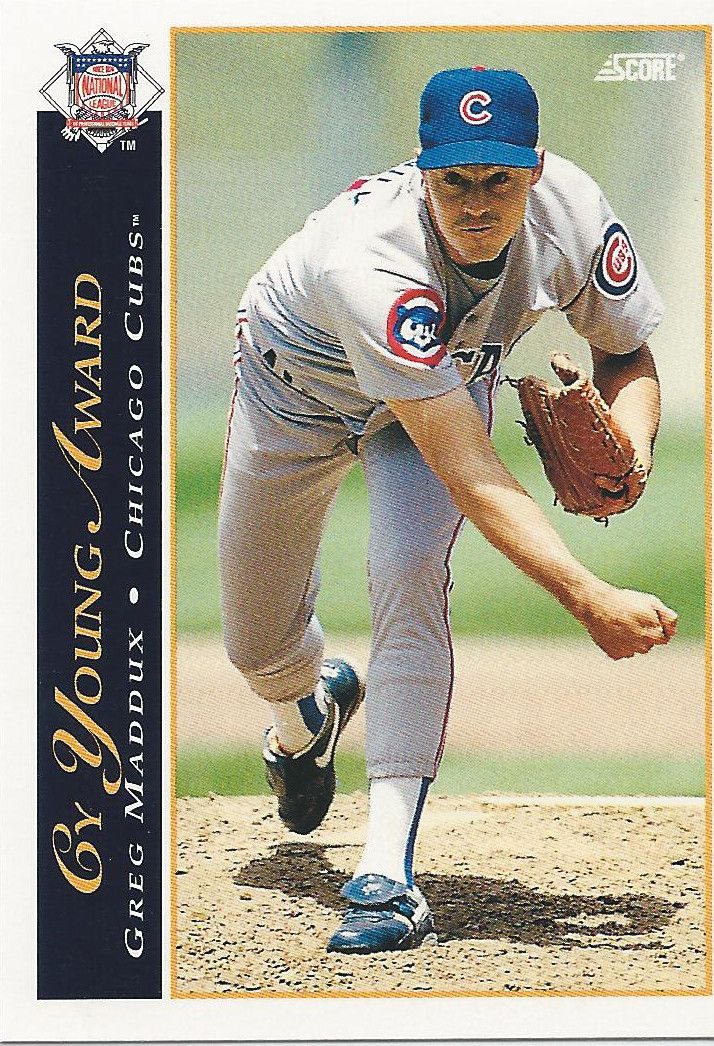
85% demon eyes
All of the subsets were original and dynamic and used to feel special. This is maybe halfway there, but should be more than a black bar.
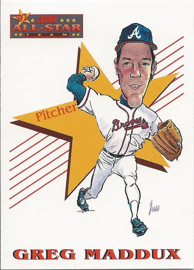
What the.....pinnacle?
I would say that this is more like it, but what the hell is this? Does that look like Greg Maddux? Isn’t this secretly a broder card? Why? I have so many questions.
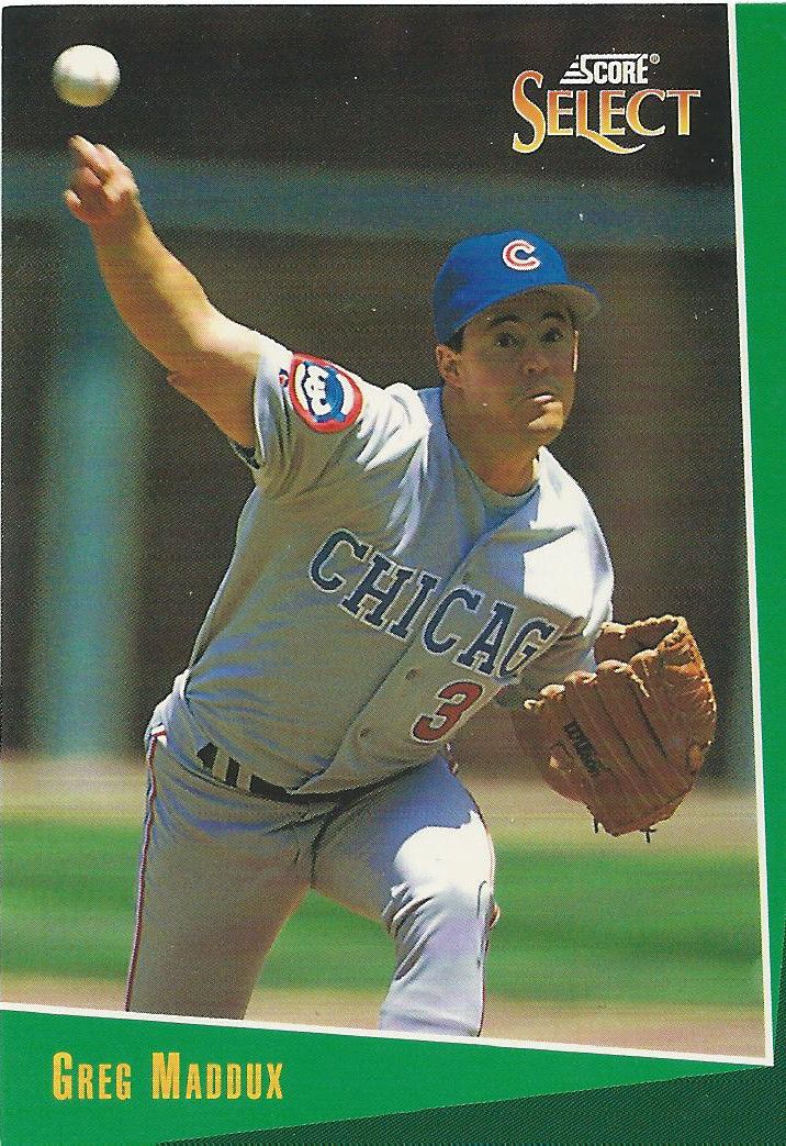
You will see Select is not so selective
Score Select is closer to what Score should be. It has the color, it has the dynamic lines. The only thing is that they’re all green. I want purple and blue and red and other not green colors.
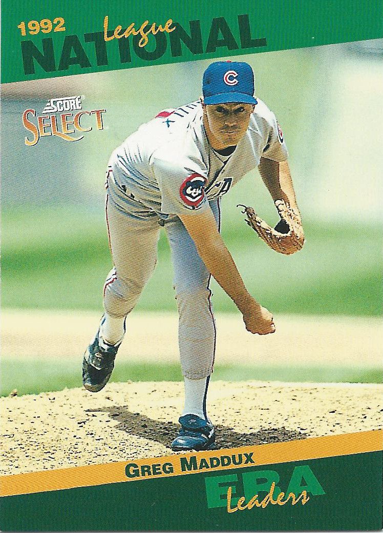
I think we just saw this picture
So, you know how everyone got on Topps’ case for those Topps 60 inserts for most whatever and the player wasn’t the leader in the category for the card? Well, select does the same thing. Greg was third on the list for ’92 ERA. Stupid monopoly. Score got so lazy as soon as they got the exclusive.
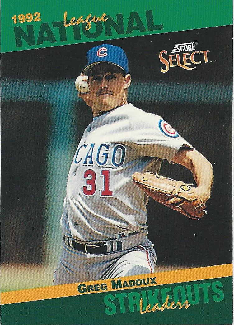
You are NOT the leader -- Maury Povich
Same thing here. It even says on the back of the card that Smoltz and Cone both struck out more batters in the NL. Both are certainly worthy of another card in 1993, so I’m not sure why Select chose to select Mad Dog again.
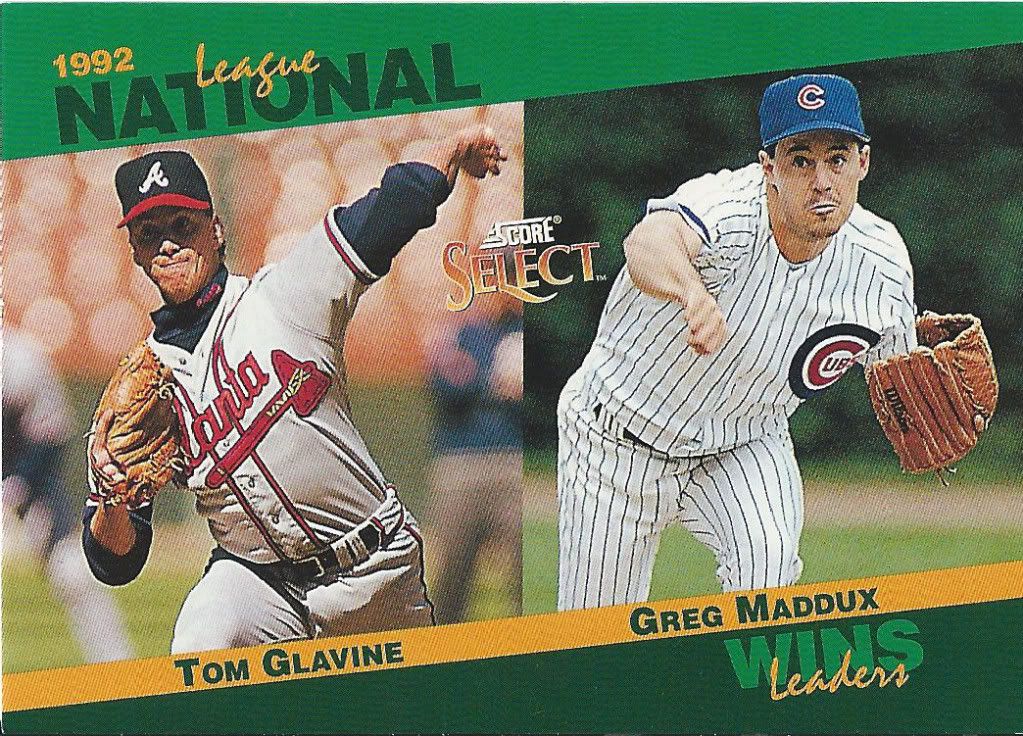
Your 2014 Hall of Fame inductees?
Here Select gets it right. Glavine and Maddux tied with 20 wins each. Good job, guys. By the way, can you tell this is an insert set? Yeah, me neither. 90 cards large, it is. I’m still missing one – a dual with Smoltz for some stat.
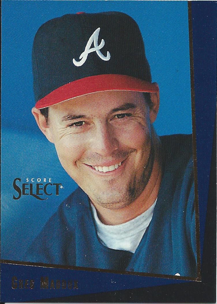
Sad to say he's smiling because he's no longer on a last place team
Here’s my blue! They saved it for the traded set. And added foil…. I guess I should be happy they didn’t add 90 more stat leaders.
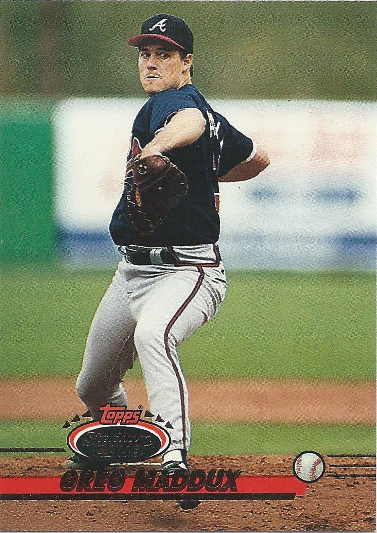
Boy are there a lot of these to get
Oh Stadium Club. You took your popularity and ran with it to the extreme and we ate it up over and over and over. More so than 1992 Topps, it’s possible that Stadium Club is the real offender for the mountains of parallels we have to deal with.
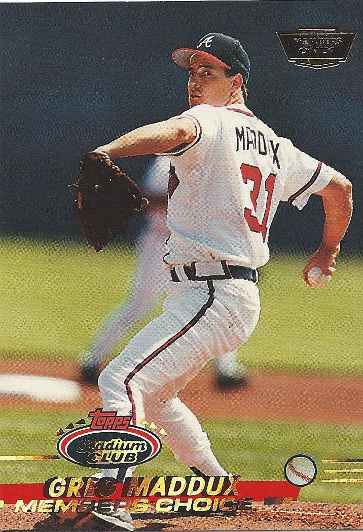
Members Choice Members Only Jacket not included
Take this for example. That little stamp in the upper right means it’s different, and difficult to obtain. You had to be a member in their paid club to get a card like this. I’m no member. I’m guessing Jeremy wasn’t a member either. If he was, he may have sent the other two Members Only cards I need. Still, after that, I need three 1st day issues, and then I’ll almost be done with Stadium Club. For one year. For one player.
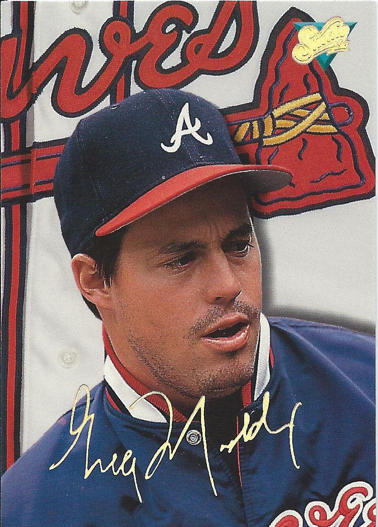
Soaking in that 8 of the 45 cards I need are Stadium Club
That’s more like it. Studio is one and done. Like Bowman, this is the last year I can say that. Oh man, I just got the feeling that future year posts are going to get pretty depressing.
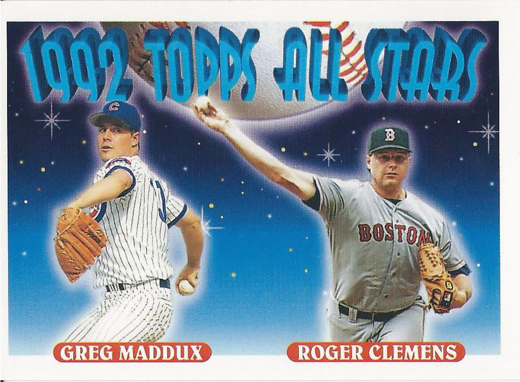
Thoughts on Clemens?
Dual All-Star cards. If you must, this is a better approach. The double-sided cards annoy me. Both players deserve equal attention and deserve to face the front in a binder, no? Side note: I want this card to glow in the dark.
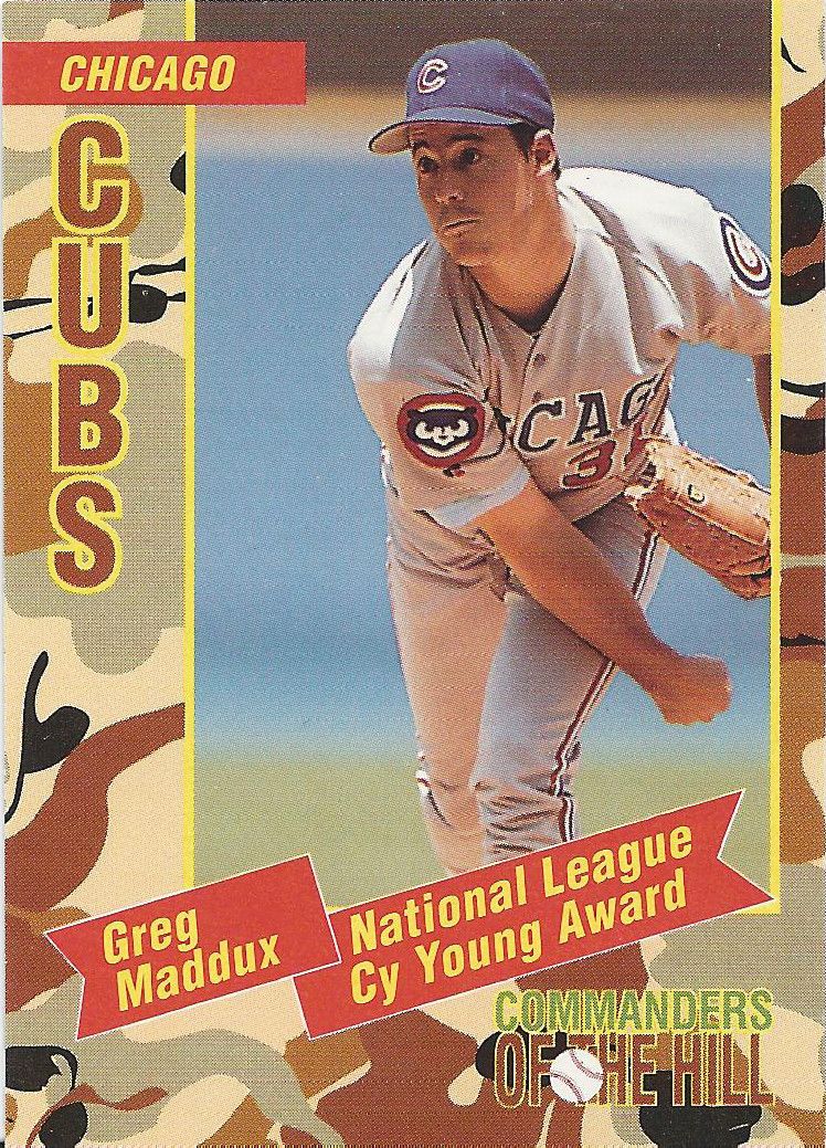
Where'd the card go?
This may be the closest I get to a ’91 Topps Desert Shield for quite some time.
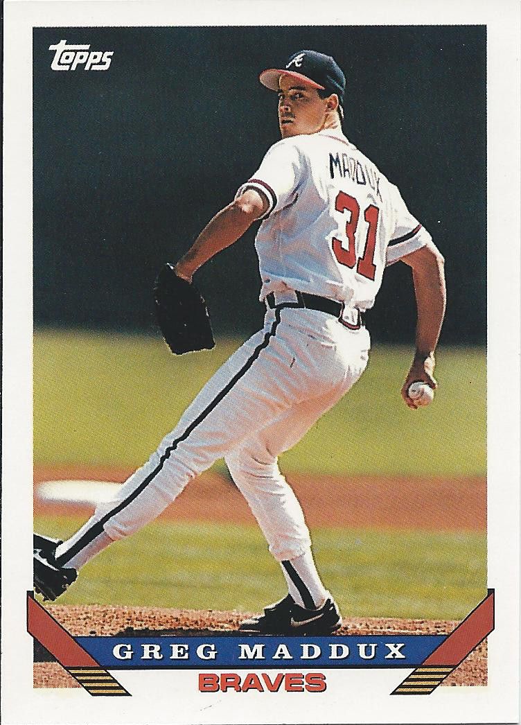
I need a bunch of Topps stuff too
Is it possible to be both sad and relieved that there are no gold parallels of the Topps Traded set?
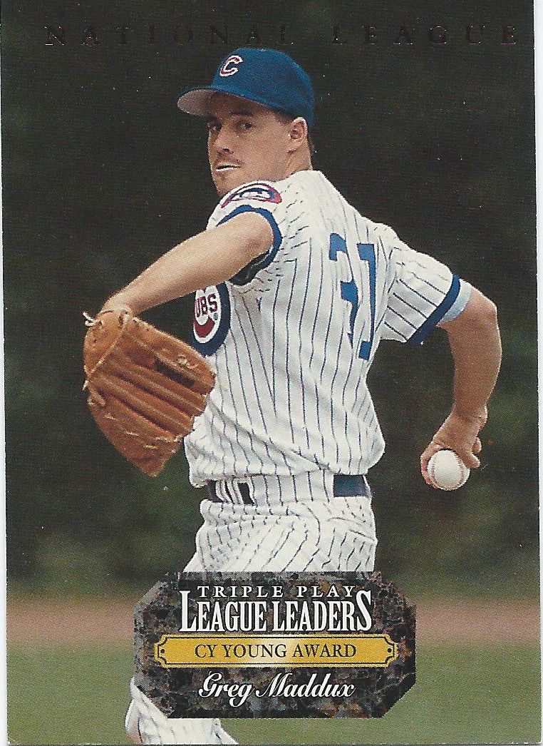
Not seen: Dennis Eckersley
This is the most un-Triple Play Triple Play card I have ever seen. Where’s the wacky? The bright colors? The kiddie stuff? Where’s the AL Cy Young winner? Oh, he’s on the other side because this is one of those cards I mentioned not being a big fan of. I like the Maddux side. I’d be okay with a split screen with another player, too.
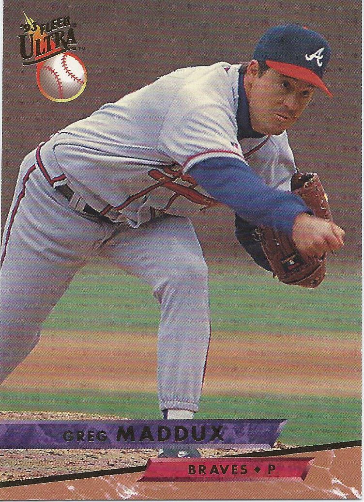
I said NO Popcorn CEILINGS!
I’ve said before how classy and special Ultra was in its early days. In many ways, I preferred them to Stadium Club. Anyone that watches House Hunters knows that granite countertops in kitchen are popular. Evidently, they’re popular on cardboard, too.
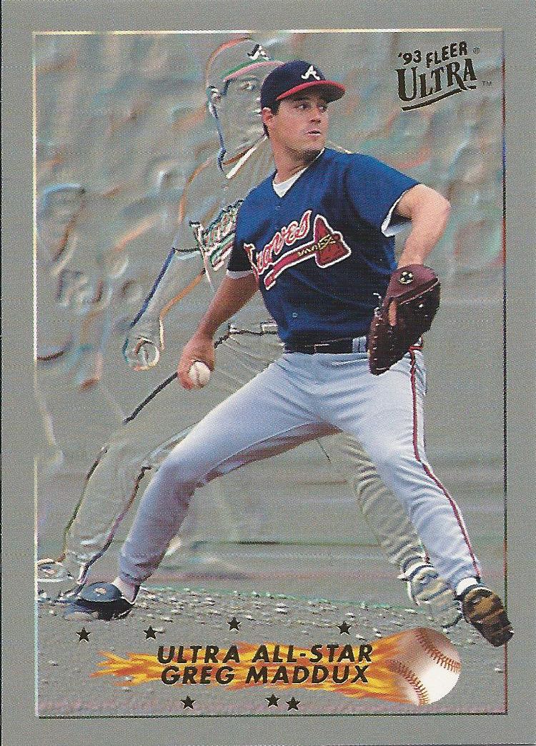
Ultra, I love you, but I also just vomited in my own mouth
Although if this is their version of Stainless Steel appliances, I’m going to pass. The neighbors are too close anyway. And why is this house on a street??? I can see a car! Isolated silo bunker or nothing.
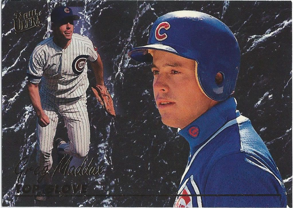
You all know the "Top Glove" award, right?
There’s that marble again. We’re back to classy. I like it.
I like adding 27 new cards for just one year. I like and thank Jeremy for sending me all of these. And I’ll continue to thank him as I go through future years. I gots me a whole lotta cards between 1994 and 2008 to show off.
It’s not called the Overload for nothing.

Recent Comments