When I say “small,” I don’t mean insignificant. Not by any means. Quite the opposite, actually. And when I say “Giant fan,” I don’t mean of us. No, no, no. I simply mean that a fan of the Baseball team from San Francisco, ARPsmith from ARPSmith’s Sportscard Obsession, sent over some smaller sized items in our most recent trade.
You see, I’ve been working on assembling my 2012 Topps Sticker Album, which is now just one, single, solitary sticker away from completion thanks in large part to these babies.

Bet you can't guess which pages he finished
That little pile of tiny, flimsy goodness knocked out a whopping 6 pages from the book. That’s some serious power, don’t you think?

White Sox Before
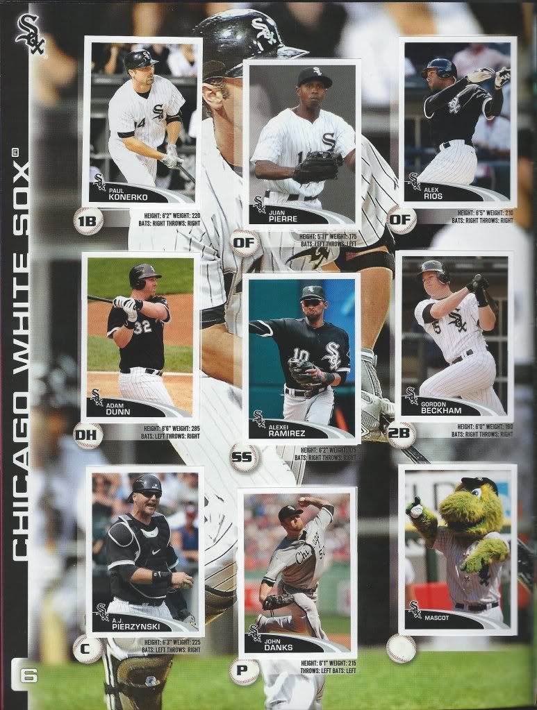
The inaugural member of my “If I Were To Collect” club. Expect another post in that series shortly. For now, pay close attention to the picture you’re seeing.
White Sox After
And now take a look at Konerko’s sticker. That kind of Inception-like scenario hasn’t happened on any other page that I’m aware of. I’ll be honest, I don’t remember too well sometimes. I do remember there being mascots on virtually every page, and this one’s no different. Then two stickers to the right of that we have some furry green thing.

Mariners Before
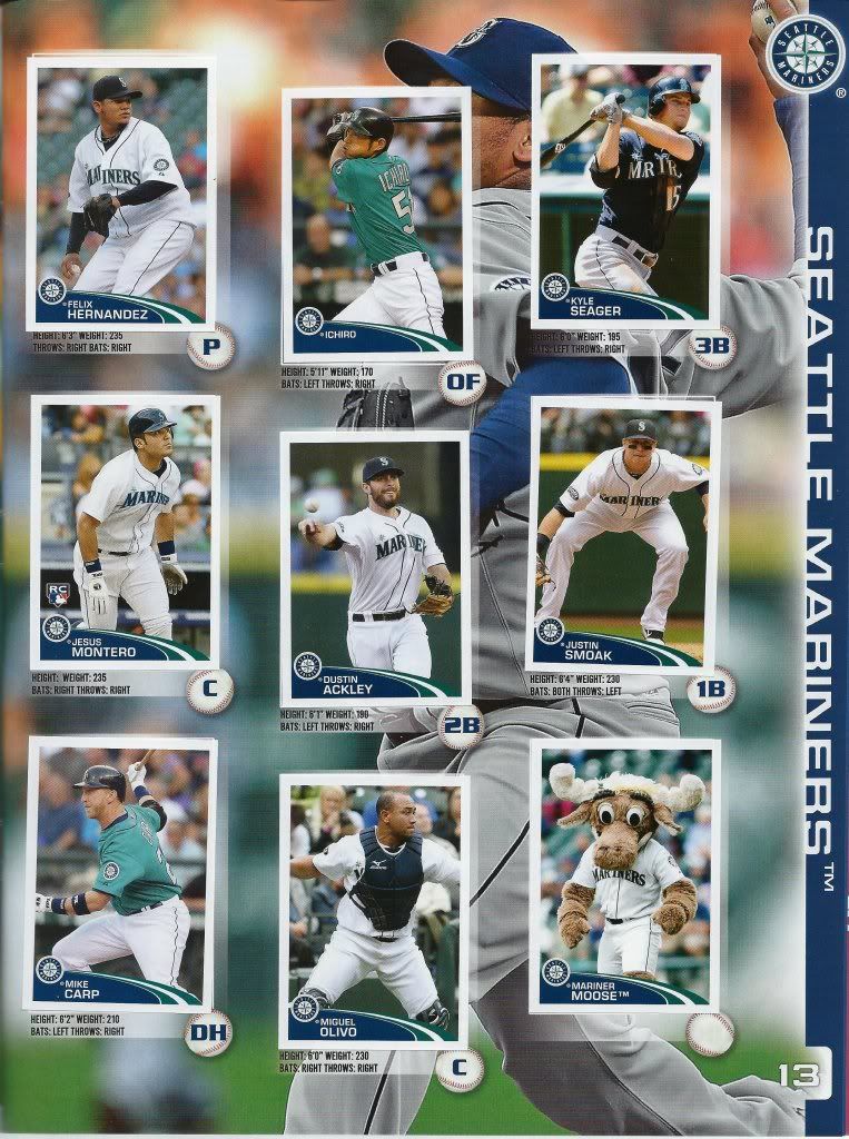
Sometimes my cheat sheets fail me. I attributed the Marlins to another trader, because I didn’t read my own handwriting correctly. It should have been the Mariners then. So, we’re flipping them around. I know it ruins what little integrity this post may have had, but what choice do I have?
Mariners After
We can’t all be perfect like his Highness. Something that just dawned on me — why is Seattle’s mascot a Moose? Is it a regional wildlife thing? Shouldn’t it be a fish or a cartoony Neptune instead?

Mets Before
It’s time to play everyone’s favorite game: What’s David Wright Licking?

Mets After
If you guessed “Jason Bay’s shoulder,” you win! I have to say, I’m surprised R.A. Dickey made it on to this page. He wasn’t exactly the Cy Young winner everyone grew to love yet. I think at the start of the year, one could easily make a case for another position player to fill that slot instead.
Cubs Before
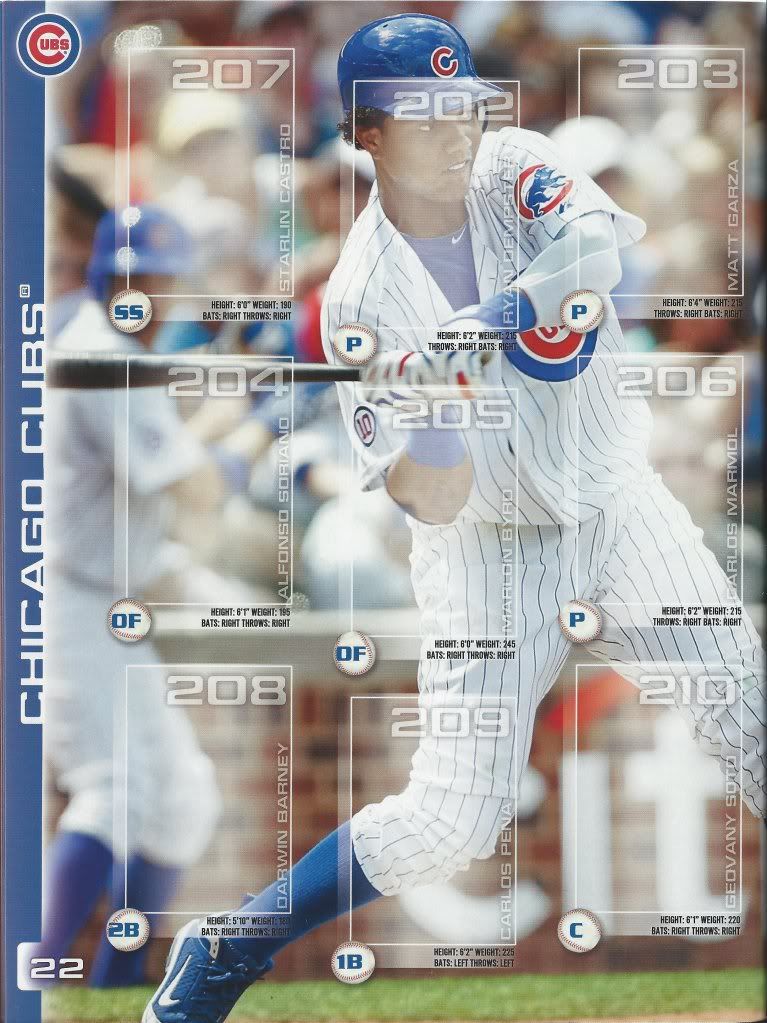
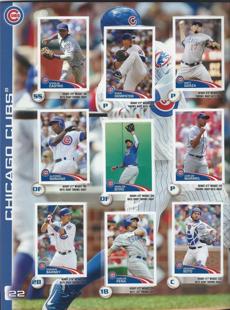
What a difference a year makes. The 2011 album had no one I collected at the time. I since added Starlin. This book has three including Castro. I’m glad they went largely by merit instead of straight-up position.
Cubs After
Also, what a difference a year makes in terms of rosters. 4 of the 9 are no longer with the team (and Pena was gone before the season and really shouldn’t be here), and there have been rumors along with 3 others. Should be a fun season.
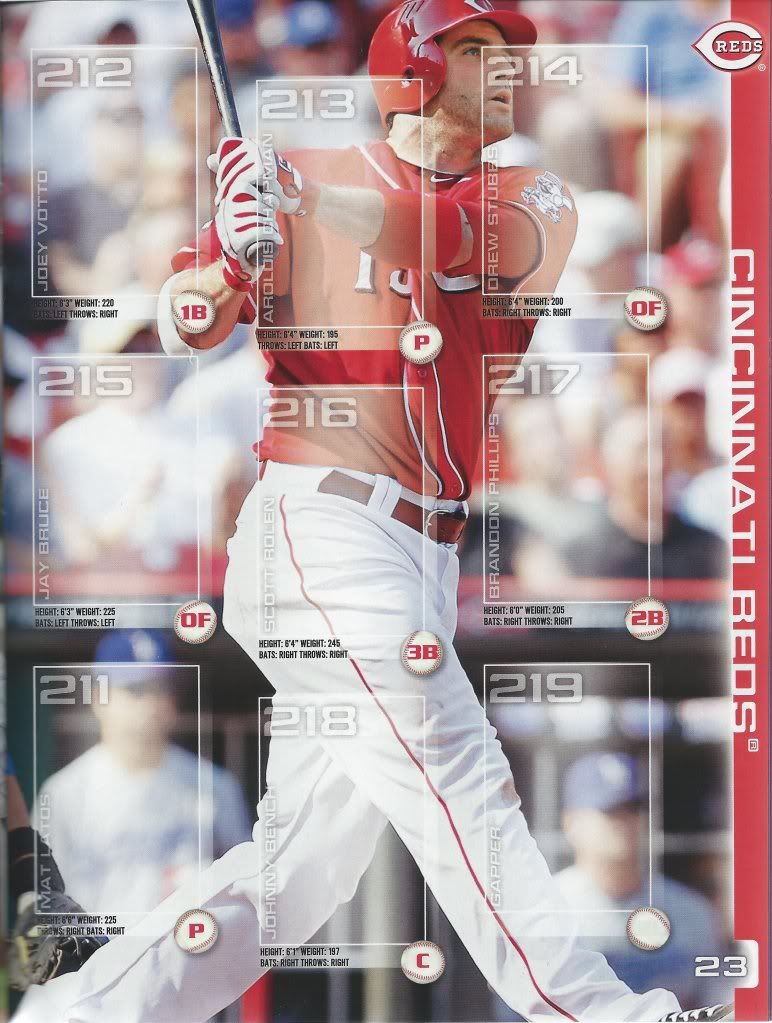
Reds Before
Well, I was right about the Reds winning the Central. It just sucks that they couldn’t keep the Cardinals at bay. It all worked out for the best in the end as I wanted neither team to ultimately win.

Reds After
My guess is that the Reds will likely repeat as champs in 2013. It’s all due to their secret weapon: Gapper.

Rockies Before
That’s kind of cool how the ball graphic looks like it’s hitting the bat. I wonder if they shifted the photo over just to line that up. CarGo is off-center to the right a little bit….

Rockies After
If you’re just looking at this sheet, the Rockies don’t look too bad. Perhaps the difference can be attributed to that phenomenon that happens with players from teams you don’t follow. I think CarGo is good, but is he really? Maybe it’s that he had this amazing run a year or two back that everyone remembers and so they think he’s a star and better than he actually is since the league has figured him out. Then times that by “x” Colorado players. Just a theory.
I’m very happy to have been able to knock so many pages into the “posted” folder from such a small handful of stickers. And, since I’m in something of a clean-up mood, how about we show off the rest of the cards ARPSmith sent in our last trade, back before he had a blog. Another convert made. Good work, everybody! One of us. One of us.
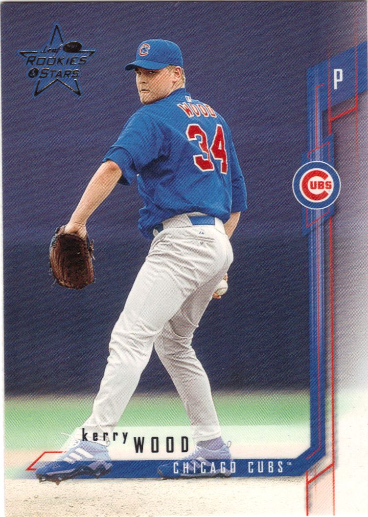
Through the uprights
I’m at a loss as to what to say about this card. The first thought that springs to mind is “bleed Cubbie blue” because those red lines sort of look like veins. They also look like goalposts. Maybe Leaf reused their football design.

Card may be shinier than it appears
I don’t know what’s going on with those little squares, but I like the rest of it. It’s tough to tell, but the outer border is shiny and continues the picture in foil. The team colors along the inner border not only give it that extra little pop, it also delivers a more subtle change in the background to fill out the colors even more. See how it changes the outfield wall?
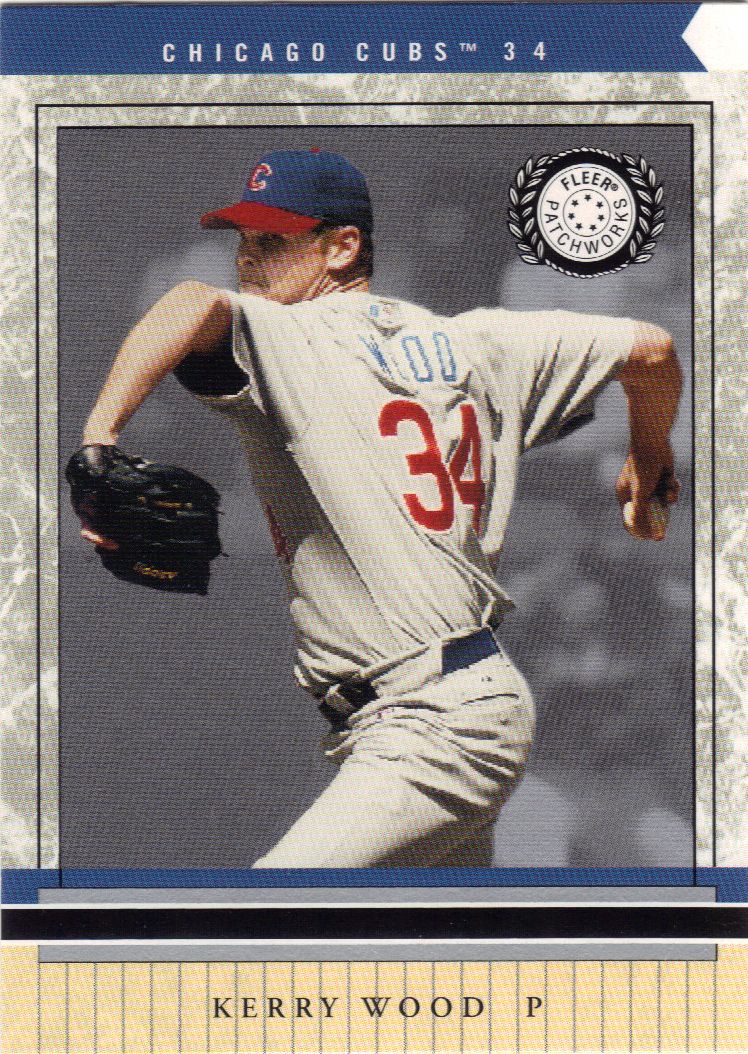
But where's the patch?
Patchworks seems like an appropriate name for the oft-injured Wood. By 2002 he was starting to put things back together. He sewed himself up to throw 4 complete games. Considering he only threw three total in his career up to that point, it was a promising sign.
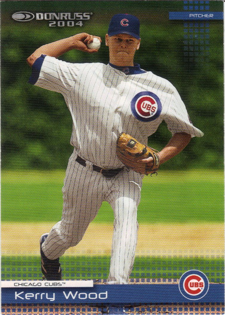
He's gone plaid
The digitization of Donruss. I noticed this happening on a few of their sets around this time. They’re very focused on pixelated looks. Sure, the tech boom was important, but it was also several years prior. What, are they going to include an AOL disc with each pack?
Thanks again to ARPSmith for the current and previous trade. If you have an excess Giants cards, and you probably will next year if not now, give his want lists a look-see. While you’re at it, take a look at my want list to see if you have that last little sticker I need. You know, since you’re here and all.

Recent Comments