Back in March, I did something I rarely do. I posted a preview for an upcoming product. While this blog comments on hobby news here and there, it’s usually in a editorial/commentary fashion rather than a straight-up news format. What made it even more unusual was that it was for a basketball product. I’ve flirted with basketball here and there since I returned to collecting, but nothing really stuck. Perhaps the Bulls’ recent dominance (this year’s playoffs withstanding) has something to do with it, but I’m getting back into the game more and more.
Of course that will naturally make a collector gravitate to the cards of the sport. I just needed an in. 2011-12 Panini Past & Present looked perfect. I originally was only going to pick up one box, but I splurged a little and doubled the order.
I know I said in the video that I was going to break the second box off-camera, but I can’t resist the limelight. So, here’s box #2 opened at my desk.
If you watched the videos you have an idea how I feel about the results, but how about we break things down a little bit and see if it lived up to my hype and high standards.
Main Set
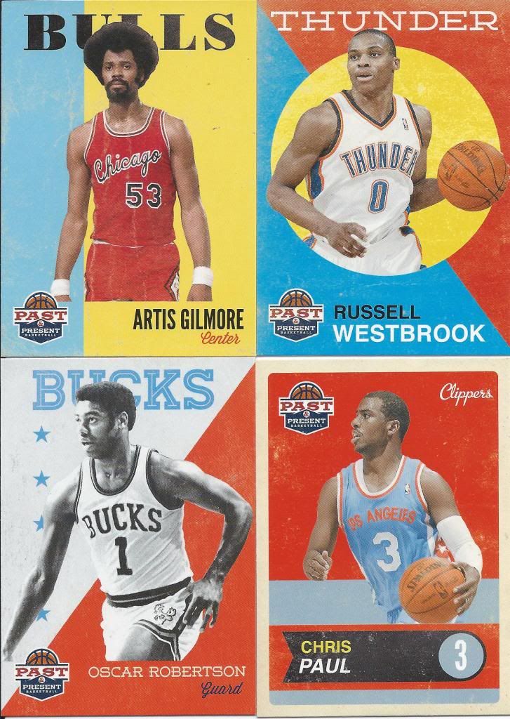
4 designs in 1
The set consists of 200 cards and 50 SP variations (you’ll see one later). The set is split up into four different styles. The current players take up 150 of the cards in the two designs on the right while the retired legends take the other 50 using the looks on the left.
If we’re being honest, it’s a little bit of overkill. The set could have gotten by just fine with only 2 of these looks. Or one. Panini is blowing its load in one shot. Still, they’re here and they all look quite nice. I’m not sure if it’s the worn book cover look or the color scheme, but there’s a nice sense of consistency between even though the designs vastly differ.
The set construction itself is a little confusing. Many players repeat from the first 100 to the second 100 cards and I have no idea why. As you can see, there are no other markings on the front and the backs are constant, so I’m not sure if they ran out of players to use or if there’s supposed to be a common thread for each section. I want to believe it’s the latter, but probably not.
I think it’s also worth mentioning that I got a full set out of my 2 boxes with 68 doubles left over. The second 100 cards are less prevalent since they fall in the short end of the packs after the insert, but the collation still worked in my favor.
Inserts and Parallels
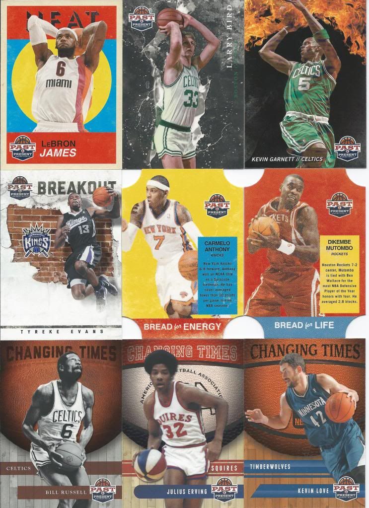
A tactile experience
I hinted at the SPs, and the LeBron you see would be it. The backs are oriented horizontally instead of vertically and evidently, they are a little tougher than you may think. In 40 packs, LBJ was it. Something tells me I’ll be skipping these in my collection goals (although I wouldn’t mind the D-Rose if anyone wants to trade straight-up).
There’s one insert that I didn’t show here and that’s the Bread for Health insert. It’s the same as the other 2 “Bread for” inserts except the colors have rotated again. My only complaint with these is that I wish the die cut was different for each type. Maybe only the top corners for one, the bottom only for the second and all 4 for the third.
The Changing Times insert turned out to be a nice surprise. As I show in the second video, the basketballs have a raised surface and the set adjusts the bumps to fit the style of the ball featured. Little details like that go a long way with me. Like the Evolution of Man inserts from 2011 Allen & Ginter, each card can work as a standalone, but put together in a row, you can see progression. The fonts change, the underlays change, the ball changes.
Breakout may be my least favorite, but I still like it. There’s a little underutilized space near the bottom, but I appreciate the matte/raised brick gloss, and it’s cool that the brick wall kind of looks like the continental US.
Raining 3’s and Fireworks win the day by far. The preview pictures really didn’t do these cards justice. The scans don’t do these cards justice. You have to see these in person. You have to have them in your hands to understand how awesome they are. I will warn you that whatever film cover Panini uses on the Fireworks cards looks like it’ll peel easily. They are condition sensitive, which could mean a big secondary market for high grades down the line. I mention that since a lot of basketball collectors are big on inserts like that.
I know it’s going to be a tall order, but I think I’m going to try to collect the inserts from this set. They’re just too cool to not throw in a binder. I am a basketball insert guy after all (*cough, 1995-96 insert set collection needs here, cough*). Besides, it’ll give me something to look for at card shows (if I ever get out to one again).
Hits
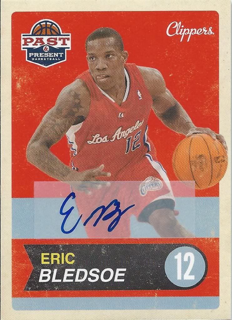
Not so Common Autograph
Each box promises three autographs and one relic. Not a bad ratio for a 2o pack box, or for a $100/box product if you ask me. Now, sometimes you’ll get an autograph like this. Nothing against Mr. Bledsoe, but this just looks terrible. Stickers are acceptable in certain situations and this is not one of them. If stickers are going to be used, I’d prefer if they were a little more inconspicuous. There’s also very little to no difference between this and the card from the set. I could see some scammers taking full advantage, can’t you?
The good news? Panini says stuff like this is on the way out for good. No, honestly! Offy from Sports Syzygy and I were discussing this card on twitter (follow us here) and the company responded to us assuring that the slapped together look doesn’t belong in their future design business model.
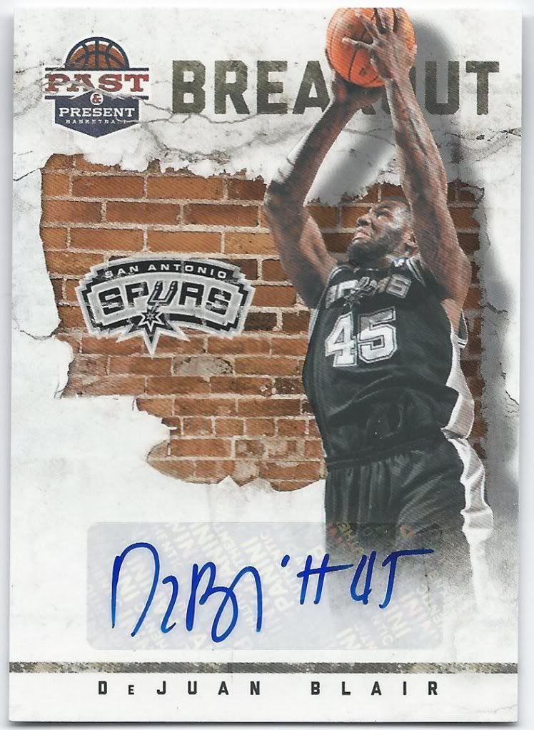
I think he signs his cards "Pizza Hut"
Next up is the only insert set to have an autograph parallel. Collectors should be happy to know that there are no crazy parallels otherwise. There is no relic version of this card. There is no relic auto. The cards are allowed to largely stand on their own.
DeJuan Blair is currently battling the Thunder in the Western Conference Finals. Since the Bulls fell apart completely, literally and figuratively, I’ve taken up rooting for the Thunder and my second favorite contemporary player in Kevin Durant. I’m hoping this auto isn’t an omen.
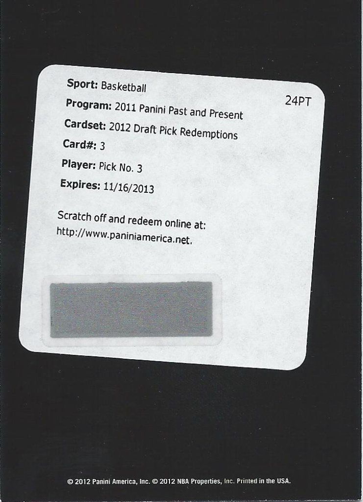
And with the third pick of the draft, the Bulls select Michael Jordan
Okay, these aren’t autographed like I said in the videos. Still, they don’t show up in every box, and they are redemptions, so they kind of feel like hits.
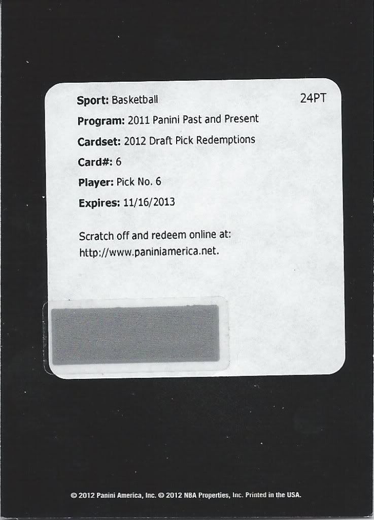
Another lottery pick
I don’t know the full story as to why rookies aren’t included, and I don’t care enough to look it up, but I do know that Past & Present is the first product to have the 2011 draft class show up in any form. I think there was some weird legal issue thanks to the lockout. Anyway, there are autographed 2011 draft pick cards in redemption form (no rookies in the main set or inserts) and there are these for the 2012 draft class. I know it rubs a lot of collectors the wrong way, but if there’s nothing Panini could do to put the guys in the sets, then oh well. It just means next year will be doubly rook-y.
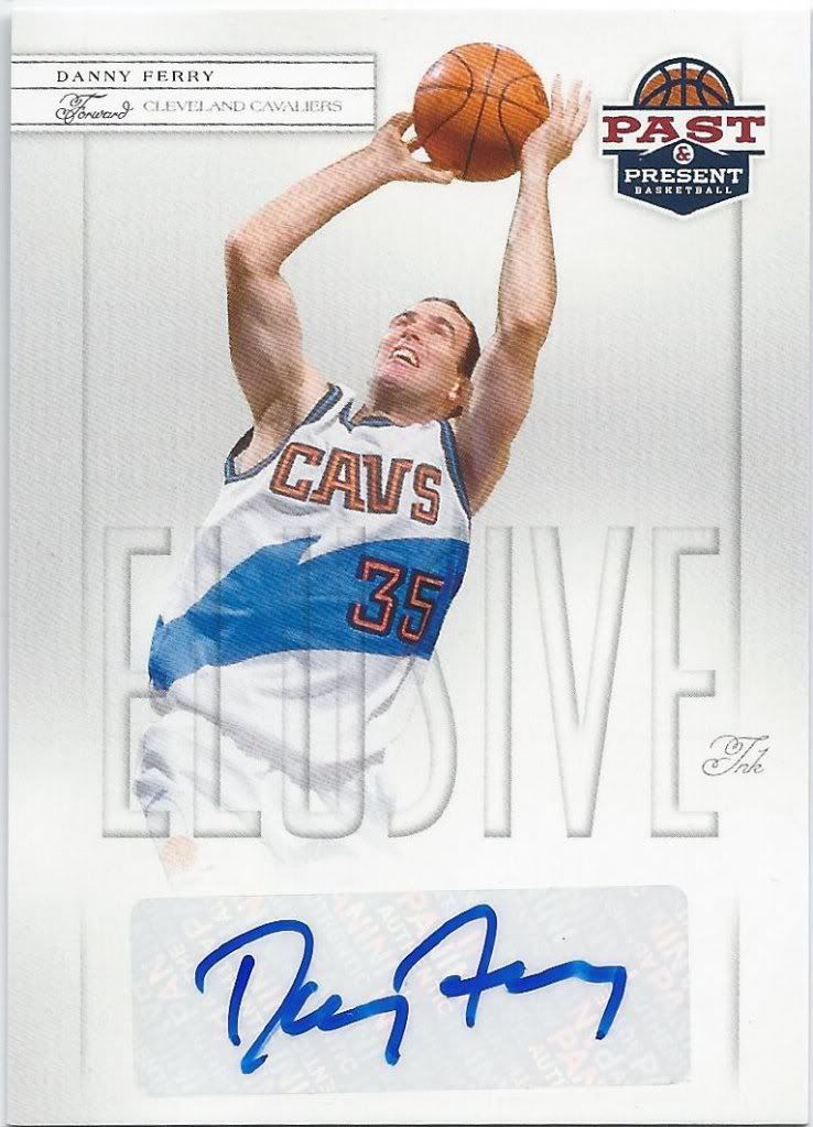
Ugh....
Have I mentioned that I’m a Bulls fan? I think maybe once or twice. As such, I don’t have fond memories of the Cavs. Can’t say I like Danny Ferry. The only way this could be worse is if it was John Starks. If it was Starks, I probably would have torn the card up right away. Or maybe surround it with Reggie Miller cards so it self-destructed.
Anyway, I need this Danny Ferry autograph out of the house. If you’ve read this far, then congratulations, you found a hidden contest!
All you have to do is comment below with the answer to three questions. 1) Who will win the NBA Finals; 2) Who will win the Finals MVP; 3) What will be the combined point total for the clinching game? The third will act more as a tie-breaker. If multiple guess 1 & 2 right, whoever gets closest to #3 (over or under) will win the card.
The contest will remain open until Wednesday midnight, since we’re getting close to having the Finals set.
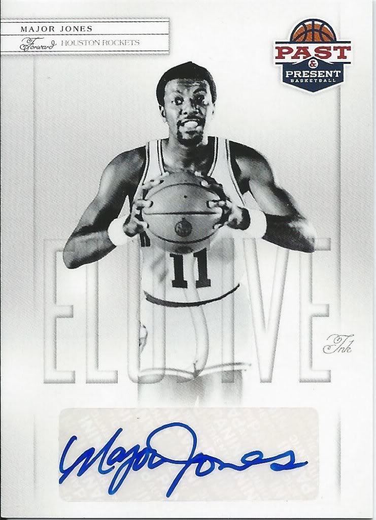
Sweet auto!
I have no problem with the rest of these guys. Major Jones is okay by me! I wasn’t too keen on the elusive ink in my preview post, but they’re growing on me.
I have to say that I really like that the Elusive Ink’s are the most prominent type of autograph in the boxes. I was hoping to get 1 in my 2 boxes. Instead I got 4 of the infrequent signers, which I hear isn’t uncommon.
This is a perfect example of a sticker autograph being acceptable in my mind. Yes, these would look absolutely stunning on-card, but let’s consider the context.
It’s easy to say that Panini should have been able to get some of these hard signed, but maybe it isn’t. These players are elusive signers for a reason, right? Maybe they don’t want to deal with the hassle of having a company rep waiting for the cards, or with having to sign and ship everything back. We may not think it’s a hassle, but professional athletes, or former ones, might. I’m not going to pretend to understand player relations, so I’m willing to accept that stickers were the best option for this autograph set, and will be happy that collectors can have autographs of these guys period.
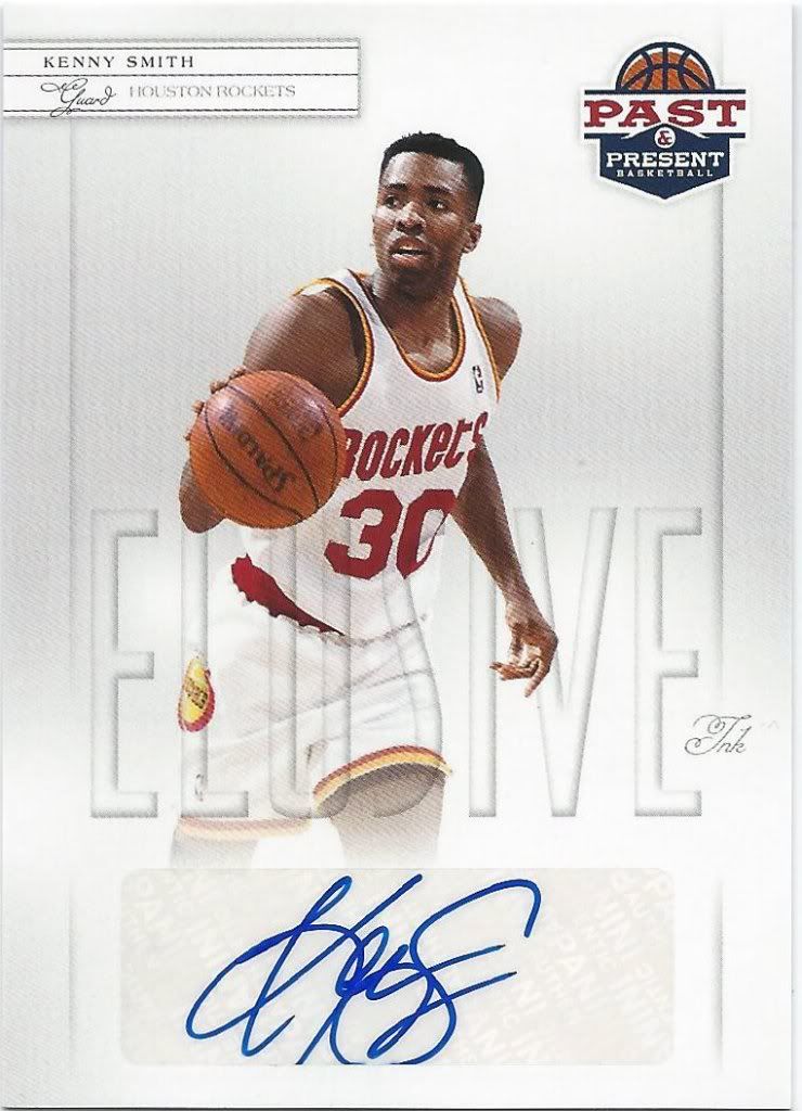
Smaller man, bigger signature
Kenny Smith has become known for his commentator work on TNT, but I’ll always know him as the guy that helped the Rockets crush the competition in those two non-Jordan years. Anyone who denies the Knicks a championship is alright in my book.
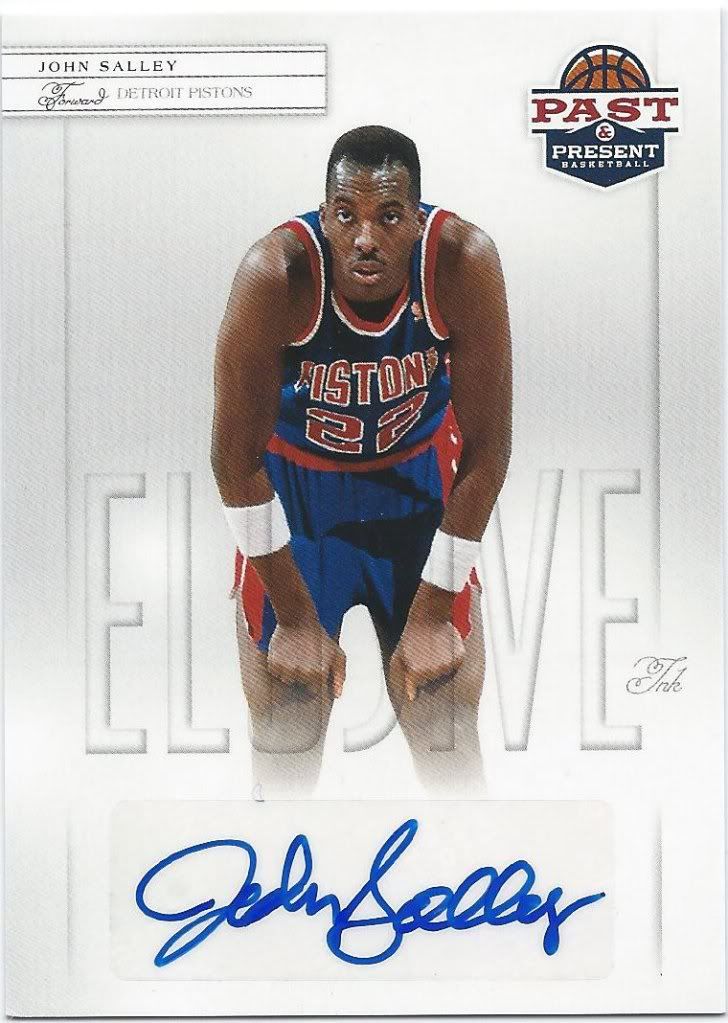
Spider signature
Andy may not know who he his, but I sure do. The other autographs will most likely find their way on ebay (except the Ferry), but I’m keeping John “Spider” Salley. I know he’s pictured as a Piston, but I prefer to remember the good times with the Bulls.
In fact, I’m chasing all the Bulls autographs from this set. Maybe eventually I’ll have an autograph from everyone that won a ring in Chicago. The count is now 1.
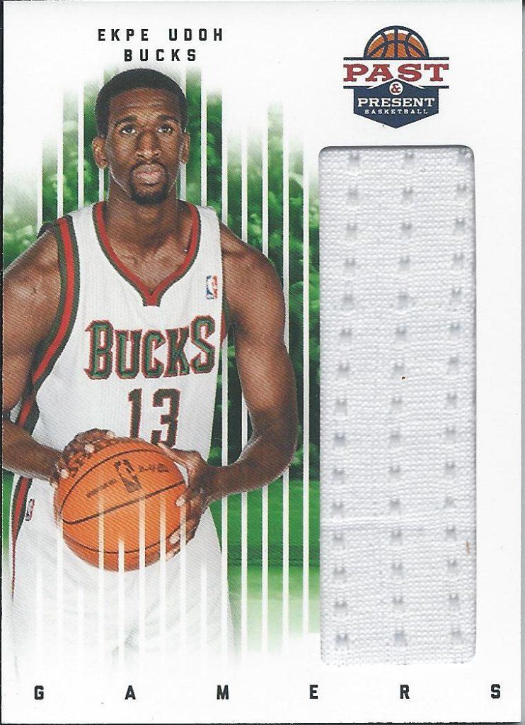
This is your normal swatch size
I don’t know much about Ekpe Udoh other than he was the 6th pick of the 2010 draft. What I do know is that this relic design is a huge improvement over what we’ve seen in the past, and I would argue over what we’re seeing from anyone else right now. Nice, clean design. A big picture of the player that’s put off to the side, but doesn’t seem like an after thought. A massive relic window. No crazy parallels. Okay, that’s not entirely true….
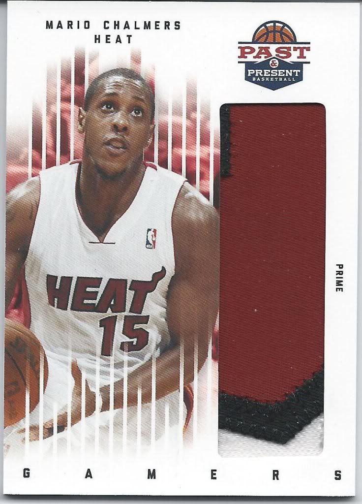
#04/15
There are Prime patch parallels, but that’s it. No auto patch, no blue, gold, mirror, etcs. And the patches look amazing. This has to be part of the name right? maybe the number? Whatever it is, it’s really cool. I could be wrong, but I think this is a case hit. I’m not a Heat fan (hoping the Celtics lose to the Thunder), but I am a fan of this specific card. Very cool.
Conclusion
The set wanted to give us the best of both worlds. It’s not a new concept, but it is one that’s usually met with skepticism and harsh criticism. Panini avoids both with this strong release. All of my gripes are minor and are drowned out by the overwhelming positives.
Panini seems to have really taken consumer complaints to heart by breaking away from the mold that I know we here got tired of. Instead of loading the packs with useless and confusing parallel sets and templated inserts, we get beautiful cards that deserve display and demand collecting.
For me, this is the product of the year so far. Not only does it look great, but it also was strong enough to bring me back into the basketball collecting fold. How often does a release like that come along?
Design – *****
Set Collecting – ****
Inserts – *****
Parallels – N/A
Hits – ****
Overall – ***** out of 5

1) Who will win the NBA Finals – Miami Heat
2) Who will win the Finals MVP – LeBron James
3) What will be the combined point total for the clinching game? – 169
1) Miami Heat
2) LeBron James
3) 201 points
1) Oklahoma Thunder
2) Kevin Durant
3) 182 combined points
[…] 2011-12 Panini Past & Present Basketball Video Box Break & Review […]
1) Oklahoma City Thunder
2) Kevin Durant
3) 190 points
NBA CHAMPS- Boston Celtics
MVP- Rajon Rondo
178= Total Points
1) Oklahoma City Thunder
2) Kevin Durant
3) 183 points
Celtics
Garnett
188
okc thunder, russell westbrook, 207pts
okc thunder, kevin durant, 202 points
1>Oklahoma City Thunder 2>Kevin Durant3>211
) Who will win the NBA Finals – Oklahoma City Thunder
2) Who will win the Finals MVP – Kevin Durant
3) What will be the combined point total for the clinching game? – 186 points
Spurs
Parker
176
Thunder, Durant, 197
1) Who will win the NBA Finals? Thunder
2) Who will win the Finals MVP? Durant
3) What will be the combined point total for the clinching game? 194
Thanks guys!
1. spurs
2. ginobili
198
celtics win it all, garnett mvp and 188
Celtics
Rondo
179
1. Heat
2. LeBron
3. 209 points