Get your Nikes on and Booms Shakalaka’d, because we’ve got a massive multi-post here. Our good friends at Panini sent us a box break and review for our blogstituents and we are happy to oblige. Take a peek below at our video break, read on for our full review or totally blow past all that to the bottom where we’ll give the details of the contest! I do highly recommend you watch the video, as Jon and I were in rare form (aka: I cut out the parts where we weren’t funny or I looked especially old). Also, we do try to make our reviews complete and awesome. If you have any suggestions about our breaks or reviews, please don’t hesitate to let us know in the comments or by sending us an e-mail! On to the goods!
Rare form indeed, right? Now that we’ve gotten several NBA Jam references off in the top third of this post, let’s move on to the meat to the video’s potatoes: the review!
Base Set
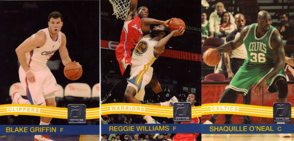
If only Don Mattingly's moustache were around to see these today...
Now here’s a base set design I can get behind! I was too young for this era of Donruss beaut. Now that Panini owns the license to Donruss’s’s’s back catalog, I expect to see many callbacks to the design vault. Hopefully it’s not overdone. I presume that, since the Donruss design catalog is not as deep or iconic as Topps’, there’s a limit for this sort of thing but, being that it’s the first time I’ve seen it from them, I’m on board. Photography is chock full of great action shots and the color timing has a shift to the yellow. I presume that’s to give this set a “dated” look. I was down with this when I first noticed it but now, looking back at the cards again, I’m left wondering why they committed to this decision. My cards from the early 80s aren’t yellowed out… more often they’re poorly printed with wicked print spots and registration shifts. Obviously they can’t go with either of those methods, but why go at all? I’ve called Heritage out on not going the distance with their photography and I support Panini’s decision to commit to a look, but I’m not so sure this was the right one. Maybe because seeing dudes play basketball in a yellow tint reminds me of high school gym class under those awful sodium vapor lights. Ugh. At any rate, the color is a small gripe among many positives- I’m definitely a fan of this base set.
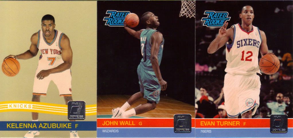
I wonder who actually gets to rate the rookies...
I fully support the bringing back of Rated Rookies. I think Rated Rookies have the potential to be the other sports’ version of hockey’s Young Guns. It seems so easy: “I’ve got a John Wall patch auto Ultrafractor numbered to his mother’s address.” “Oh yeah? I’ve got his Rated Rookie.” “::shame::” Make this happen, Panini.
But seriously, Rated Rookies are kickass. And I like 2 out of the three cards above (hint: not the school photo looking one). I actually like the studio shots a lot… if only they were consistent. I think a set of rookies with a consistent limbo (or non-limbo) background would be cool as hell if they were all obviously related to each other. I think that the photo editors often think in terms of singles, “That Wall card looks great!” “That Azubuike looks like a driver’s license photo… but it’s the only one we have the rights to.” What the editors [and brand managers, if they exist at card companies (and if they don’t, I’m experienced!)] need to think about how the cards they’re designing will look in a binder next to each other. These three don’t even look like they’re made by the same company except for the logo. Again, this is a minor gripe, as the RR subset needs to exist and most of them actually look pretty awesome- if only as singles.
Inserts
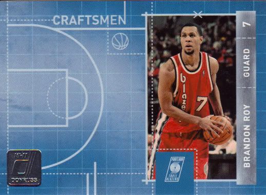
That's an empty blue court right there.
So here’s where things get a little dicey. There’s a large complement of inserts in this set, most of the standard star player variety. The Crafstmen insert above is one I’ve chosen to demonstrate one of my biggest pet peeves in the hobby: The Catch-All Insert Design. We mention it in the video too, but the totally dead space on the left is unforgivable. Obviously the point is for a relic and/or auto to take up that space over there. But not having either of those makes this card a design disaster. My argument is that this is simply lazy design. If you want to have a blueprint of the court as half your card, make it special. Draw a play on the court, hopefully specific to that player so that there is added visual value and meaning to the insert name. Plus, something as basic as that can be covered up by a relic and auto without complaint. I don’t see why the cards can’t have two separate designs to account for hit and non-hit versions. The backs already have to be different. Or, better yet, there’s a simpler solution to all of this: just don’t have any of these without the auto and relic. No one will miss this insert set. Just cut it and make it a relic auto insert set only. Okay, enough of that. Let’s talk coolness!
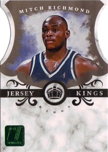
There is no other way to die cut this card.
Here’s a sweet die cut version of the Jersey Kings insert- another nod to the old Donruss standards. There are non-die cut versions of this insert set too, which kind of bugs me as well- parallels are another form of laziness though somewhat more forgivable, if only due to their prevalence and ubiquity in the hobby today. The problem with the die cuts in this set is that aside from the Jersey Kings and the base card versions, they make no sense. We didn’t get any in our box, but look online at the Magicians and Craftsman die cuts and you’ll see what I mean. They’re just randomly sliced and notched with no real cohesive theme. Sometimes the cuts are so slight, they can be easy to miss entirely if you’re not careful.
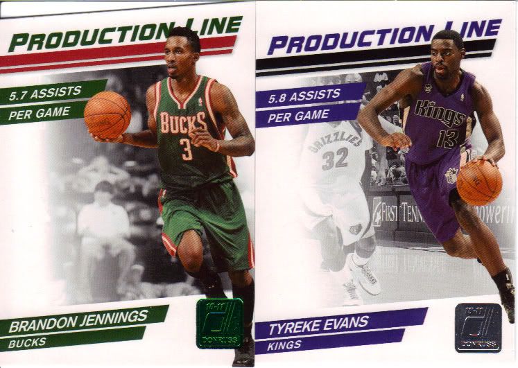
To slash or not to slash.
Here’s an example of the die cut vs. non-die cut situation. A particularly strange example, given that the die cut on the Production Line insert is kind of hilariously minimal to begin with. As it happens, the die cut versions of the inserts are not numbered, while the uncut ones are numbered to 999. Seems backwards to me, but given the number of parallels in the set (inserts included), it seems that numbering is pretty willy nilly to begin with. From what I understand, standard practice in the Panini world is to jam pack boxes with numbered inserts and parallels. At first I kind of rolled my eyes at all the numbering going on, but the one thing it does provide is some accountability and transparency in production numbers. Sure, it verifies that products in this price range are printed up like crazy, but at least there’s no secret about it!
Hits
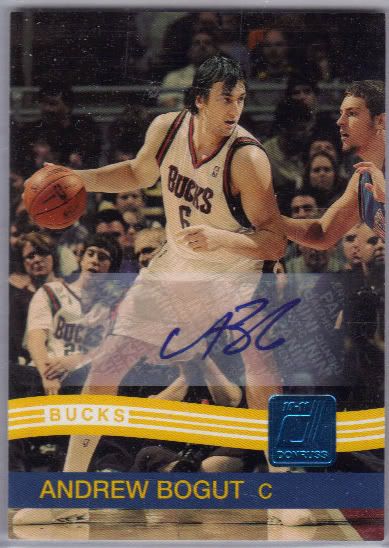
In my head, I'm saying his name like Frankenstein in Monster Squad
As a lower end product (around $70 per hobby box), this product offers a more slight selection of relics and autos than some of the heavy hitters. You’re promised one auto and two relics per box and ours delivered. Apparently, Mr. Bogut up there is having a fine defensive season and we were lucky enough to grab a blue logo version of his auto which is numbered to 25. Low end almost always means sticker autos and that’s the case here. I love the idea of putting autos on base cards, but the way the design elements are stacking with a semi-transparent sticker being the top bun of the Burgertime sandwich isn’t really working for me. I’d prefer a slight redesign of the base card to allow a better flow for the auto. If you want to see sticker autos done right, definitely check out my review of Topps Magic that I think simply nailed it. This set has the potential to be as good, but this one doesn’t quite cut it. Still a decent pull with a low-numbered auto of a good player (artificially scarce though it may be).
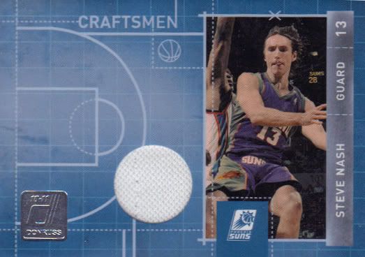
Well looky here! A relic version of the Craftsmen insert we saw above. And boy is that relic not were I’d expect it to be. It’s another case of some lazy design- I’m sure they want the room for an auto up there but this card looks so naked and lopsided that it’s a real disappointment. Bummer as it’s a 2-time MVP and all, but this relic left me wanting.
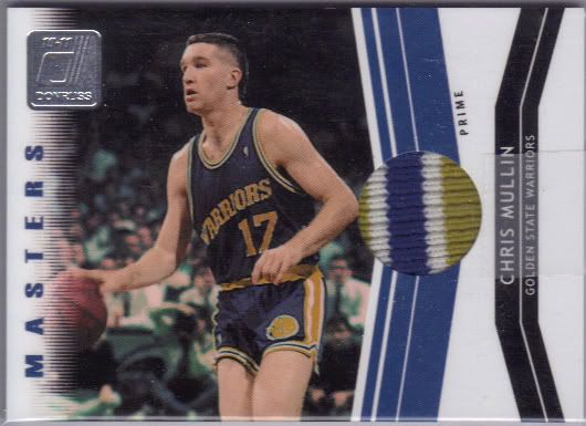
Nothing wrong with this relic, though! A design that looks like it was designed for being what it is: a sweet patch card of a superstar from my youth. This card is killer in every way, even if I’m not sure what a neon green and blue Warriors jersey looks like. This is a card I wouldn’t really expect to pull from one box of a lower end product and was a real nice surprise. If only the Craftsmen relics had such… craft.
Conclusion
As you may have seen in the video, I’m not expert on basketball cards, but I have to say that the opening of this box was a great experience. Lots of fun stuff to look at, from the promised hits to the die cuts and the Rated Rookies. Every pack had a surprise in it, and the vast majority of those surprises were good. Are there too many parallels? Sure. Does the numbering seem arbitrary? Yep. But, all told, the number of complaints gets drowned in the positives of the base set and I’m left with a feeling that this is a pretty good value. If I were a basketball set collector, I’d buy a case to get a base set and the inserts and sell off the relics, autos and parallels to fund the venture. If I was a basketball player collector… I’d quit. Because there must be 30 different Kobe Bryant cards in this set including inserts and parallels. And that trend isn’t likely to die down any time soon unless people stop buying anything with a serial number on it.
Design – ***
Set Collecting – ****
Inserts – ***
Hits – **
Overall – *** out of 5
Contest
Okay, you’ve patiently listened to my ramblings so now let me tell you how you can win some cards you’ve seen here today. To keep our shipping costs down, here’s how it’s going to work:
– One winner in this contest
– Winner is to receive all 3 relics and autos (including the Mullin which you’ll be pulling from my very sad hands) as well as all the cards from one team of their choice
– Due to a complaint on YouTube concerning our last contest (in which we were called “ripoff artists” for giving away some awesome cards), we’ll make this one a YouTube only contest. To enter, simply leave a comment on the YouTube box break video we have at the beginning of this page!
– Let me repeat that, with a link: To enter, leave a comment on the box break video for this review on YouTube!
– Try to make the comment relevant- we’d love to hear what people think of this product. Feel free to mention the team you’ll take if you win.
– One entry per person of course.
– Comments will be randomized and one winner will be chosen on my birthday: February 5th, 2011 which means we will accept no entries after midnight central time on the 4th.
– Any questions? Drop us a line!

[…] in our Donruss Basketball box break video I said I was going to show side by side comparisons of this set to the 1992 USA set from Skybox. […]